// Project · 2025
HOC
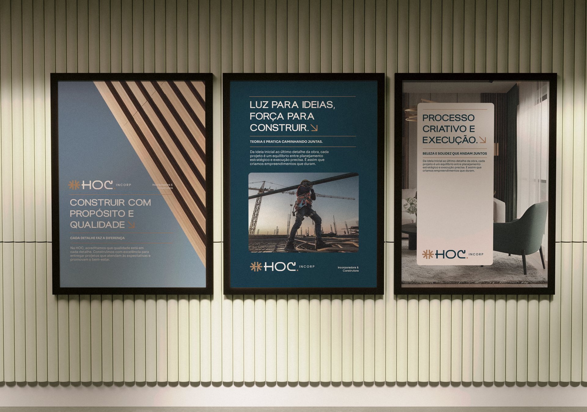
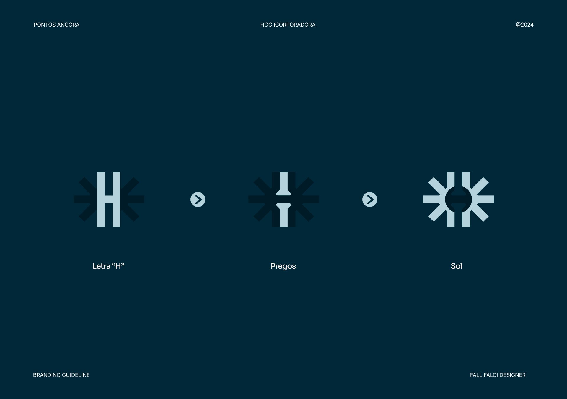
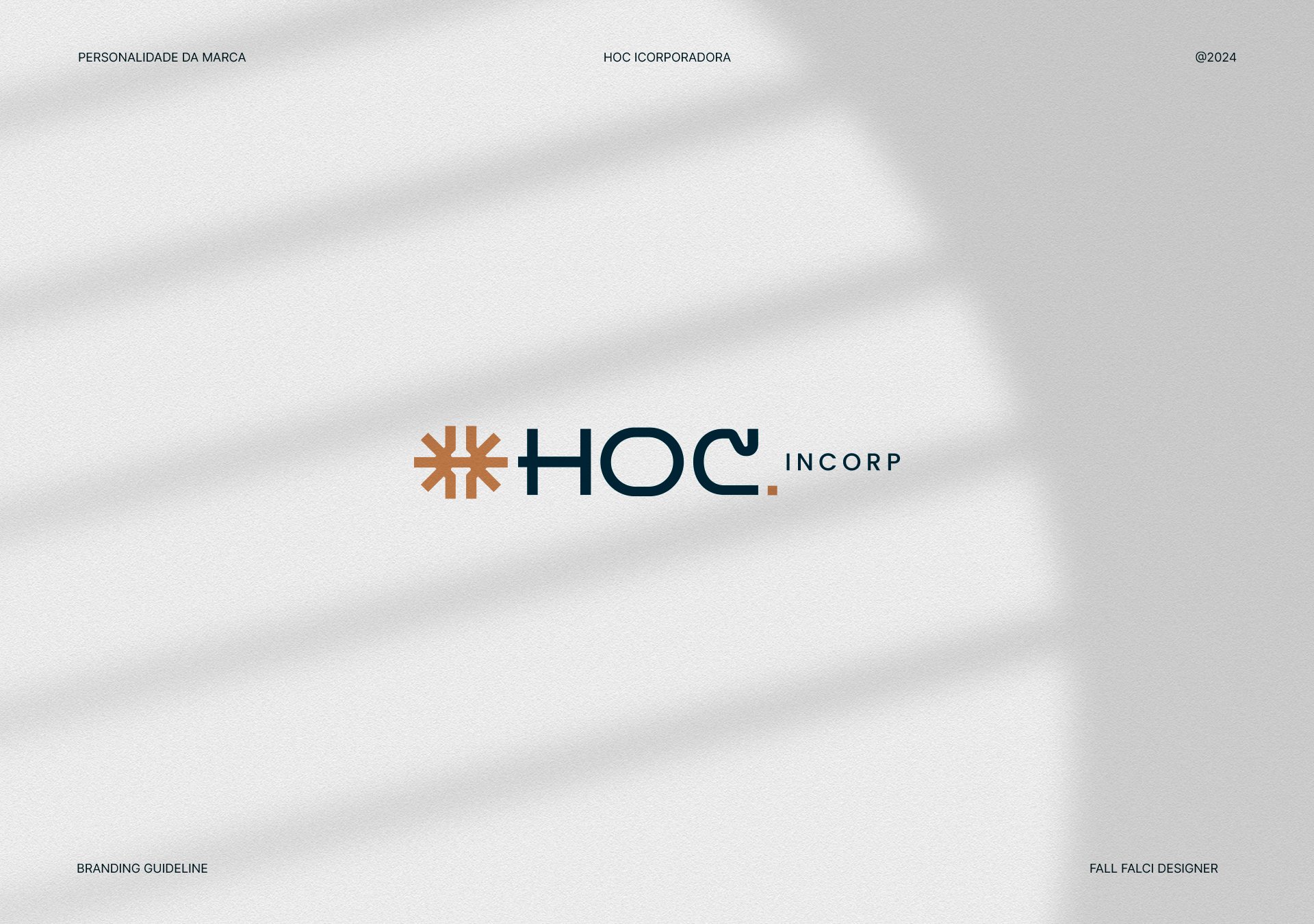
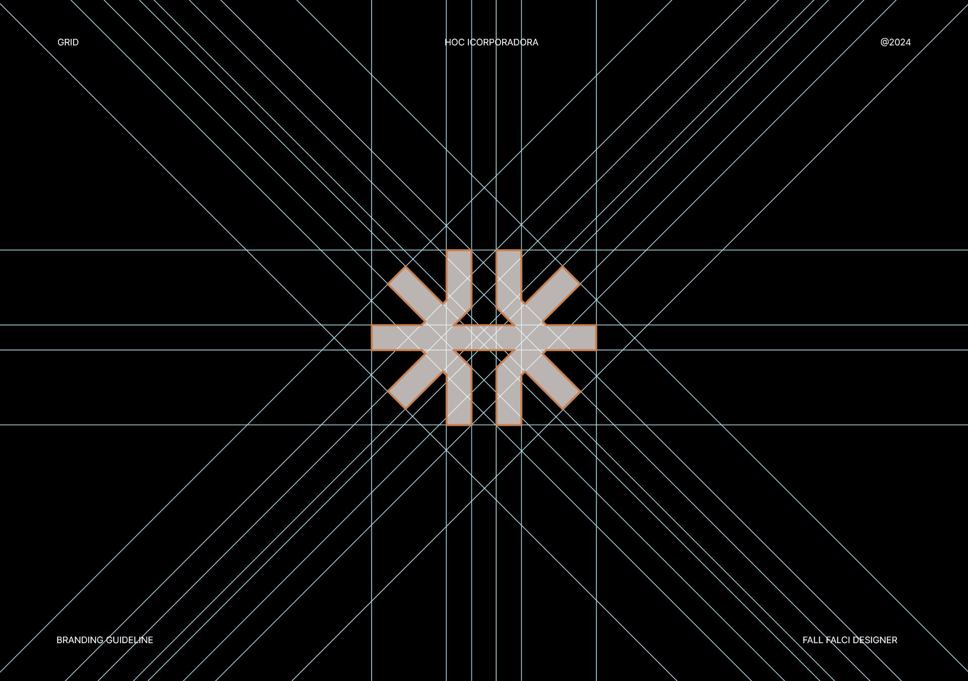
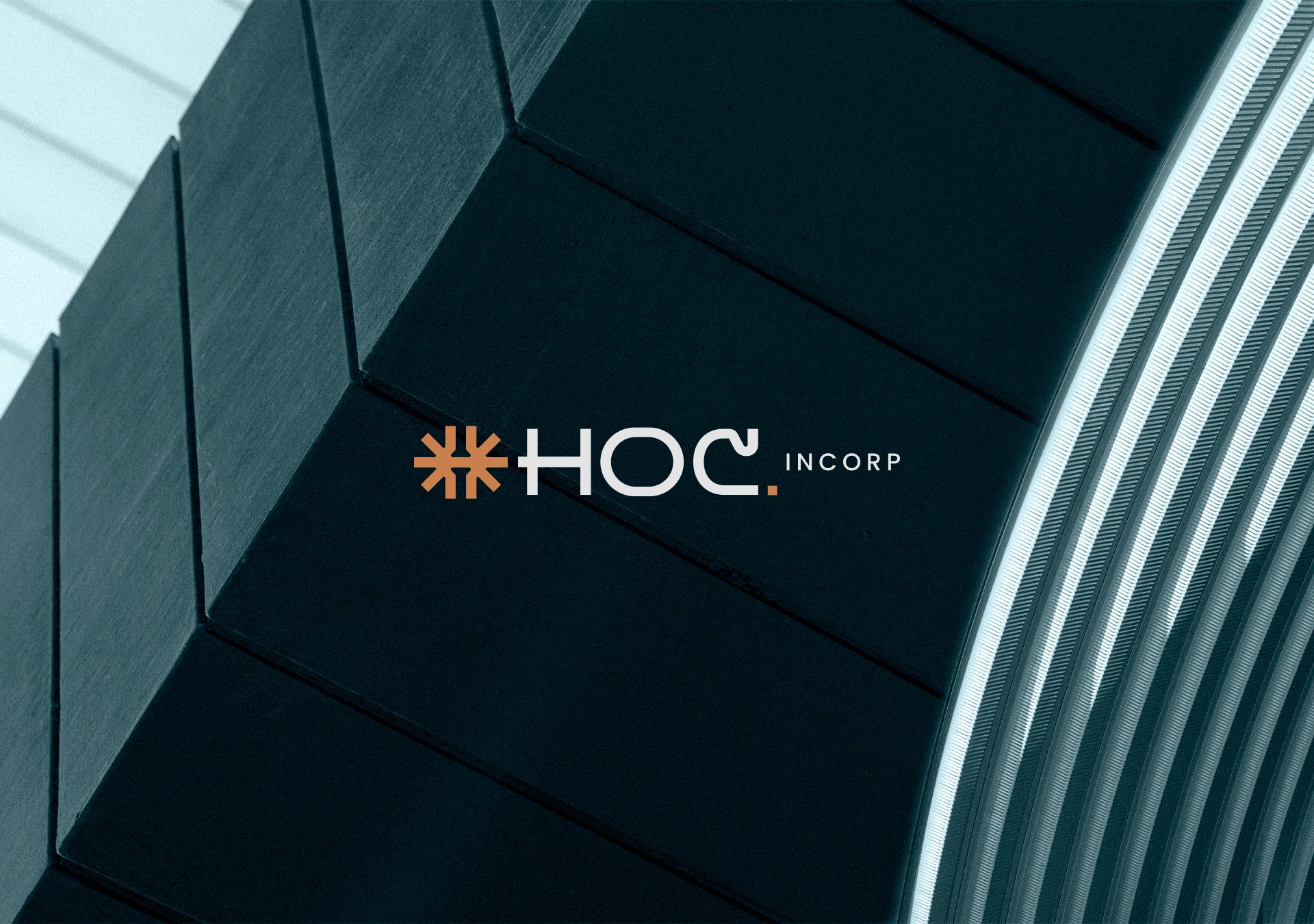
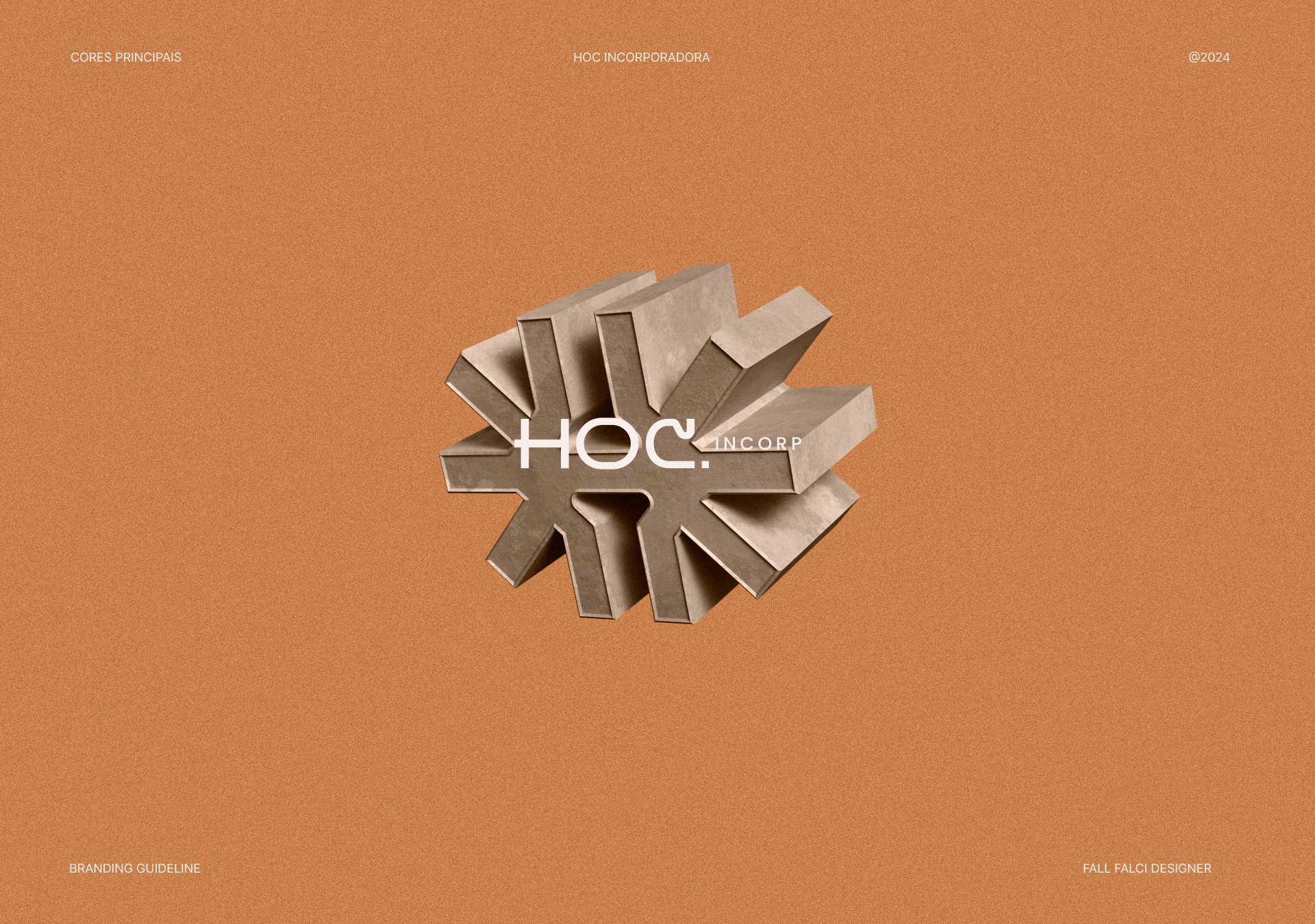
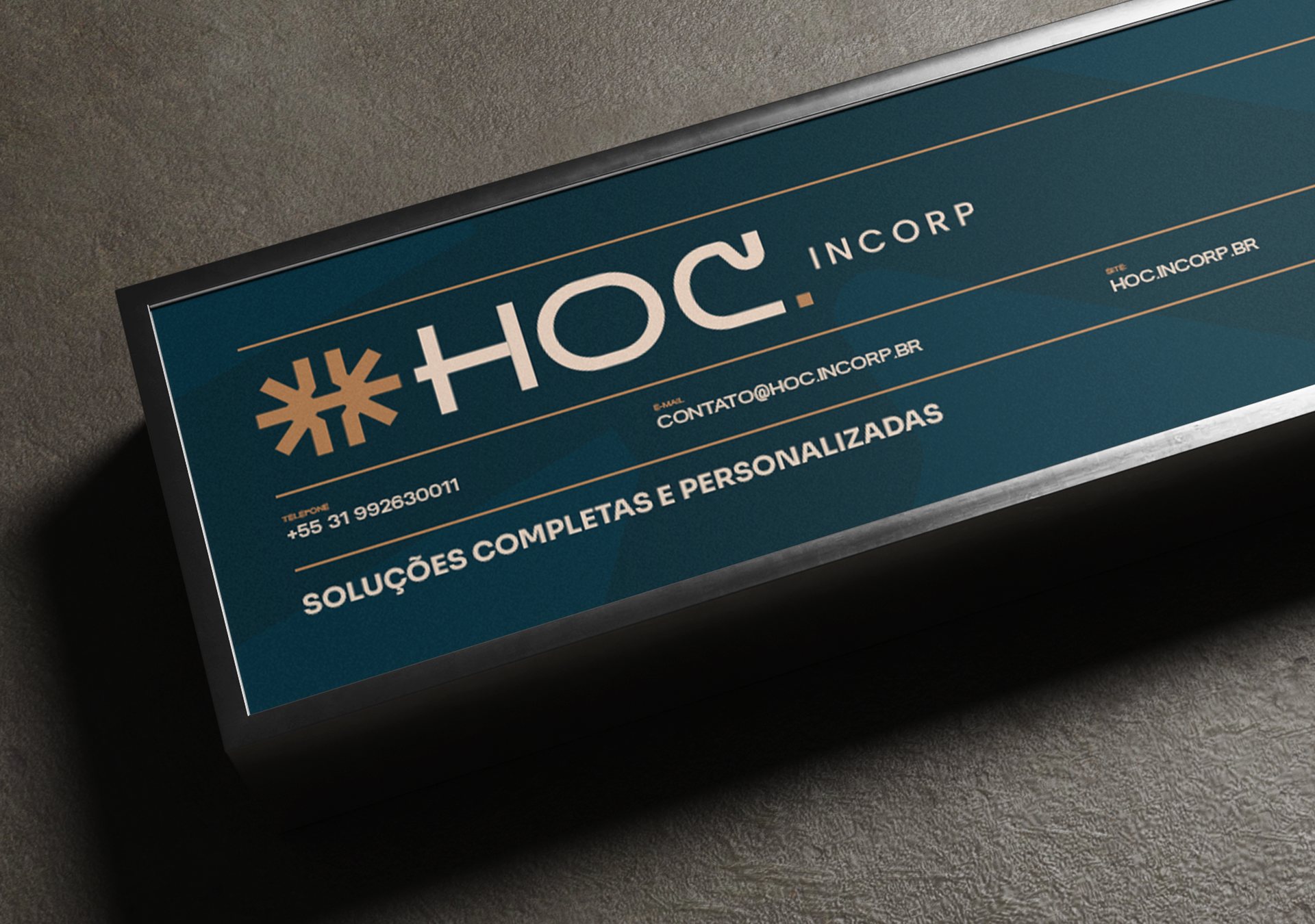
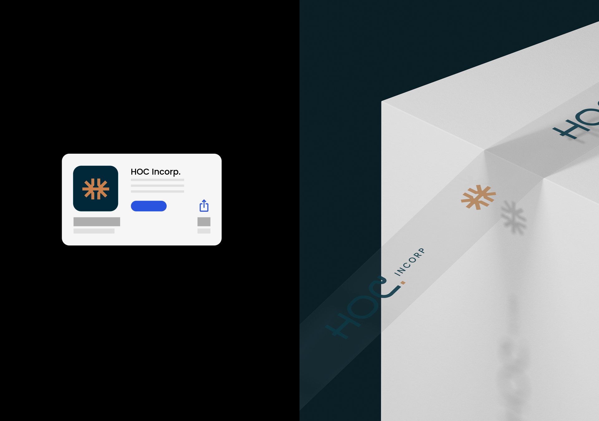
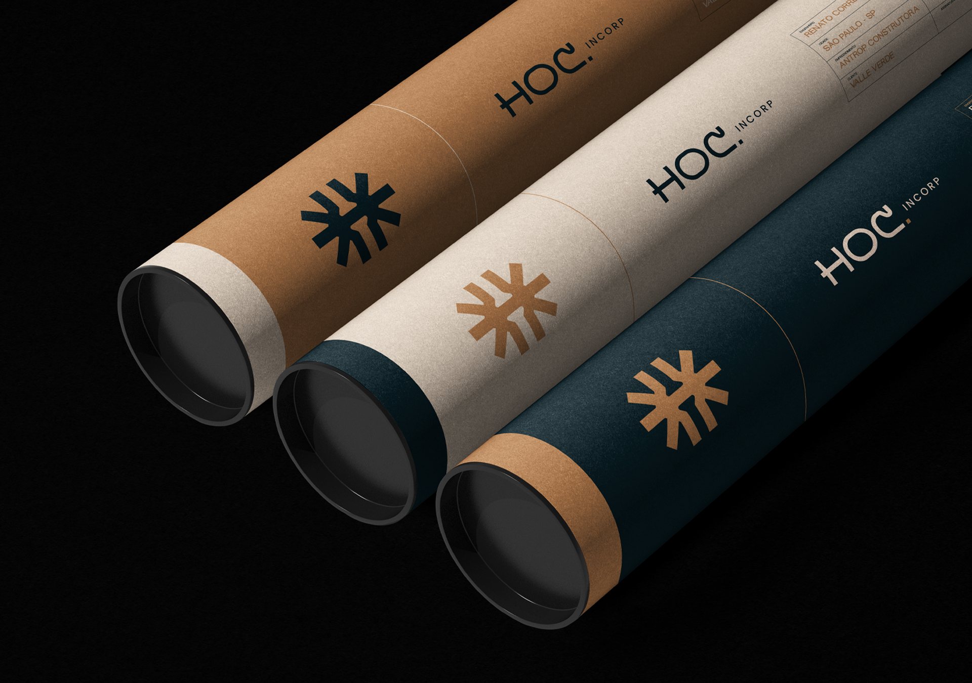
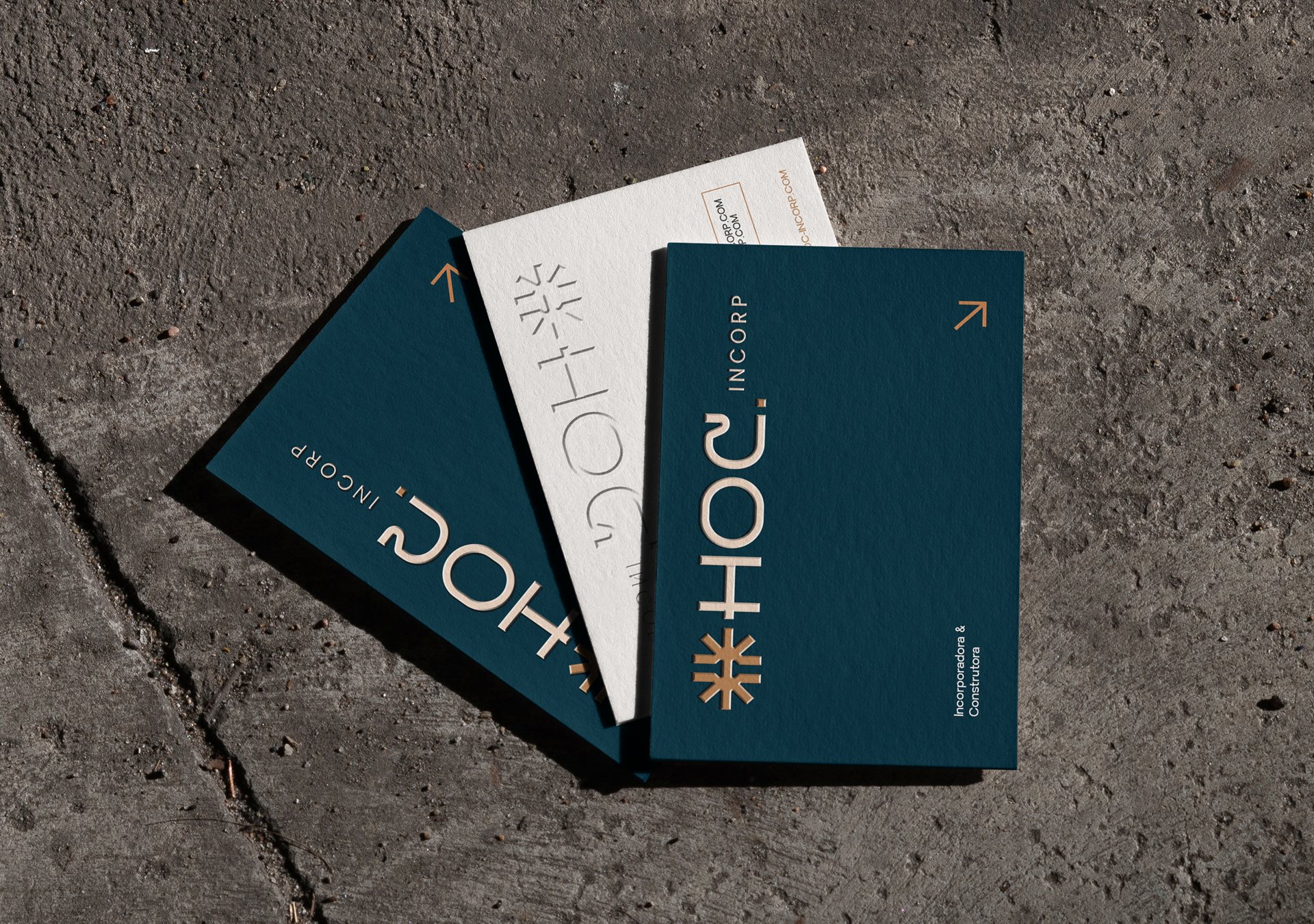
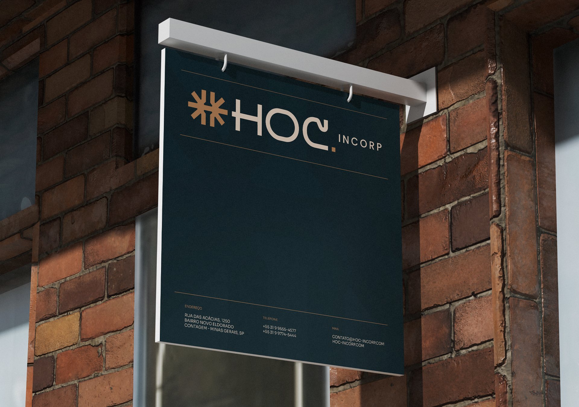
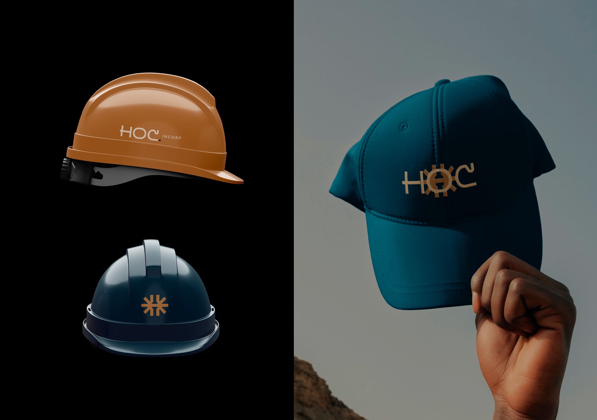
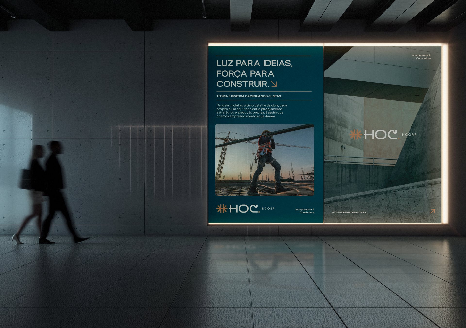
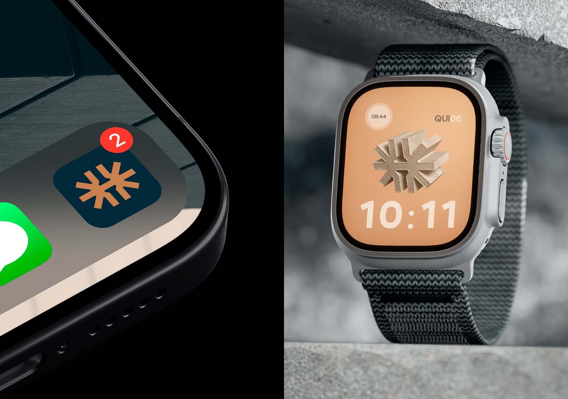
A real estate developer that combines strategic thinking with practical execution. The symbol merges the sun, the letter H and the nail.
GrFeatured on Behance · Branding
Year2025
IndustryReal Estate Developer & Builder
ServiceBranding and Art Direction
LocationMinas Gerais - Brazil
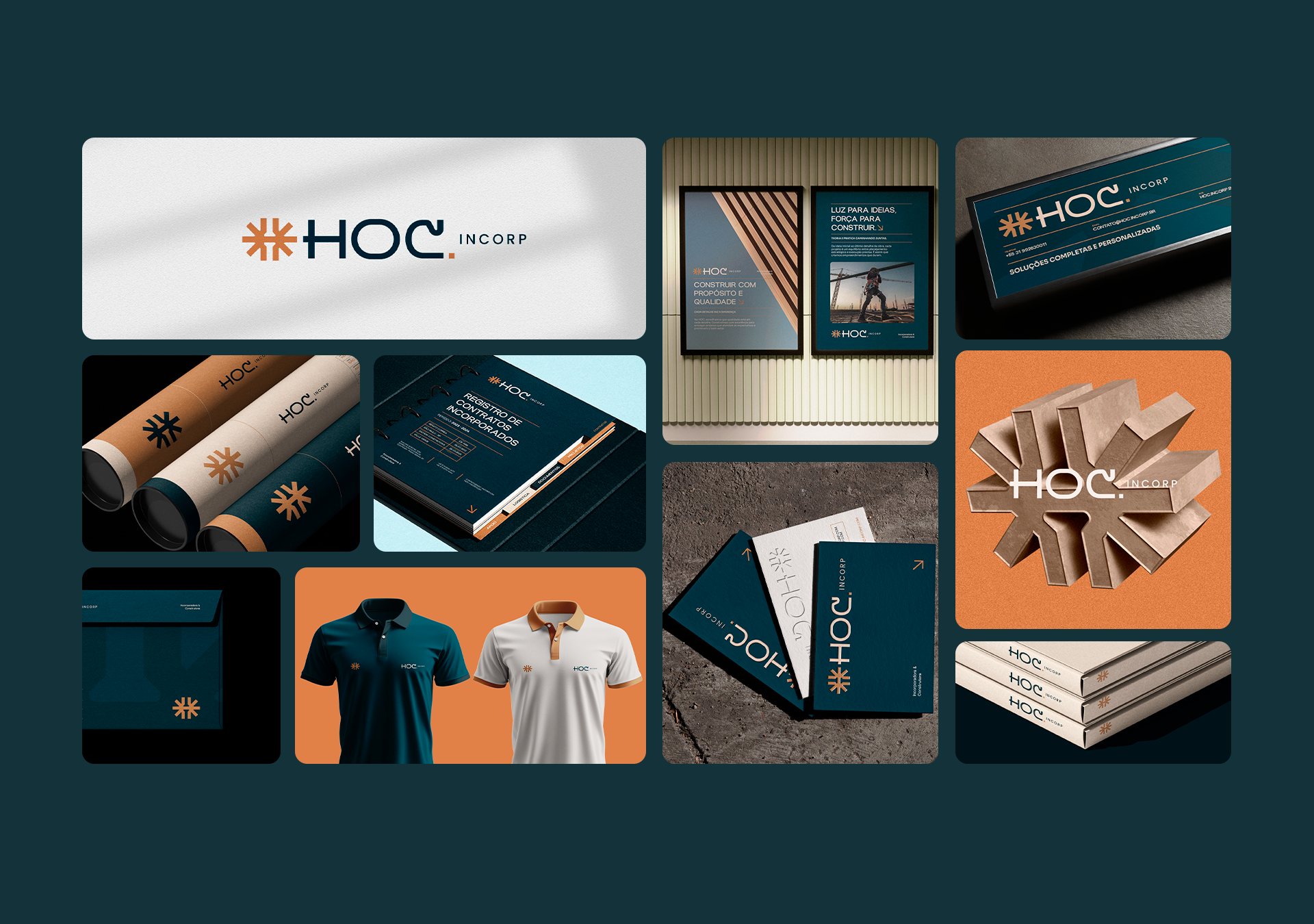
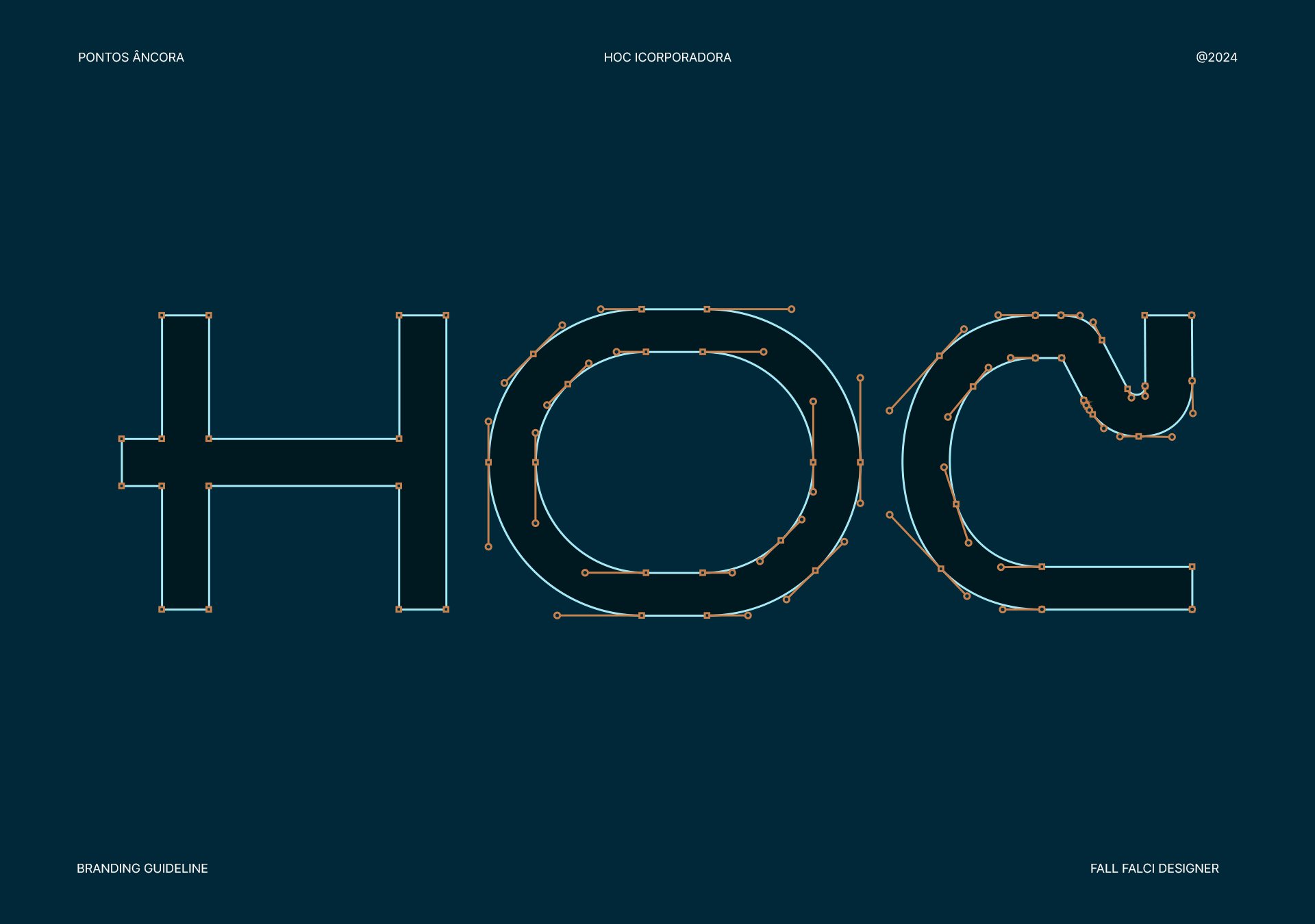
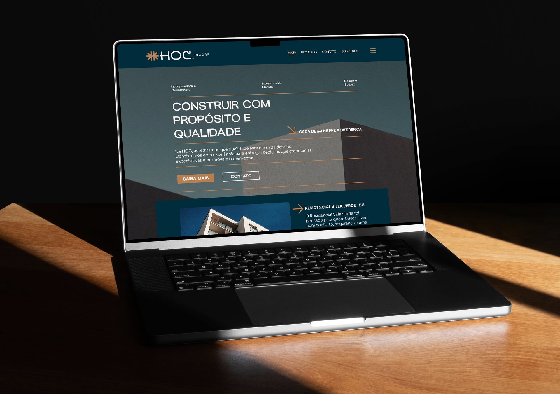
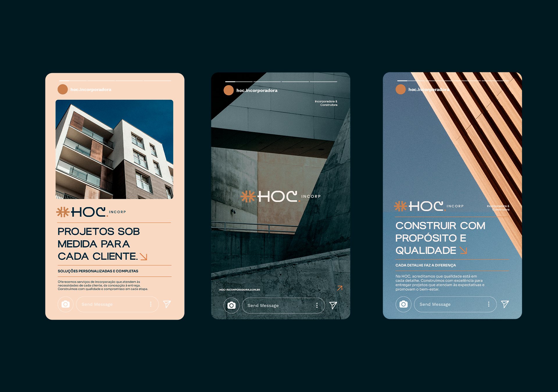
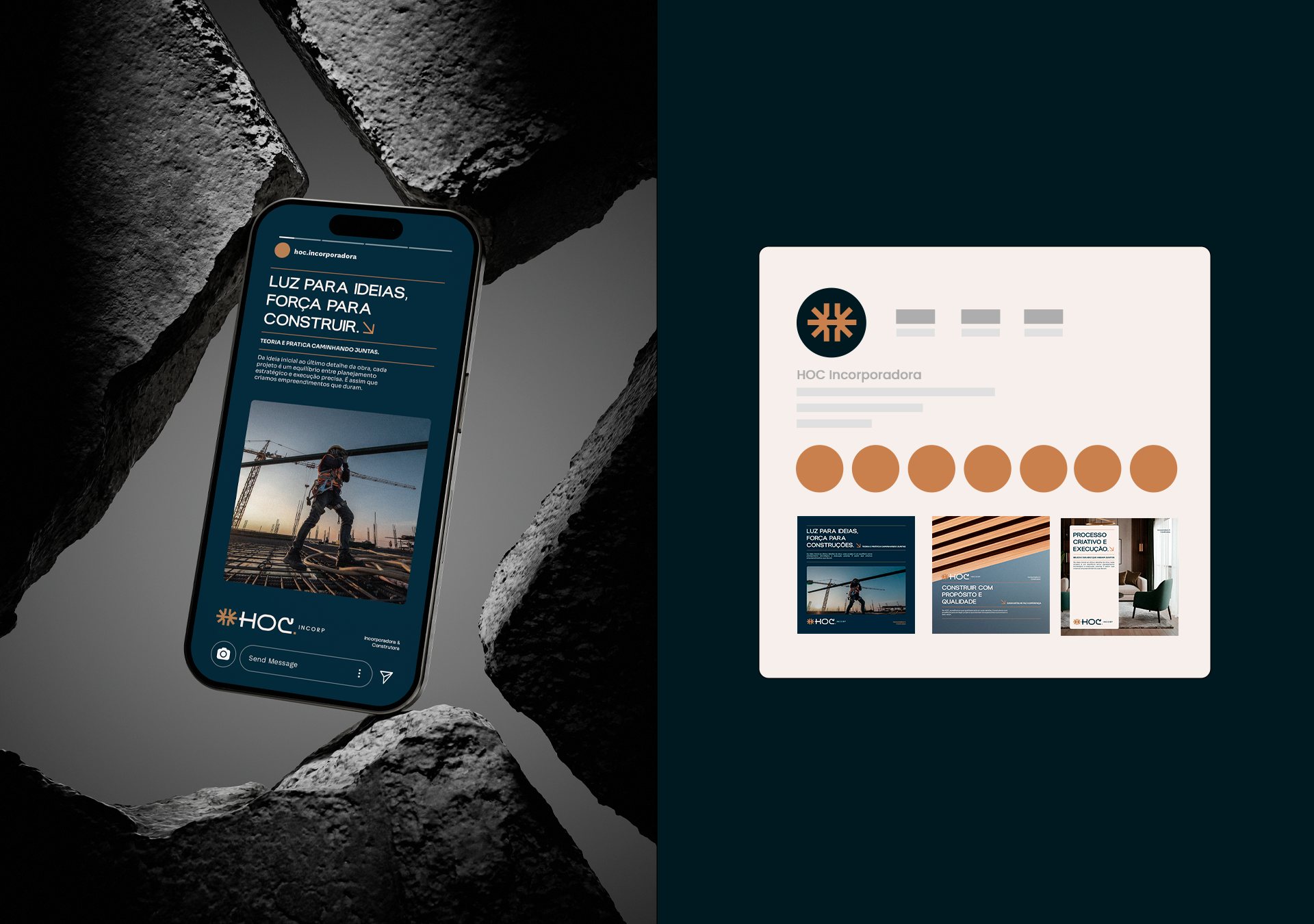
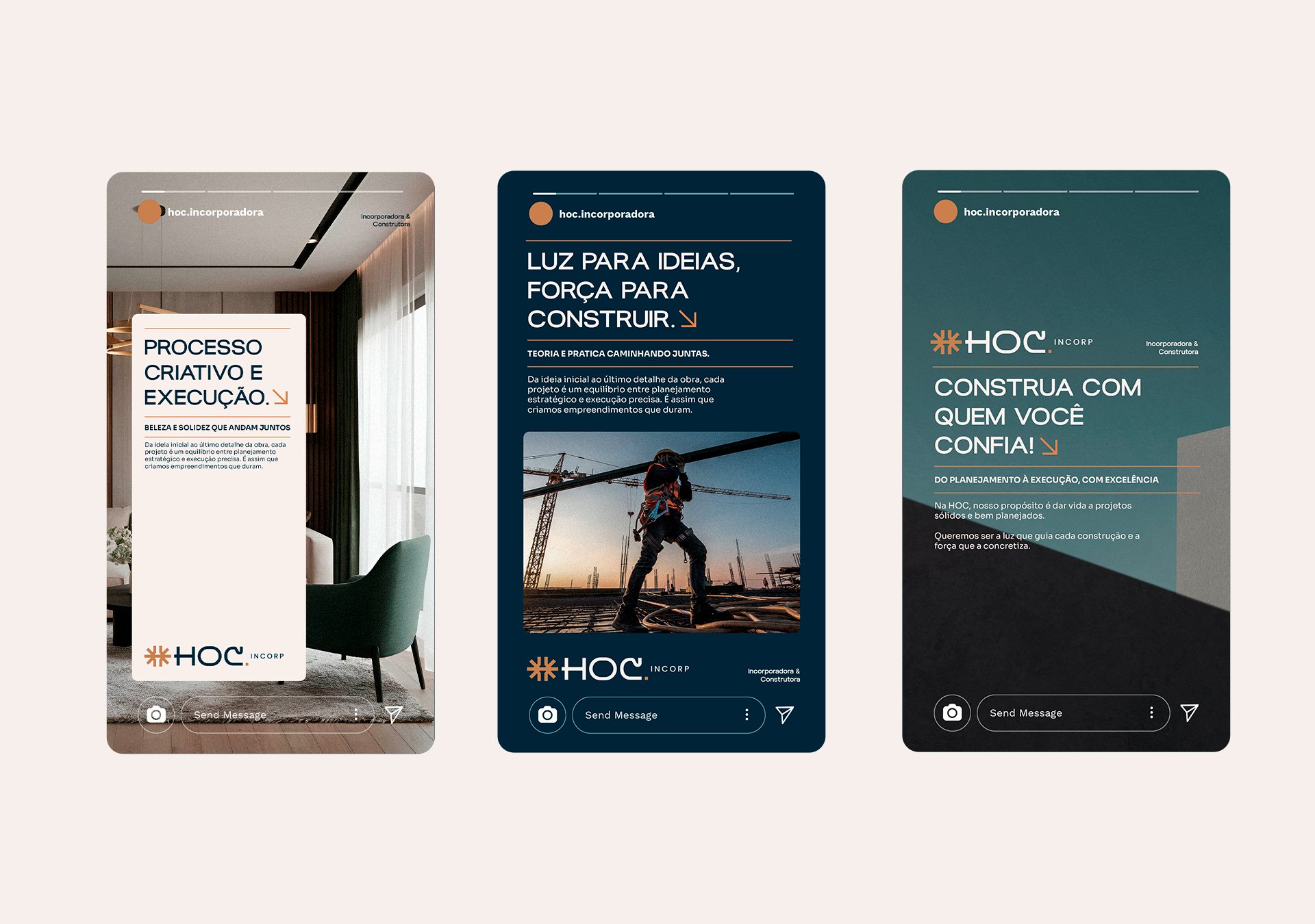
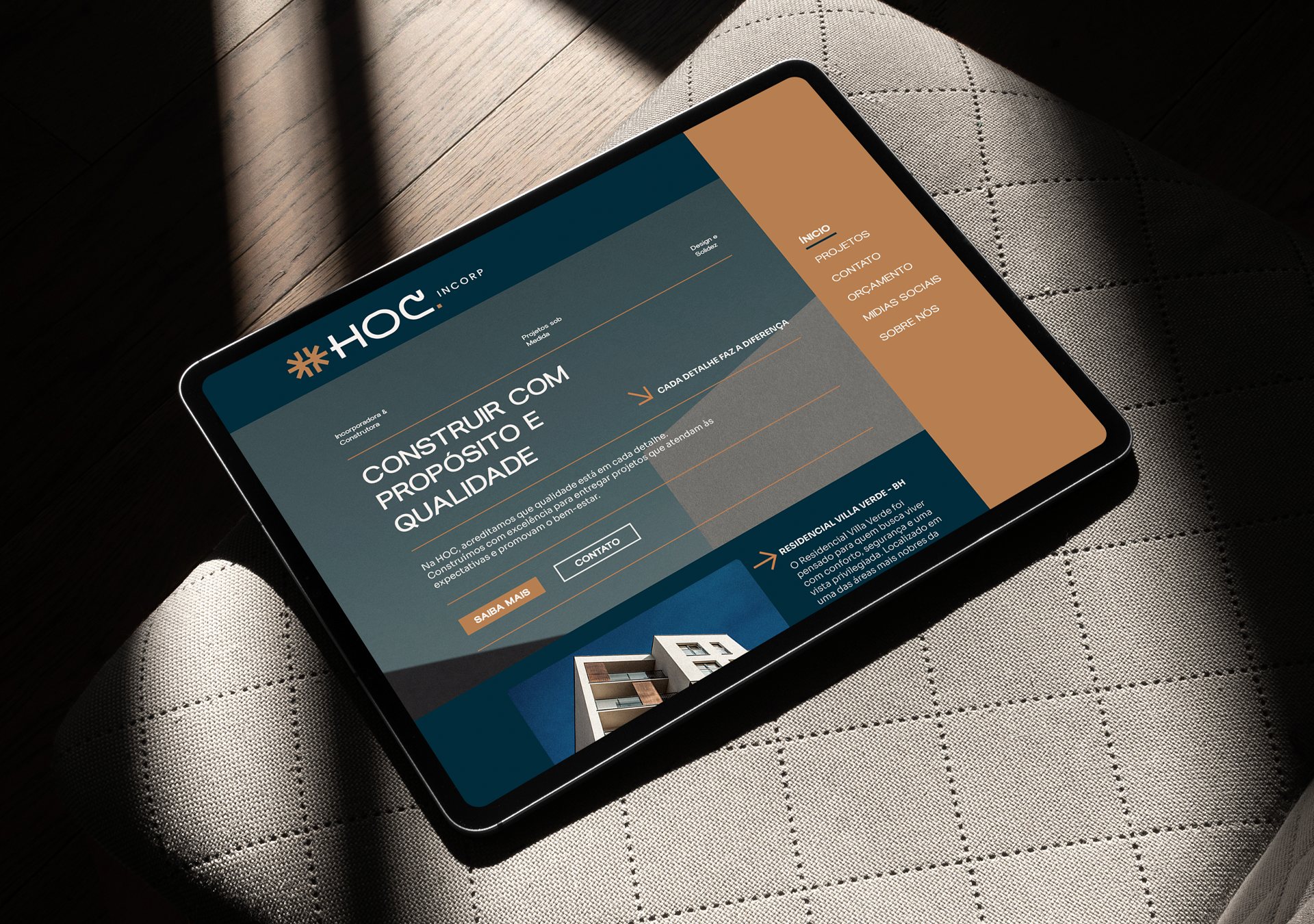
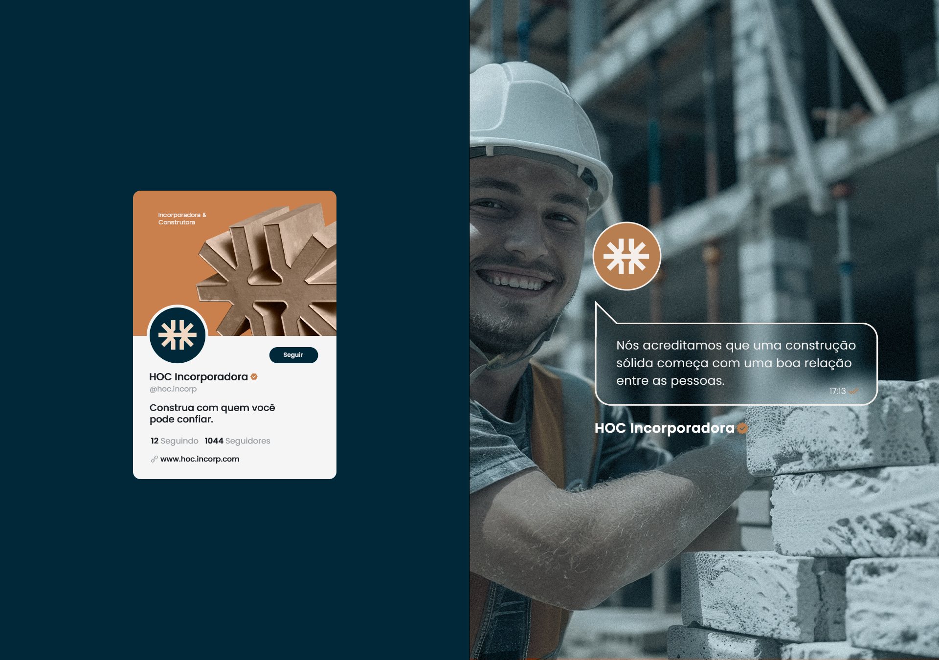
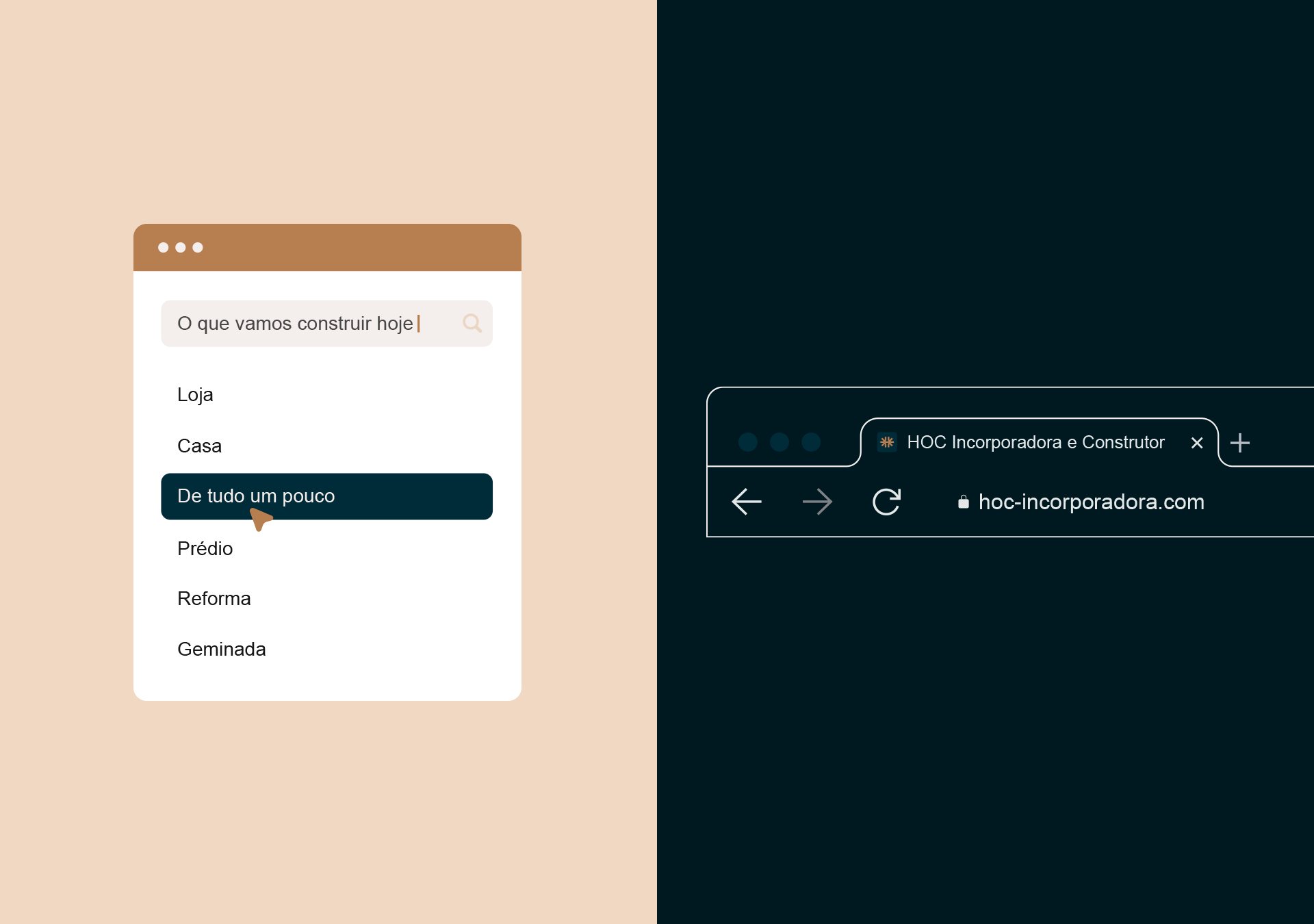
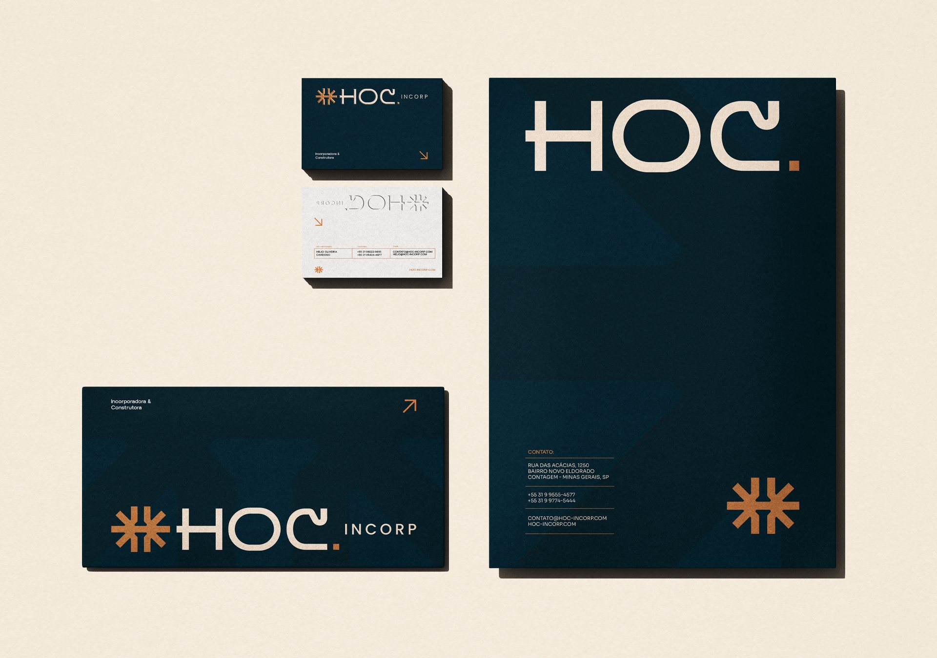
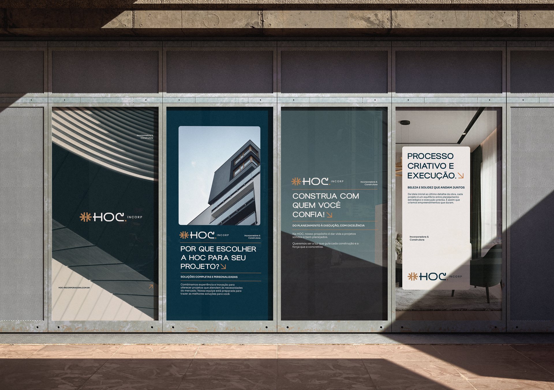
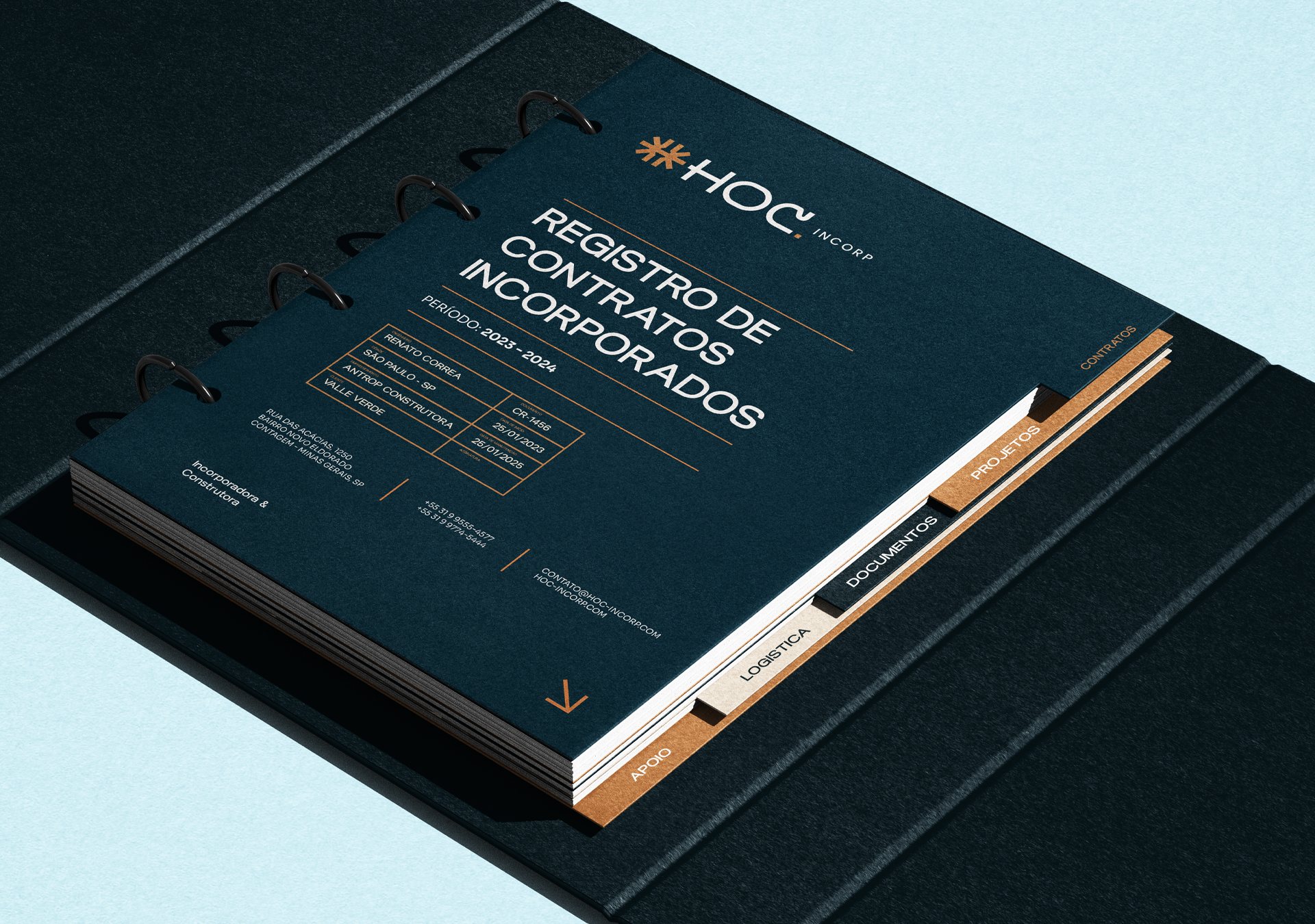
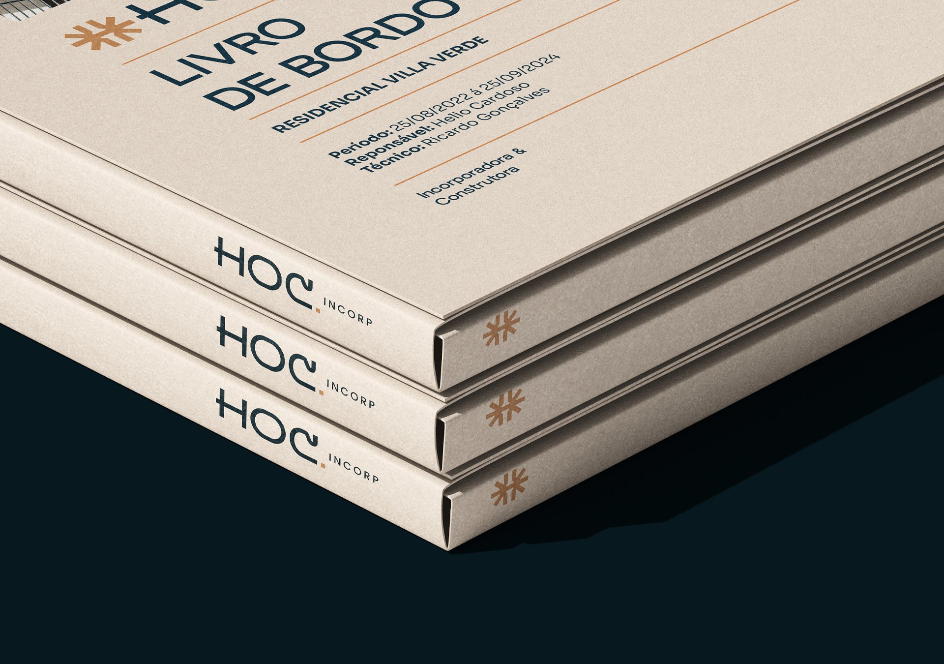
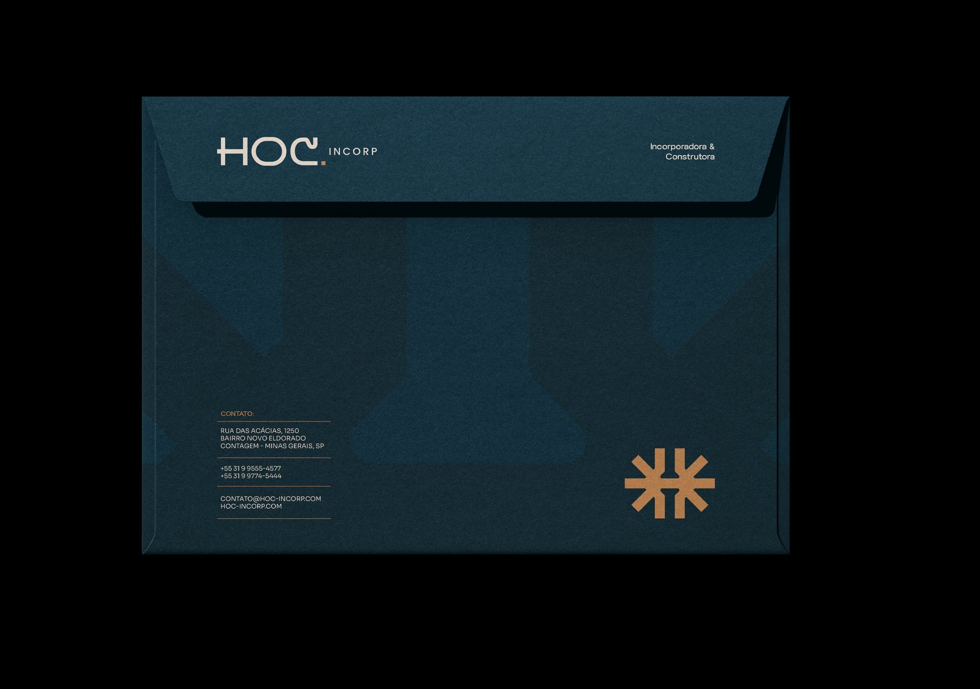
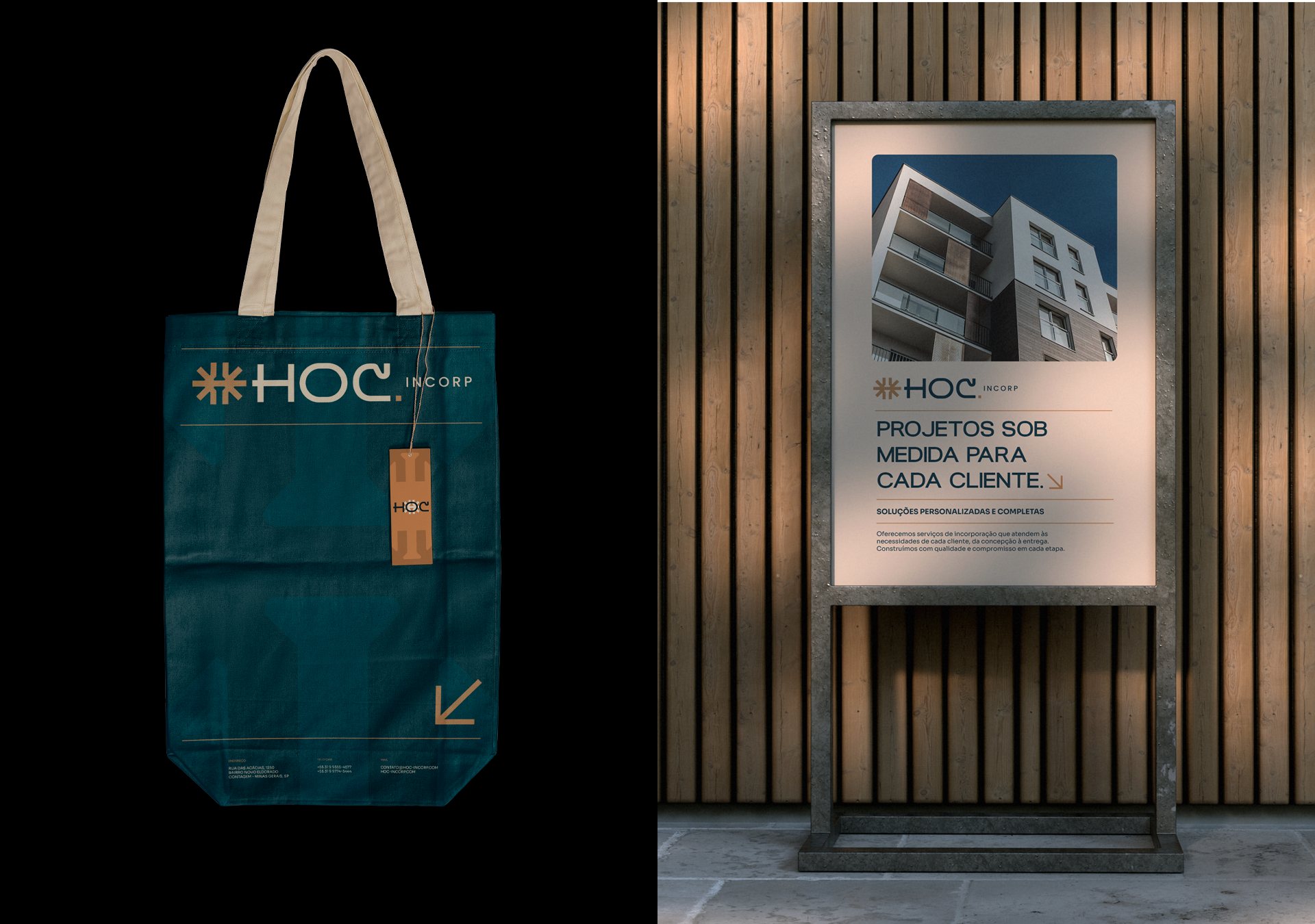
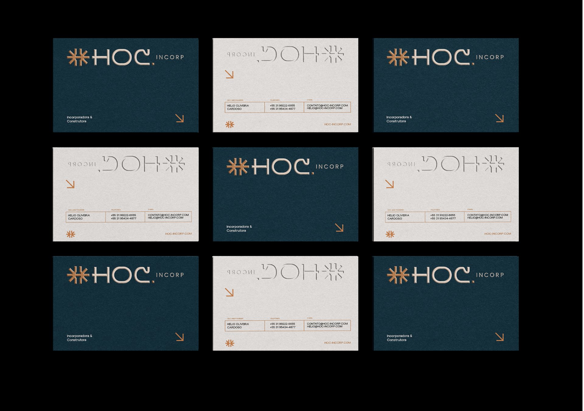
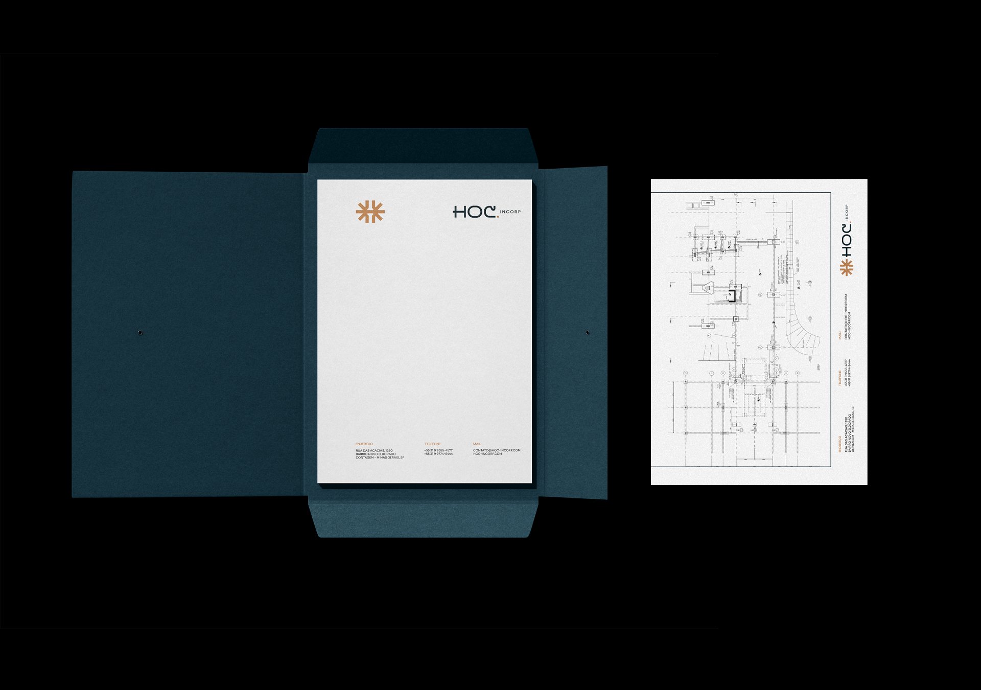
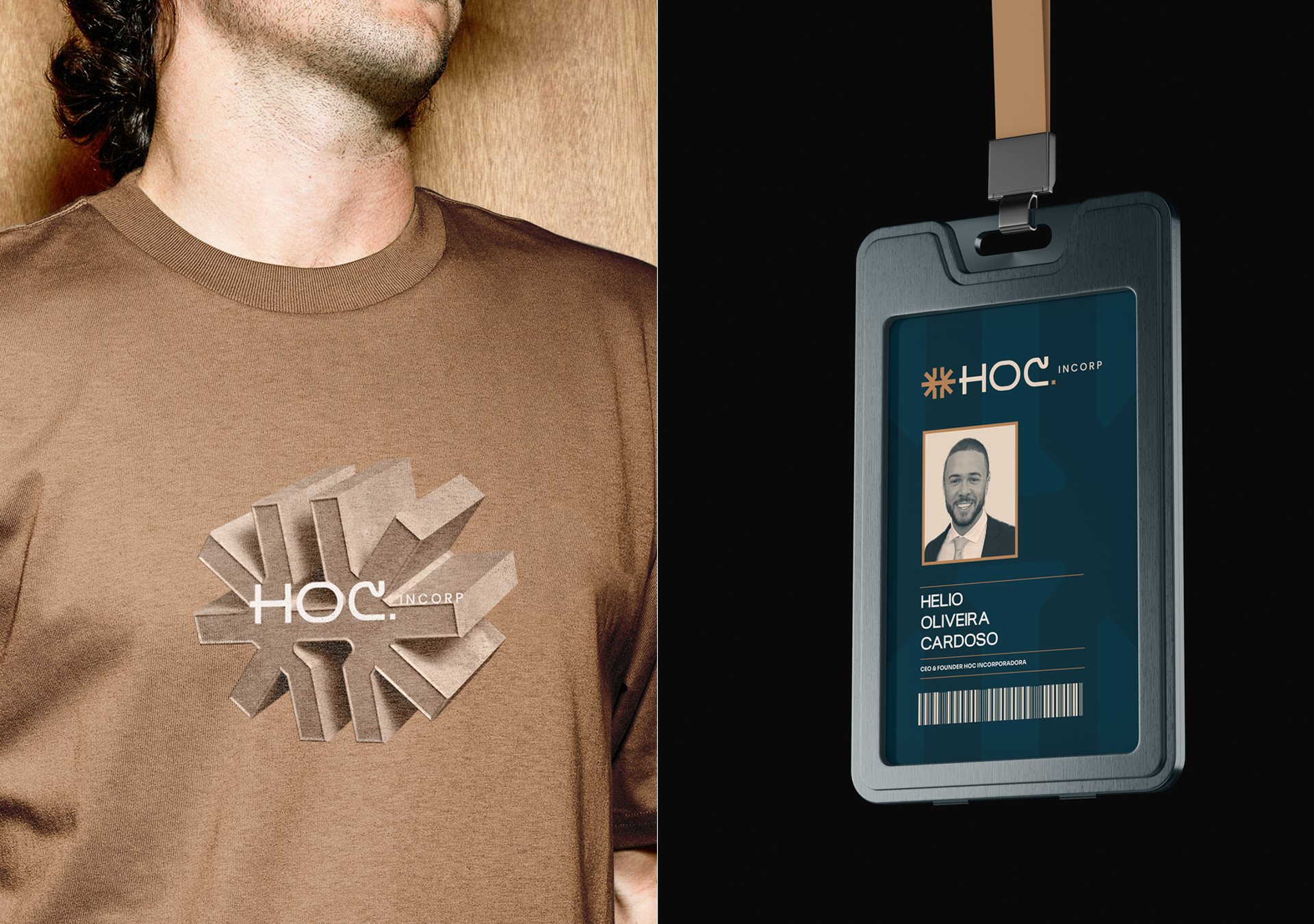
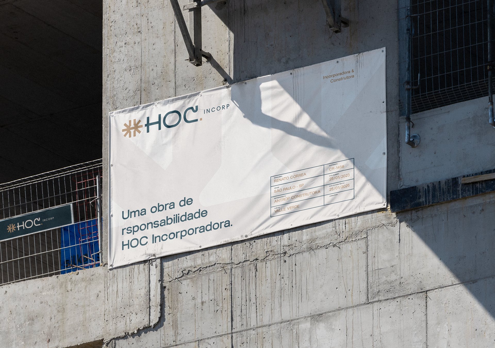
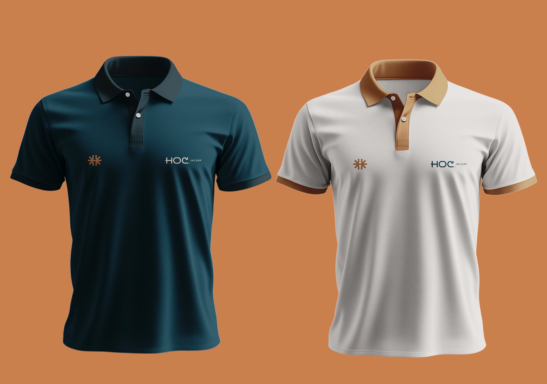
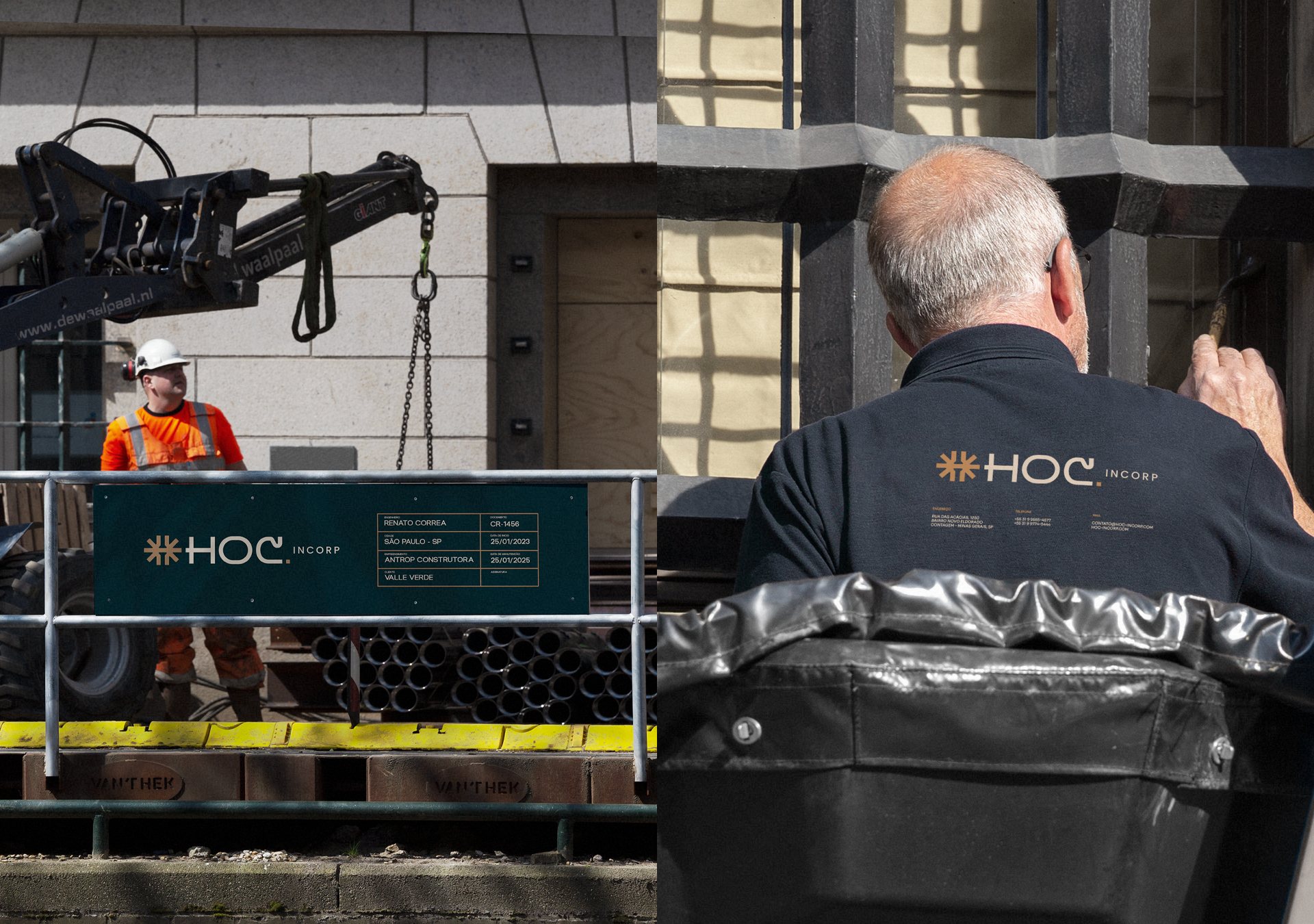
Visual identity developed for HOC Incorporadora, with a symbol that merges three central elements: the sun, the letter H and the nail.
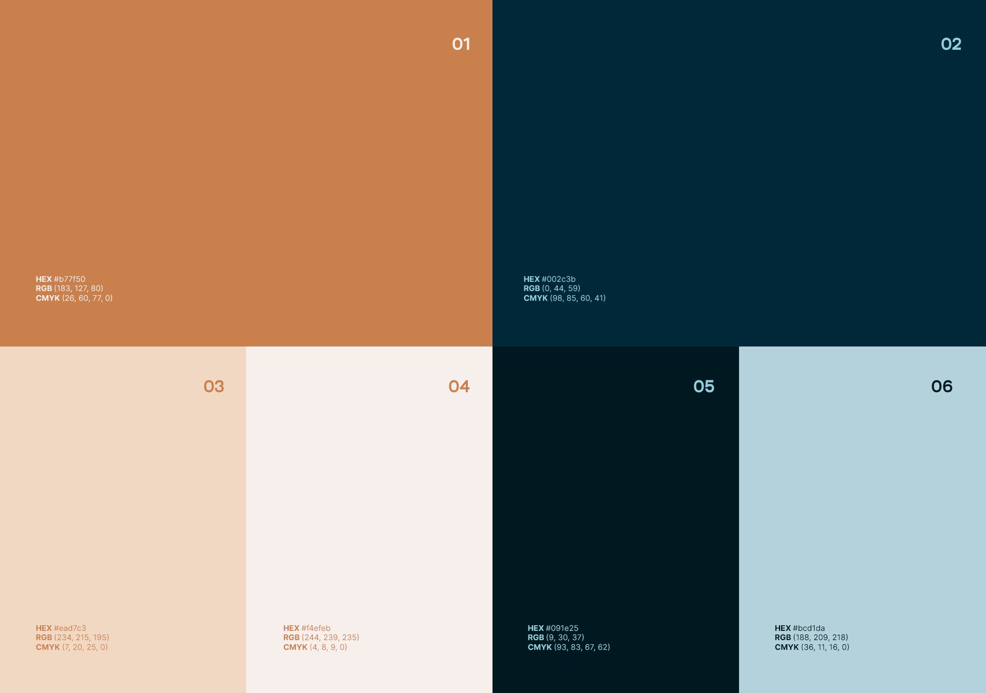
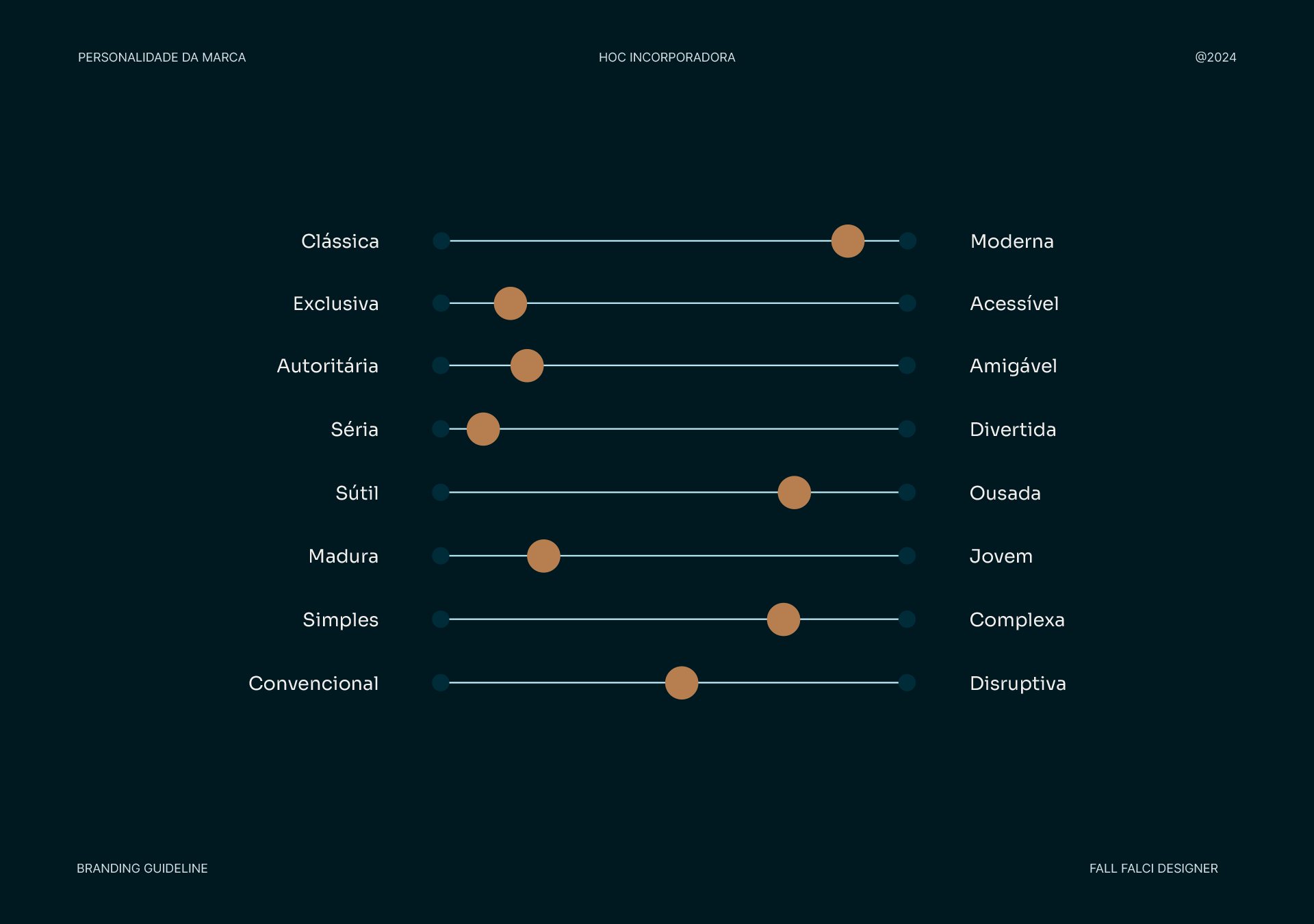
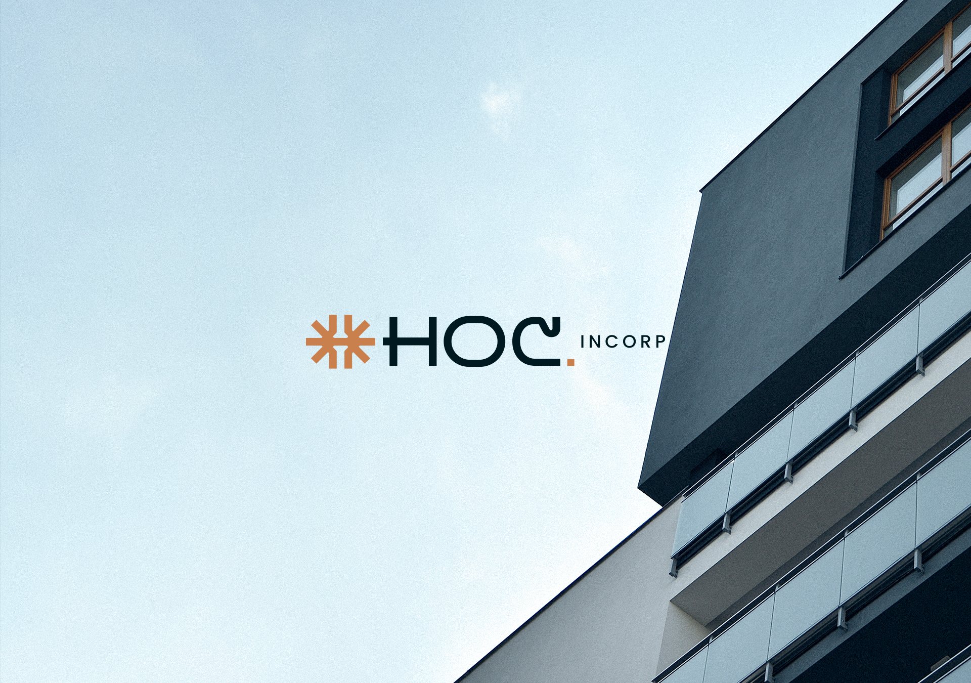
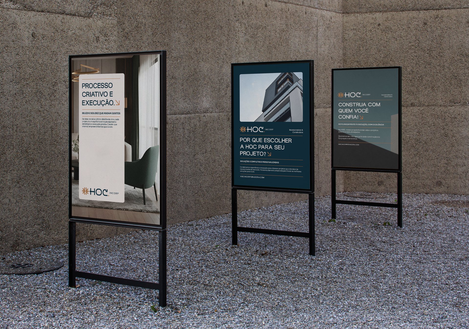
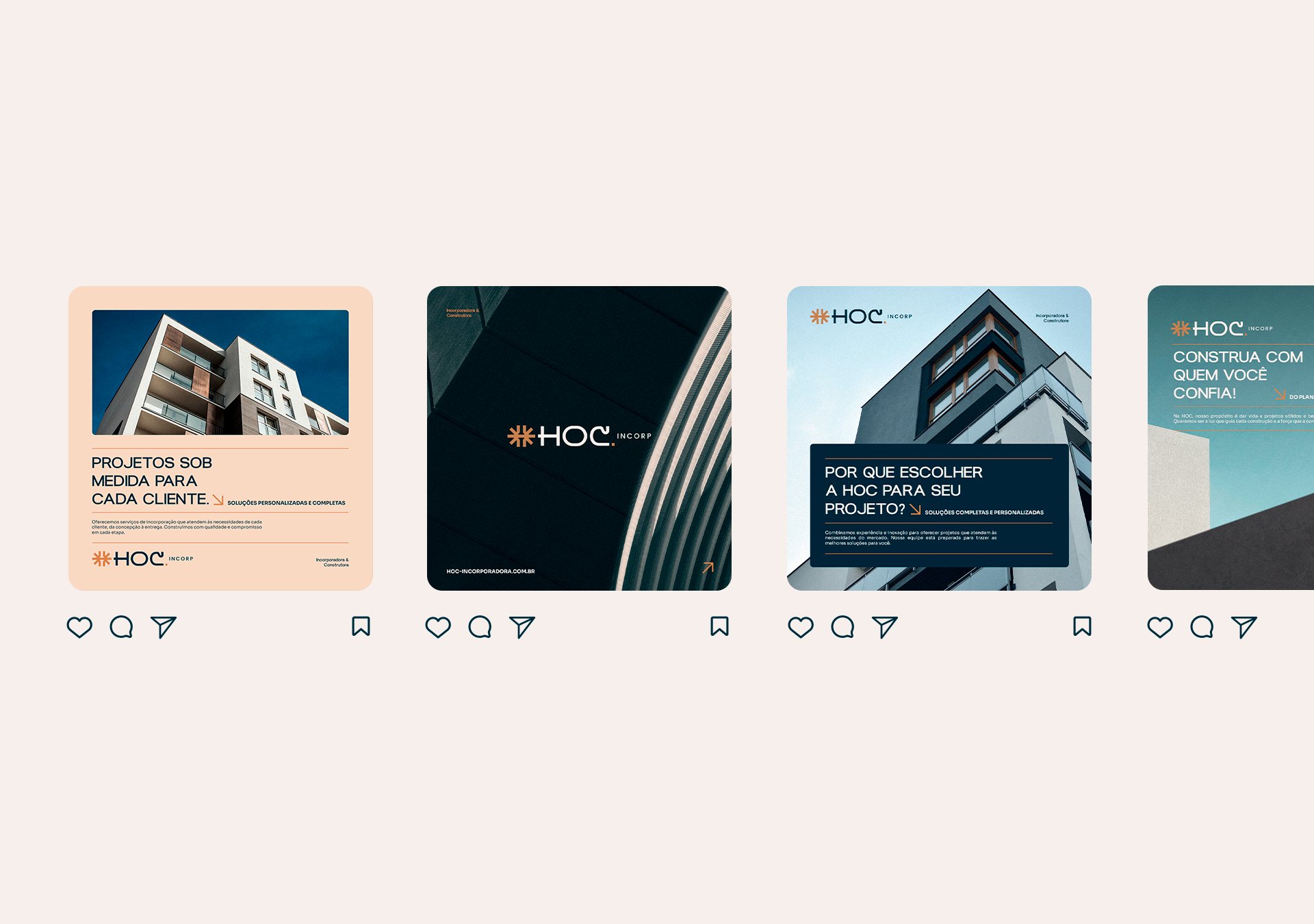
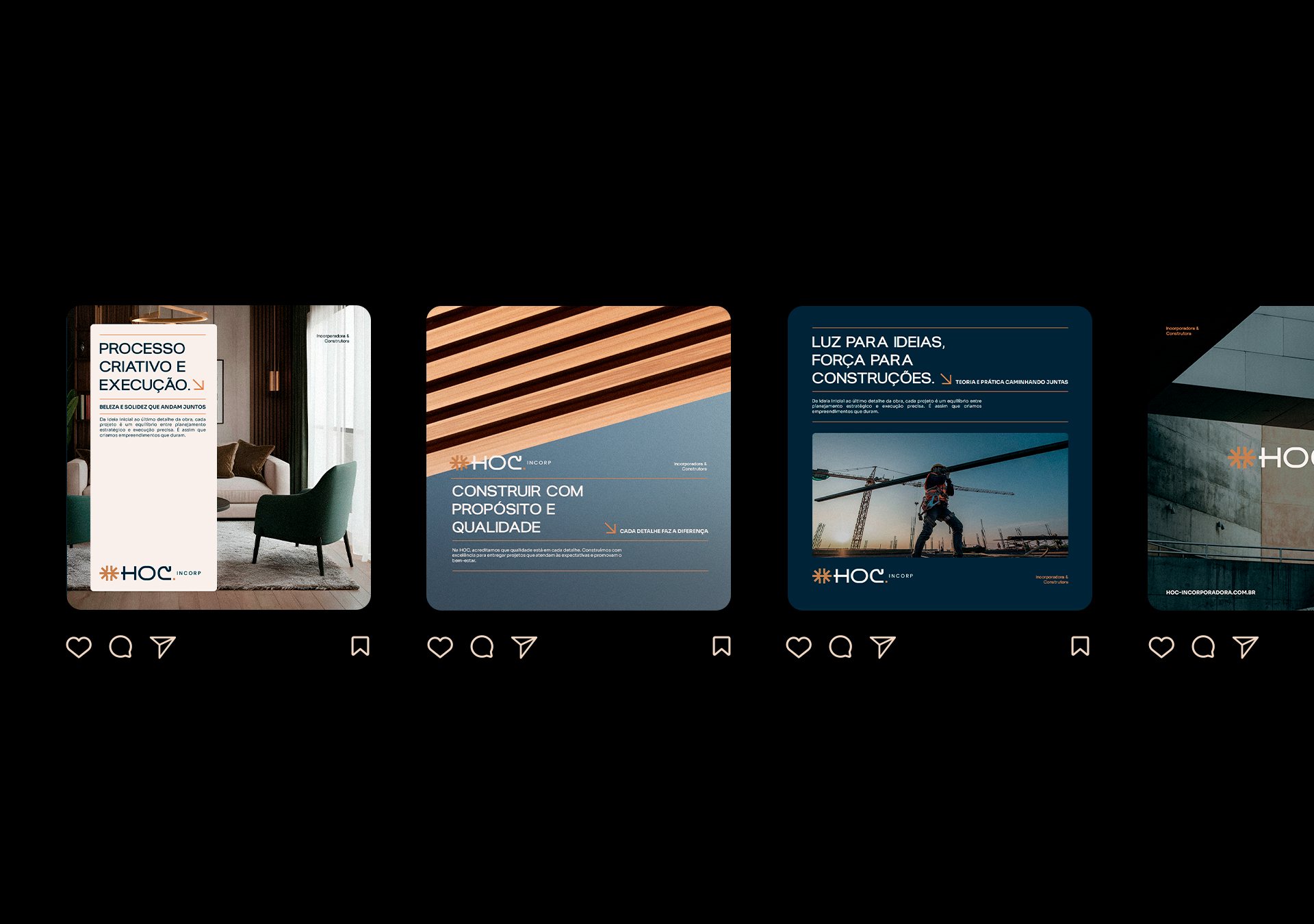
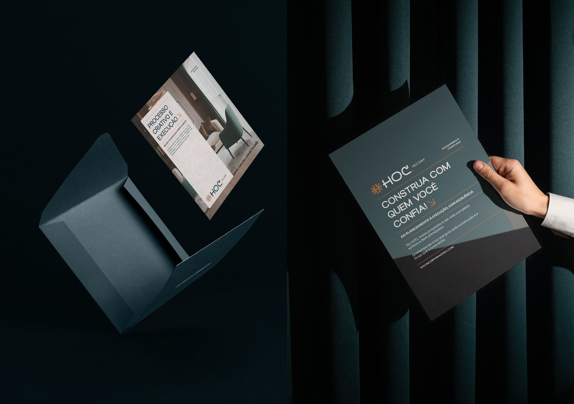
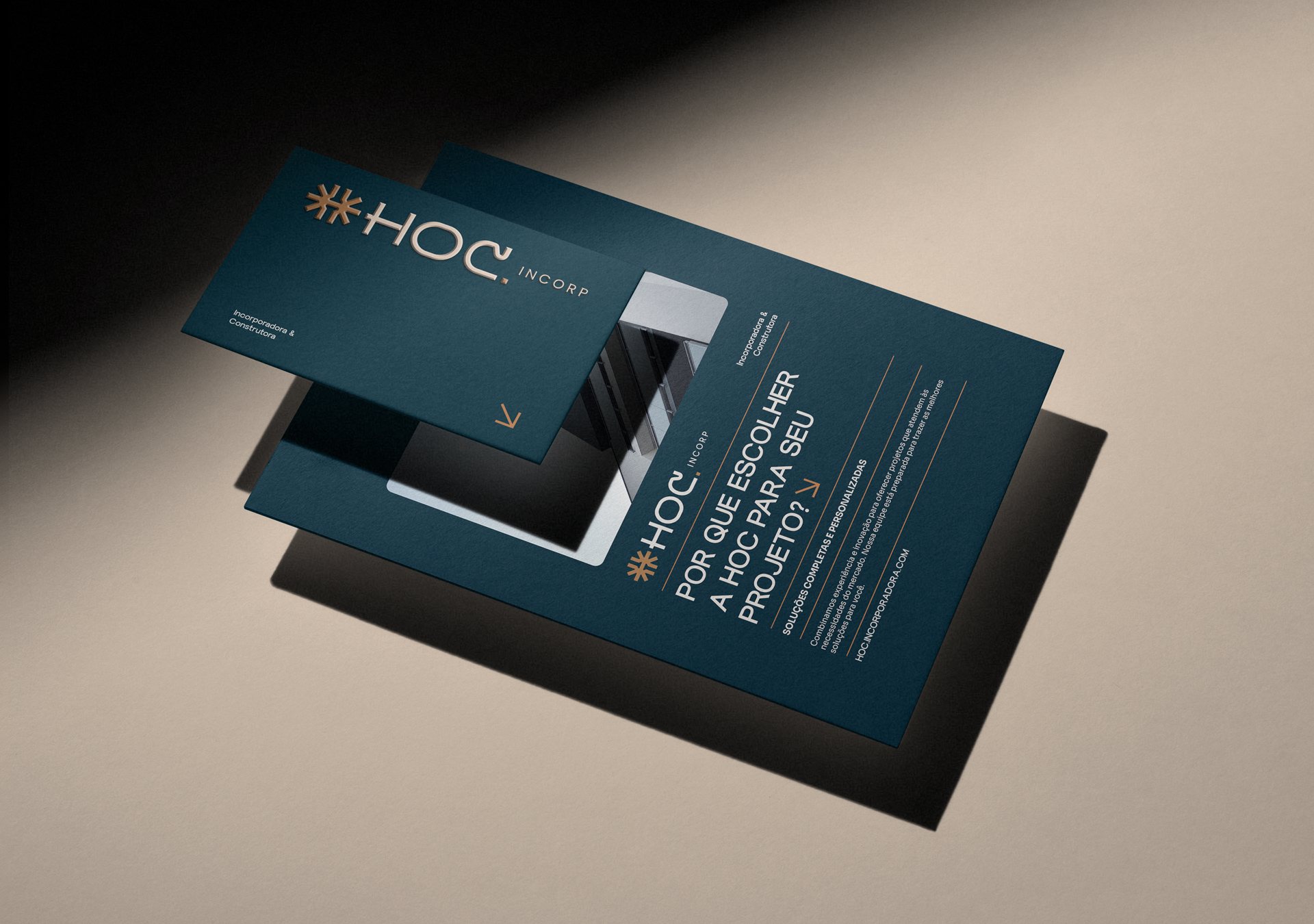
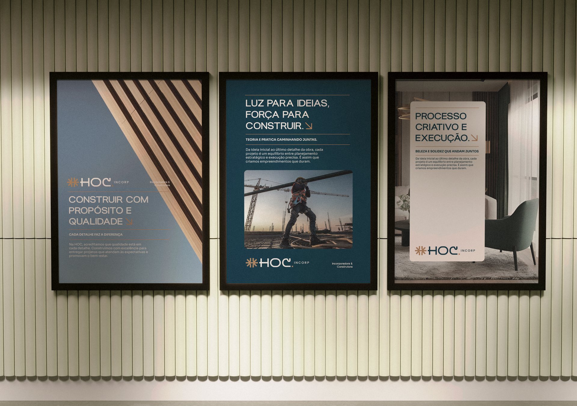
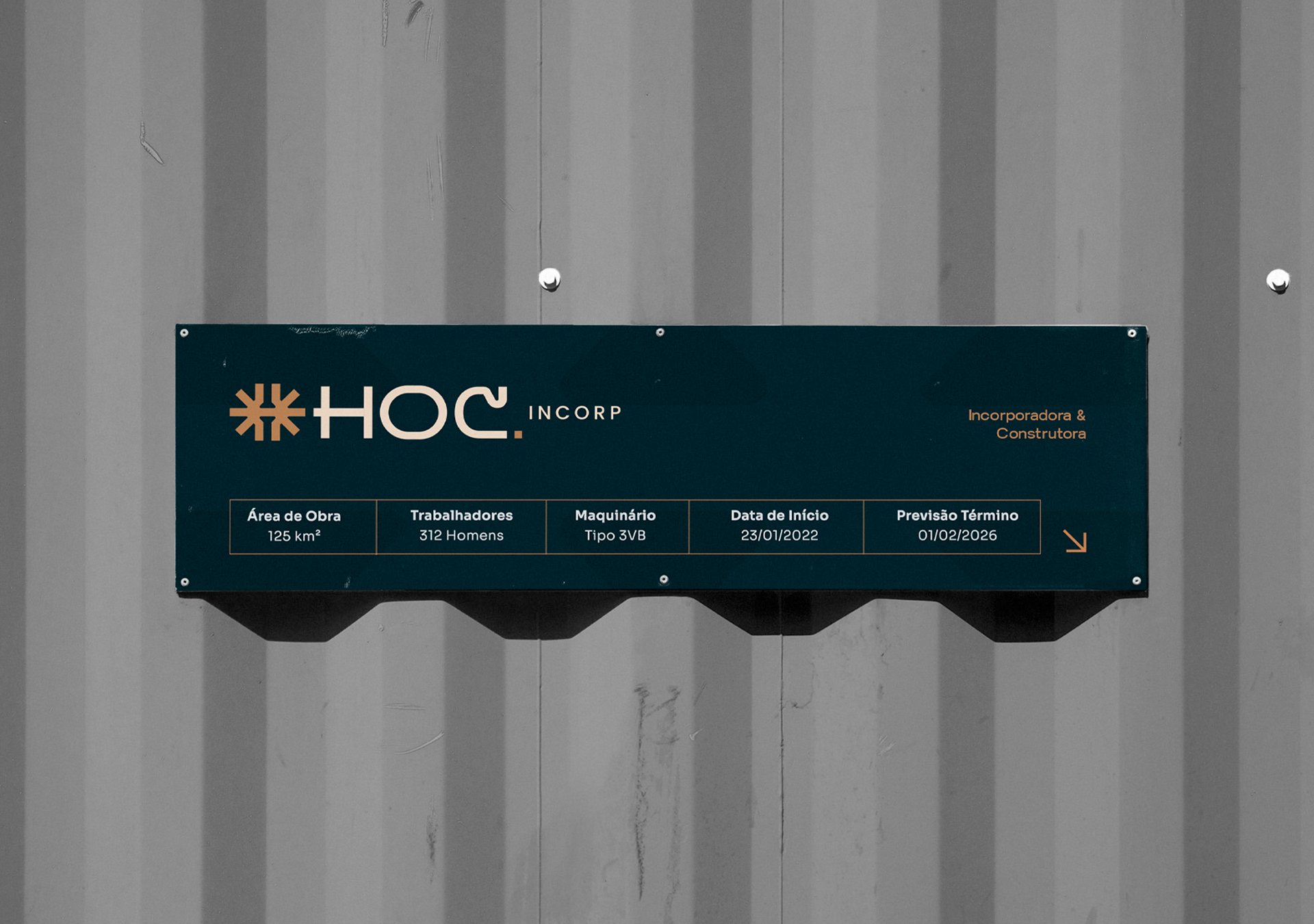
This combination expresses the balance between strategic thinking and practical execution. Precise geometric forms, sophisticated typography and a palette of earthy orange with deep green make up a visual system that conveys solidity, human warmth and trust.
// Gallery

// More projects
Keep exploring
StFeatured on Behance · Adobe StockGrFeatured on Behance · Branding
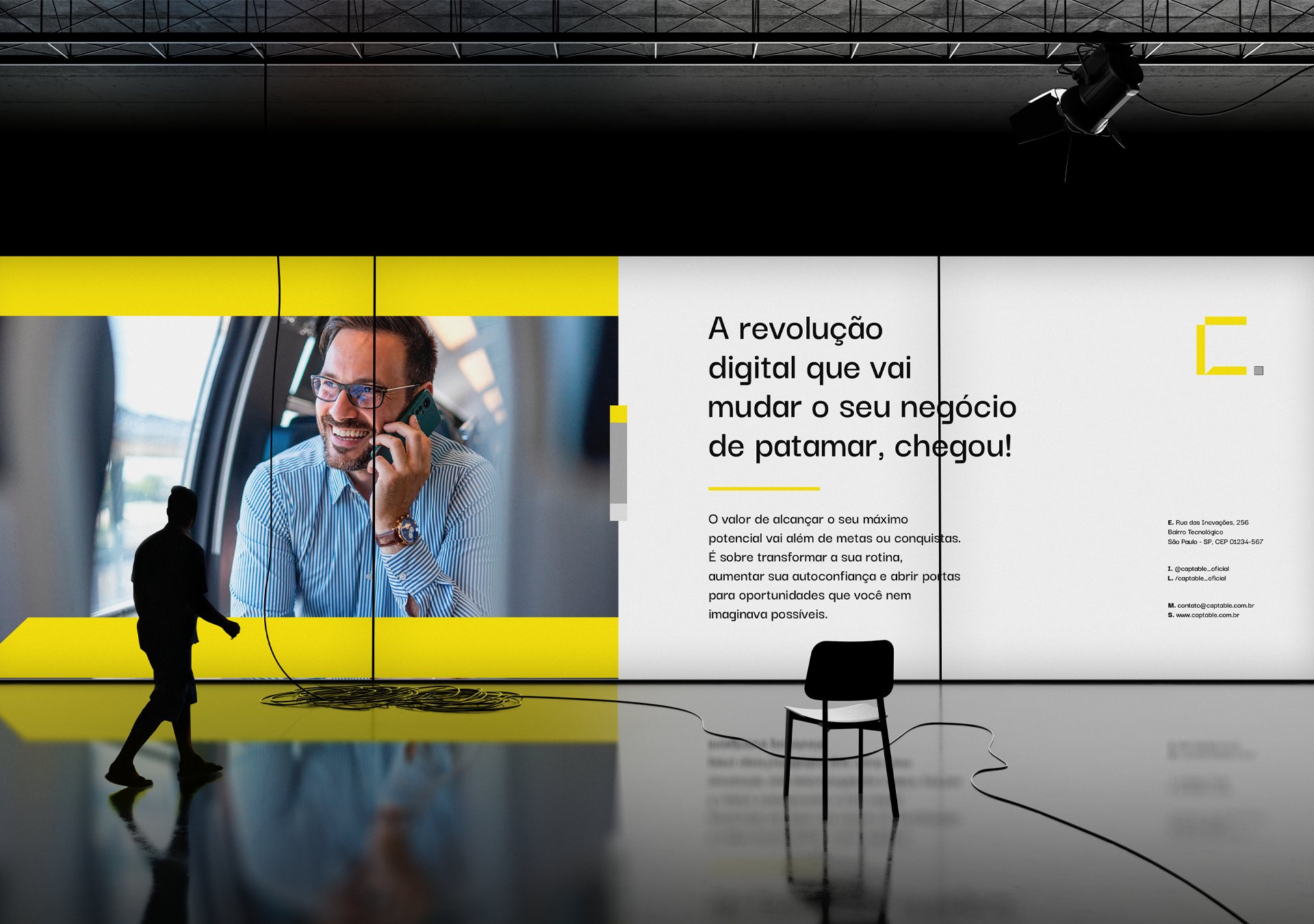
CaptableTechnology · 2024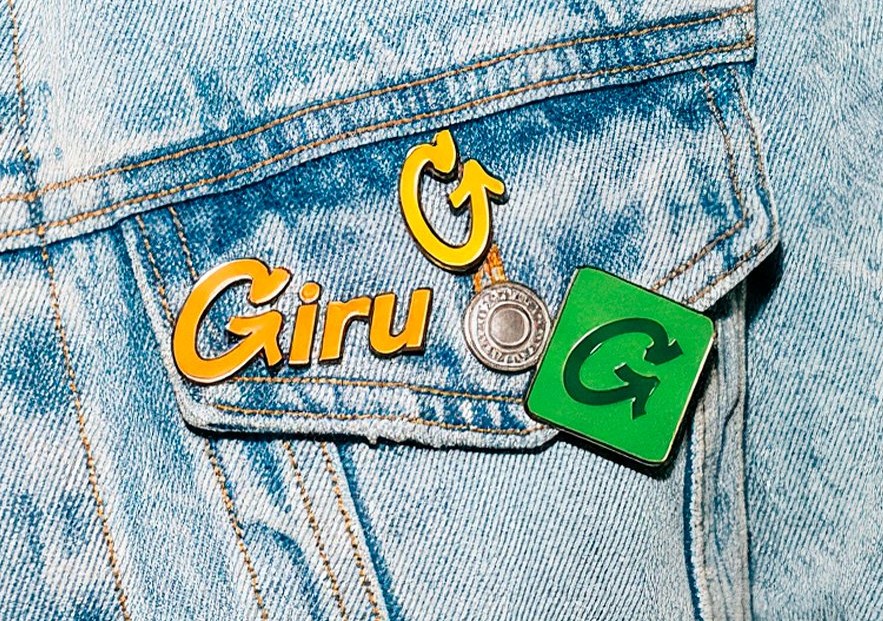 GiruInventory management SaaS · 2026
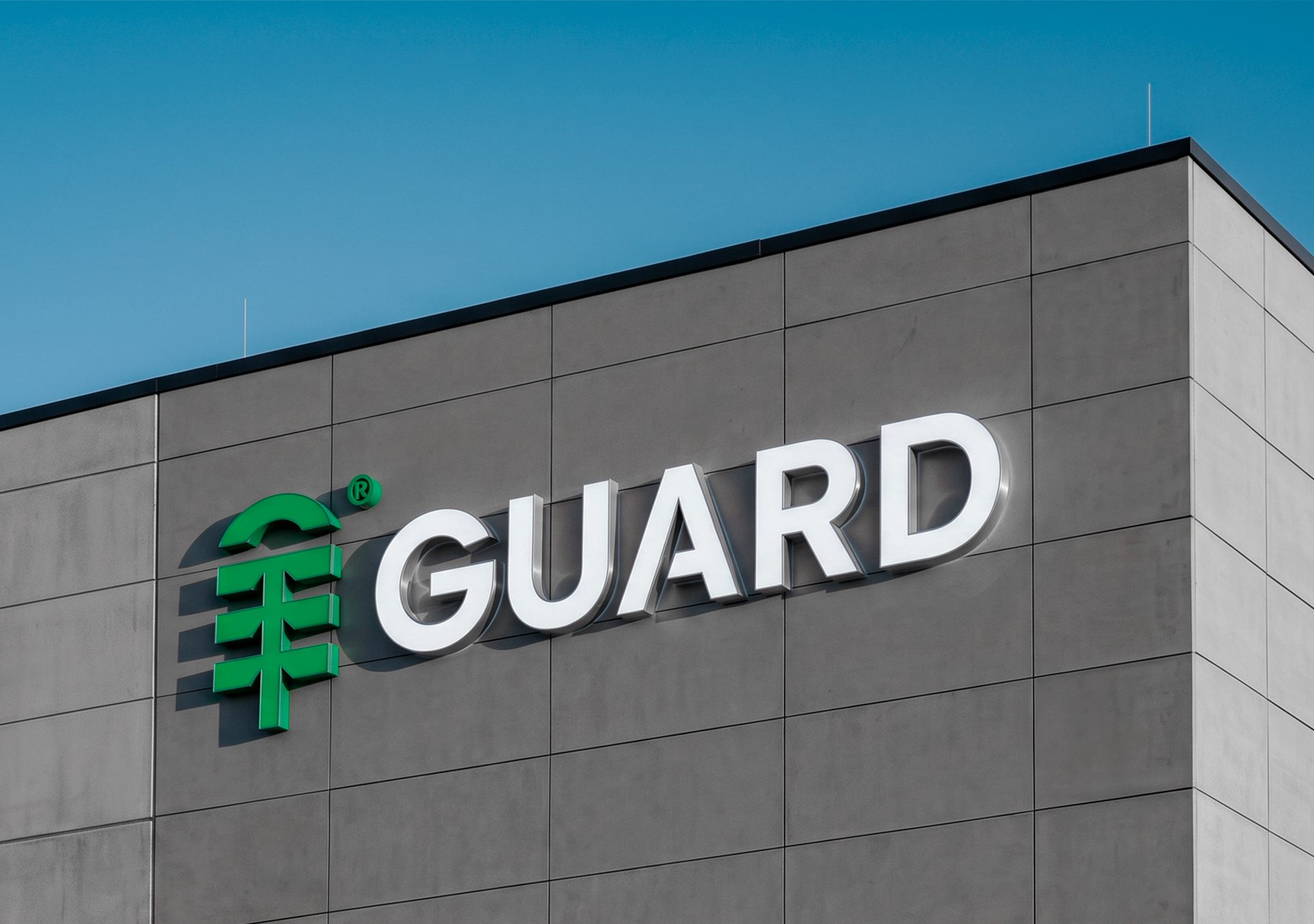 GuardGeneral Warehousing & Logistics · 2026
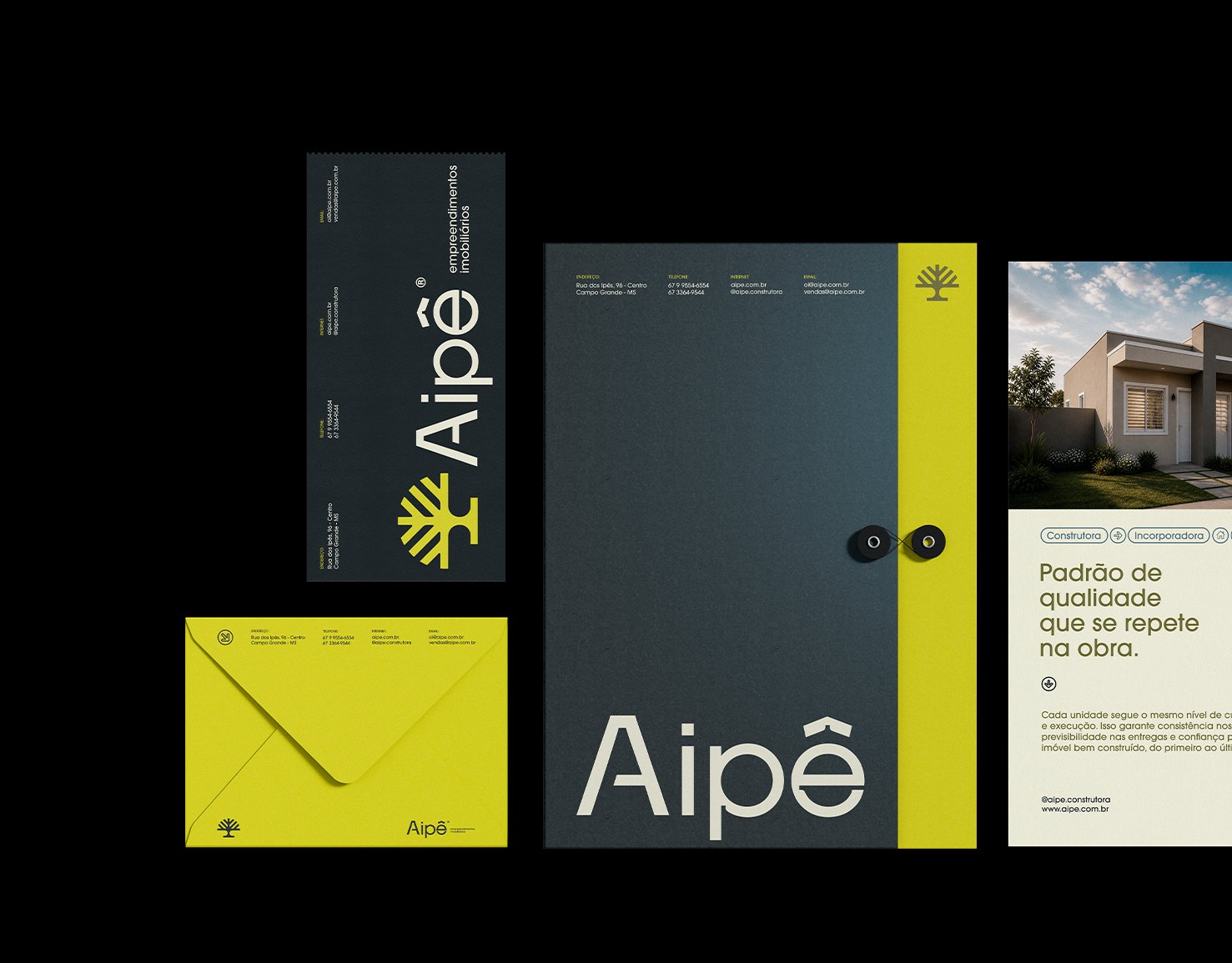 AipêReal Estate Developer & Builder · 2026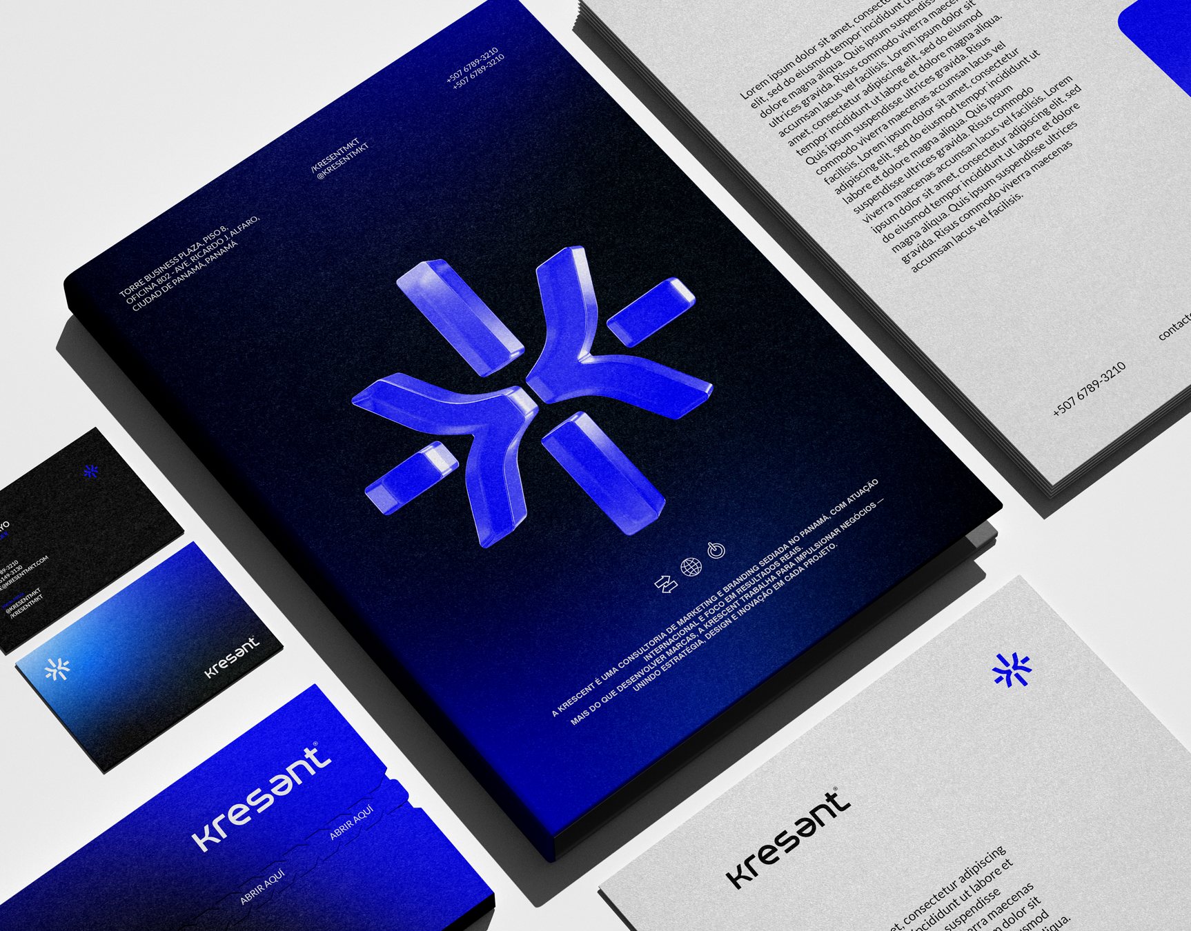
StFeatured on Behance · Adobe Stock
KresentMarketing Agency · 2025 HatamexMarketing Agency · 2025
GrFeatured on Behance · Branding
MandabenBenefits Club · 2025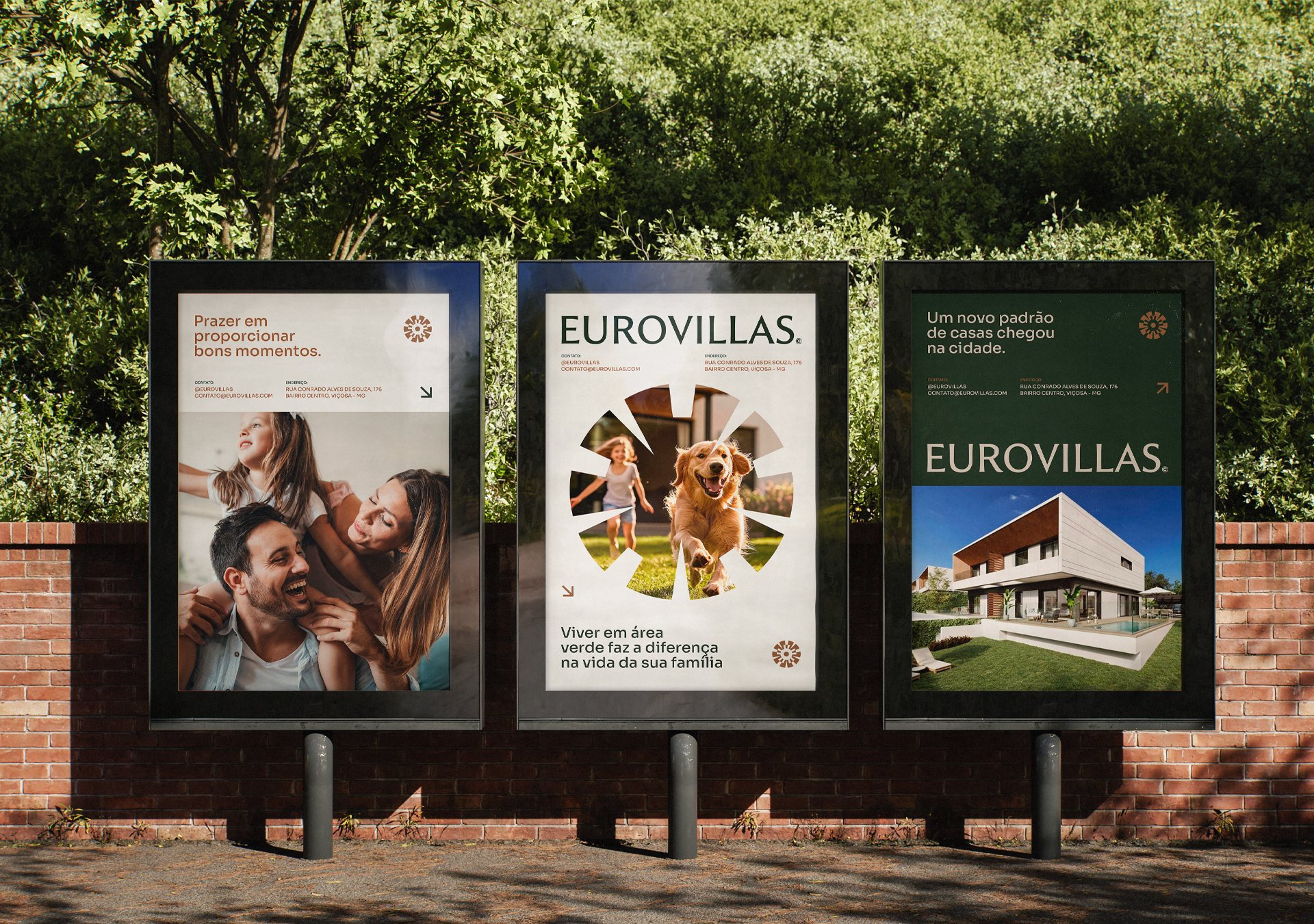
StFeatured on Behance · Adobe StockGrFeatured on Behance · Branding
EurovillasReal Estate Developer & Builder · 2025
StFeatured on Behance · Adobe StockGrFeatured on Behance · Branding
InoovvTechnology · 2024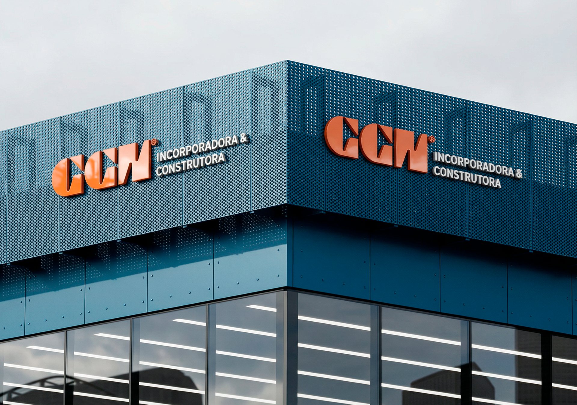
StFeatured on Behance · Adobe StockGrFeatured on Behance · Branding
GGNReal Estate Developer & Builder · 2026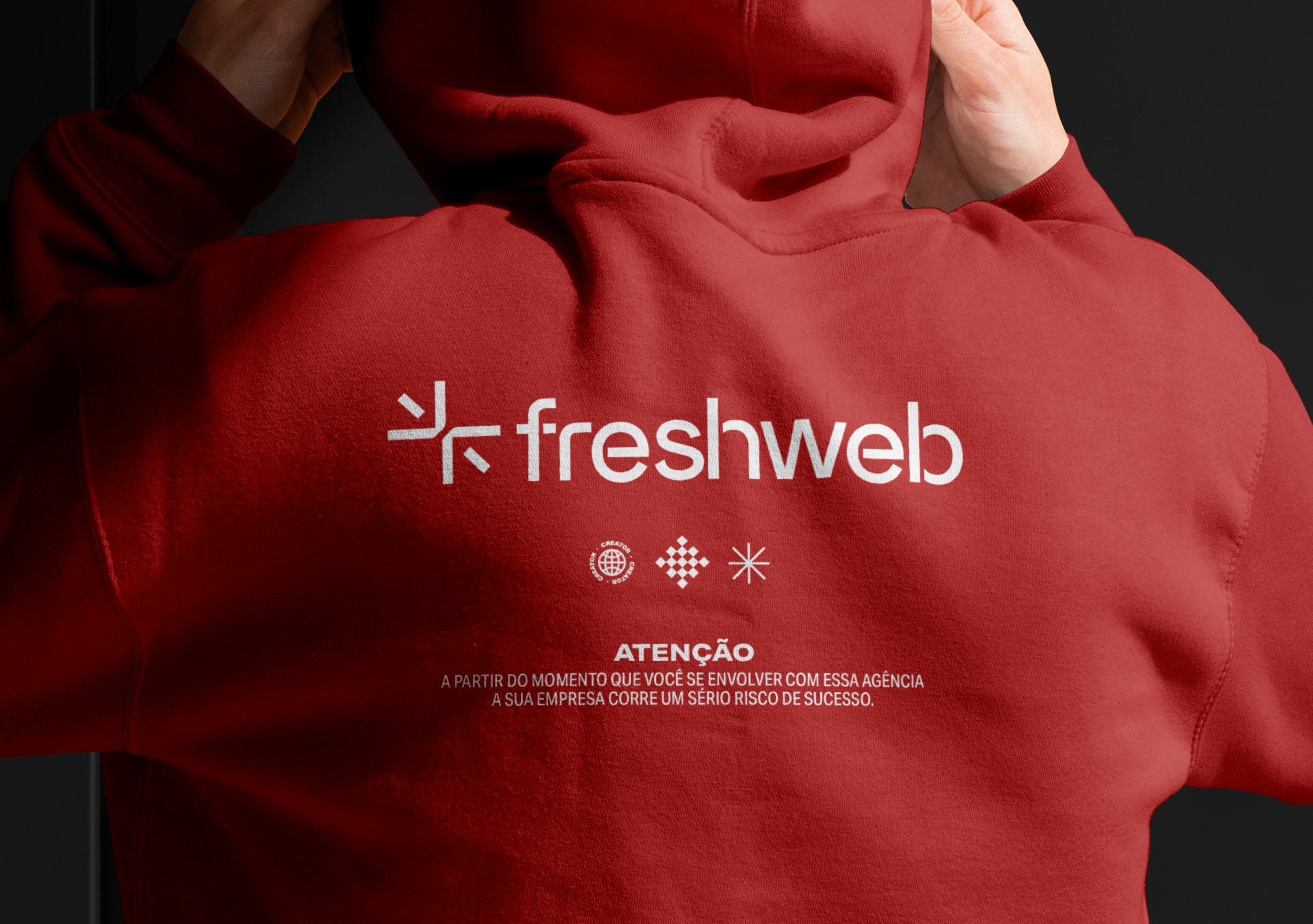 FreshwebMarketing Agency · 2025
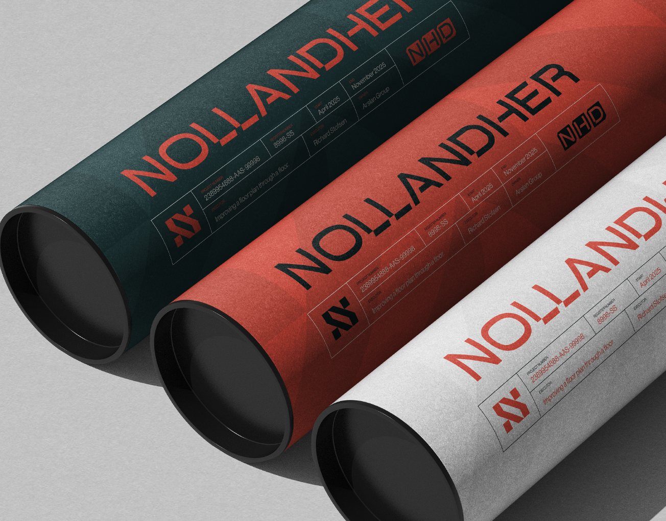 NollandherBuilder & Real Estate Developer · 2025