Aipê
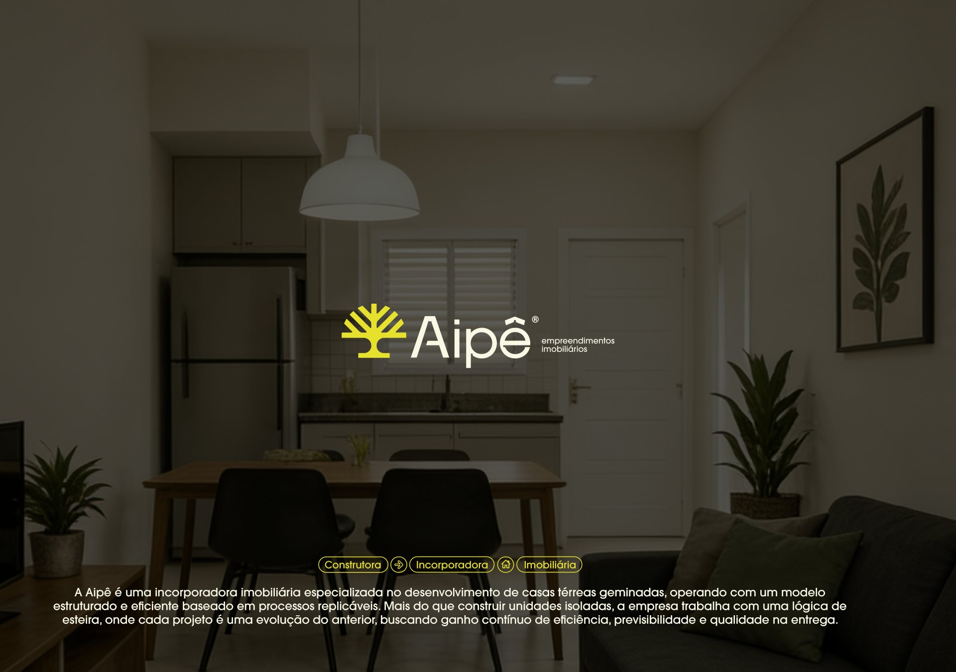
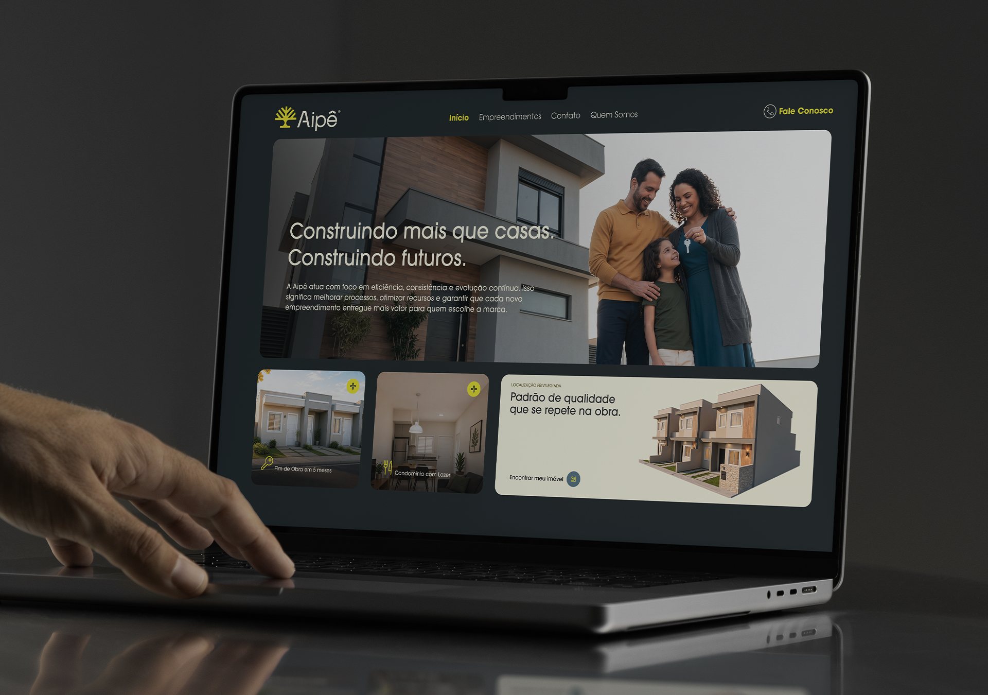
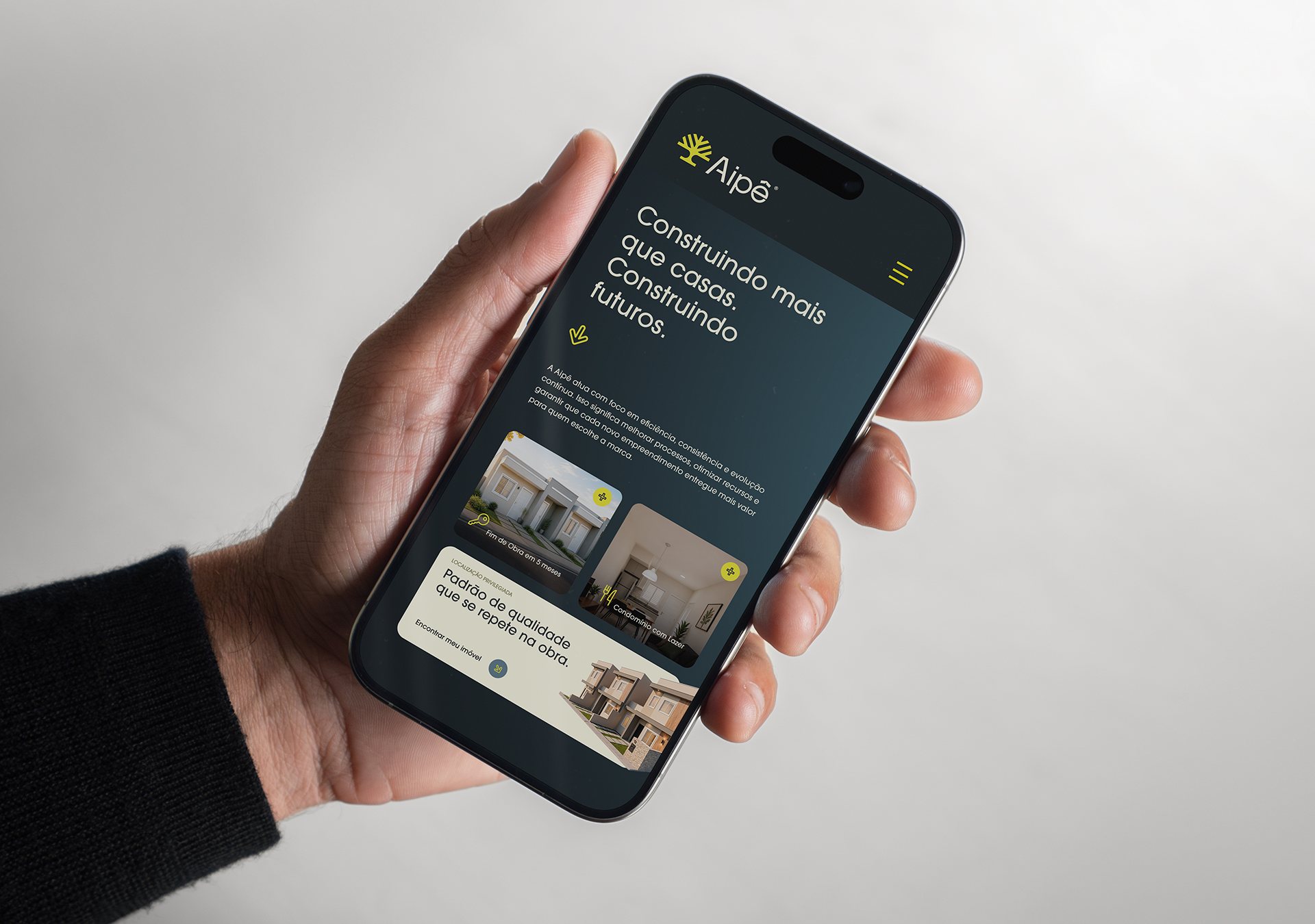
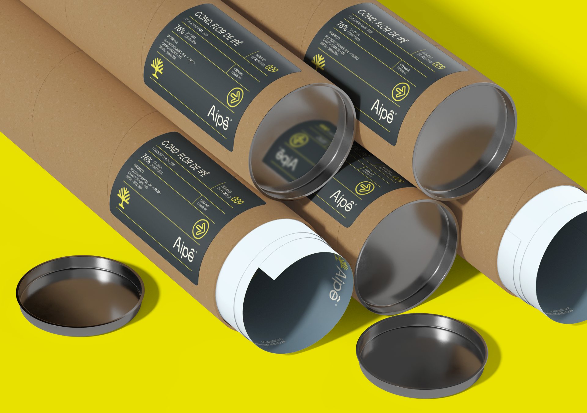
An affordable-housing developer from Campo Grande, Brazil. A warm, approachable brand, with the yellow of the ipê tree and a symbol about roots and future.
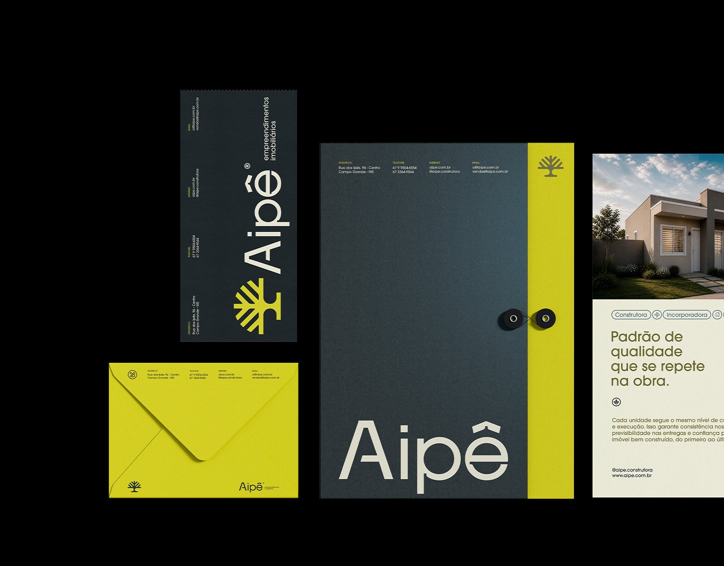
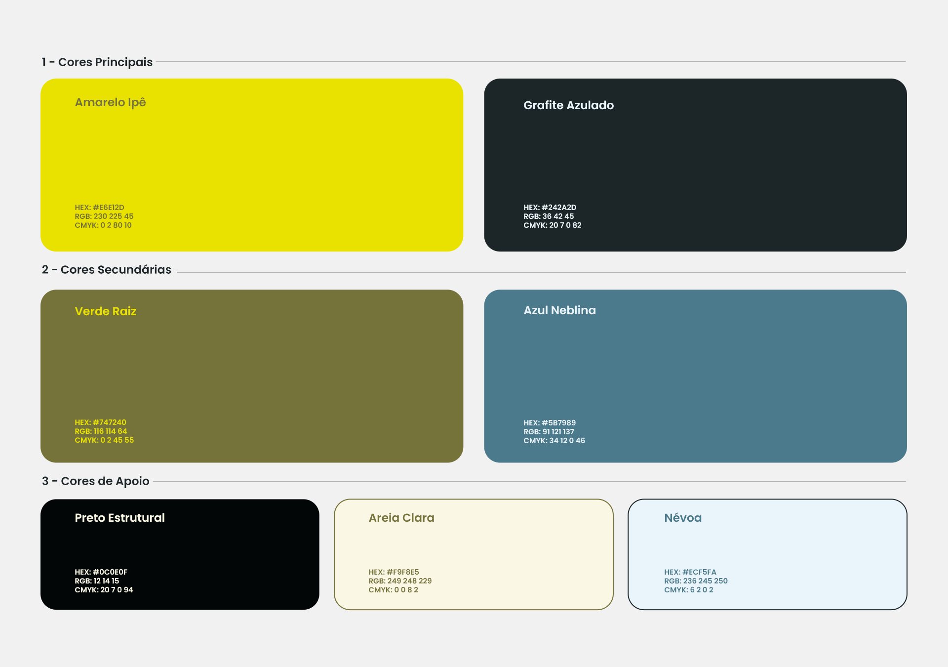
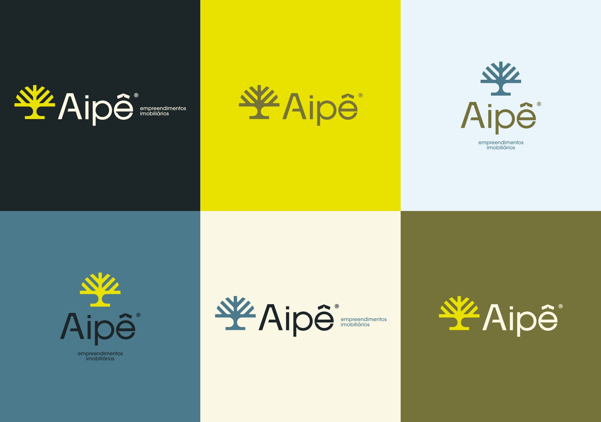
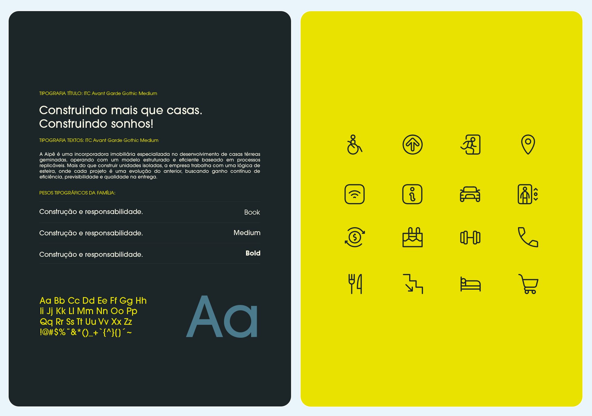
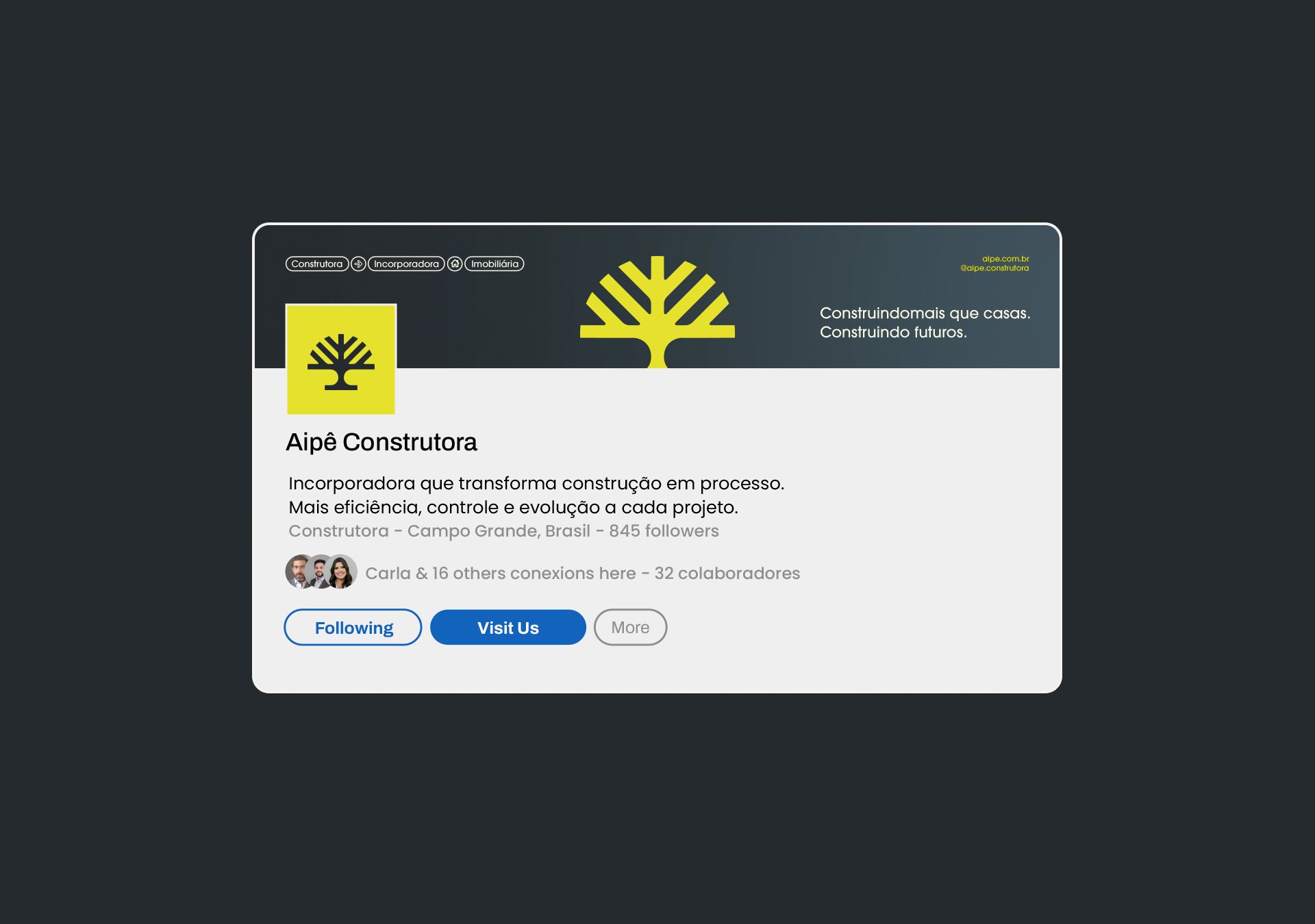
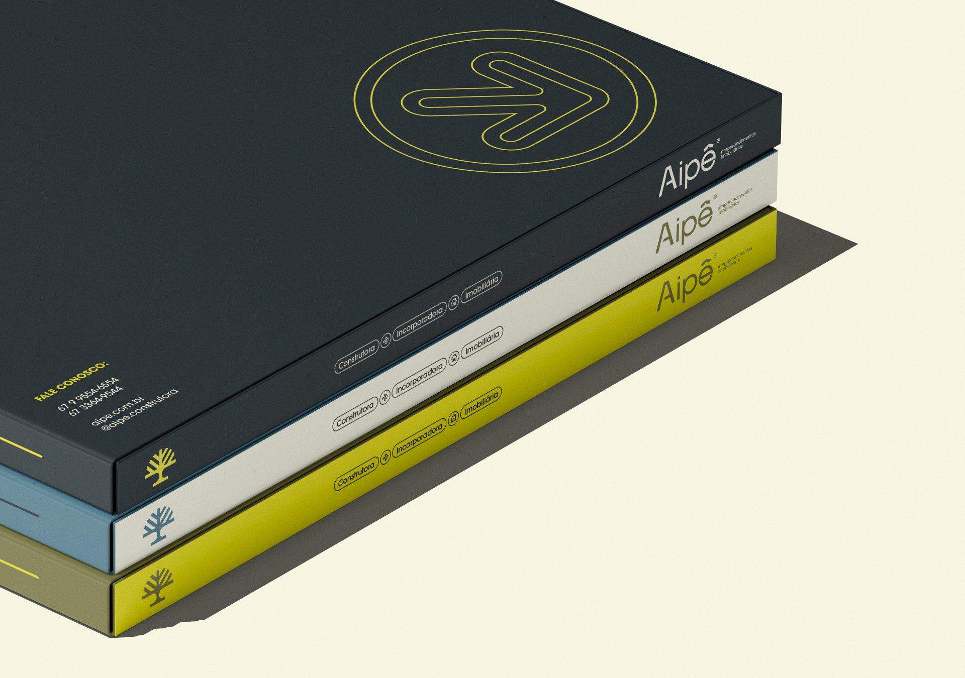
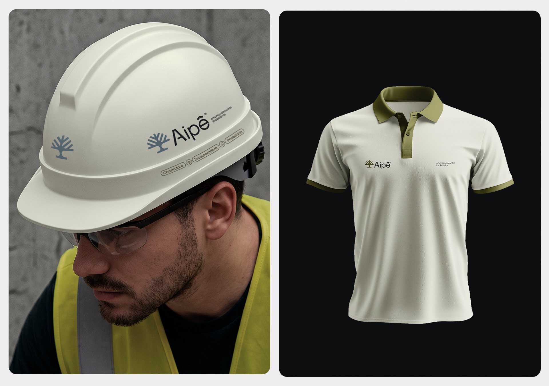
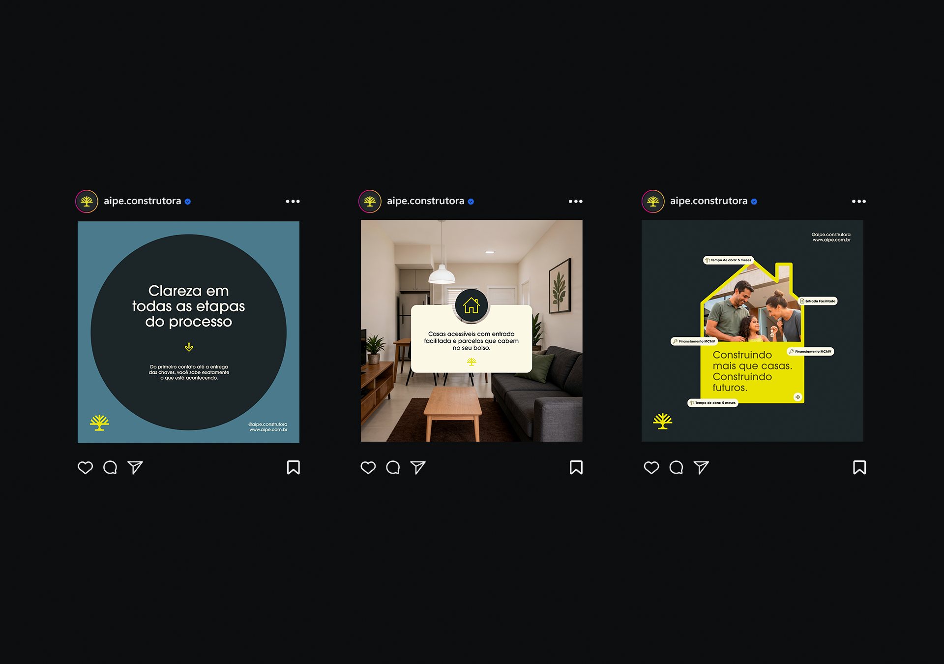
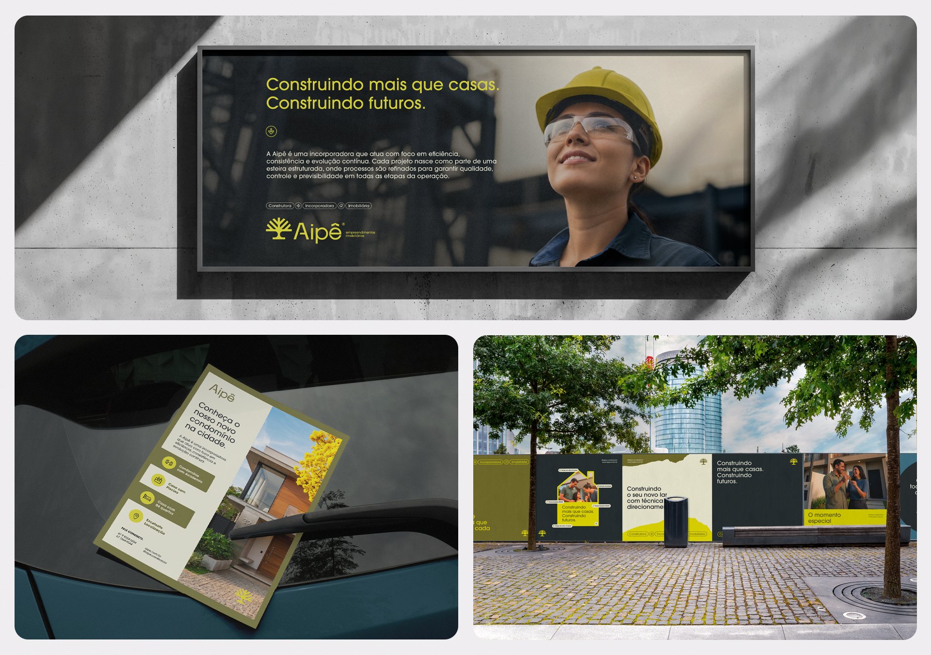
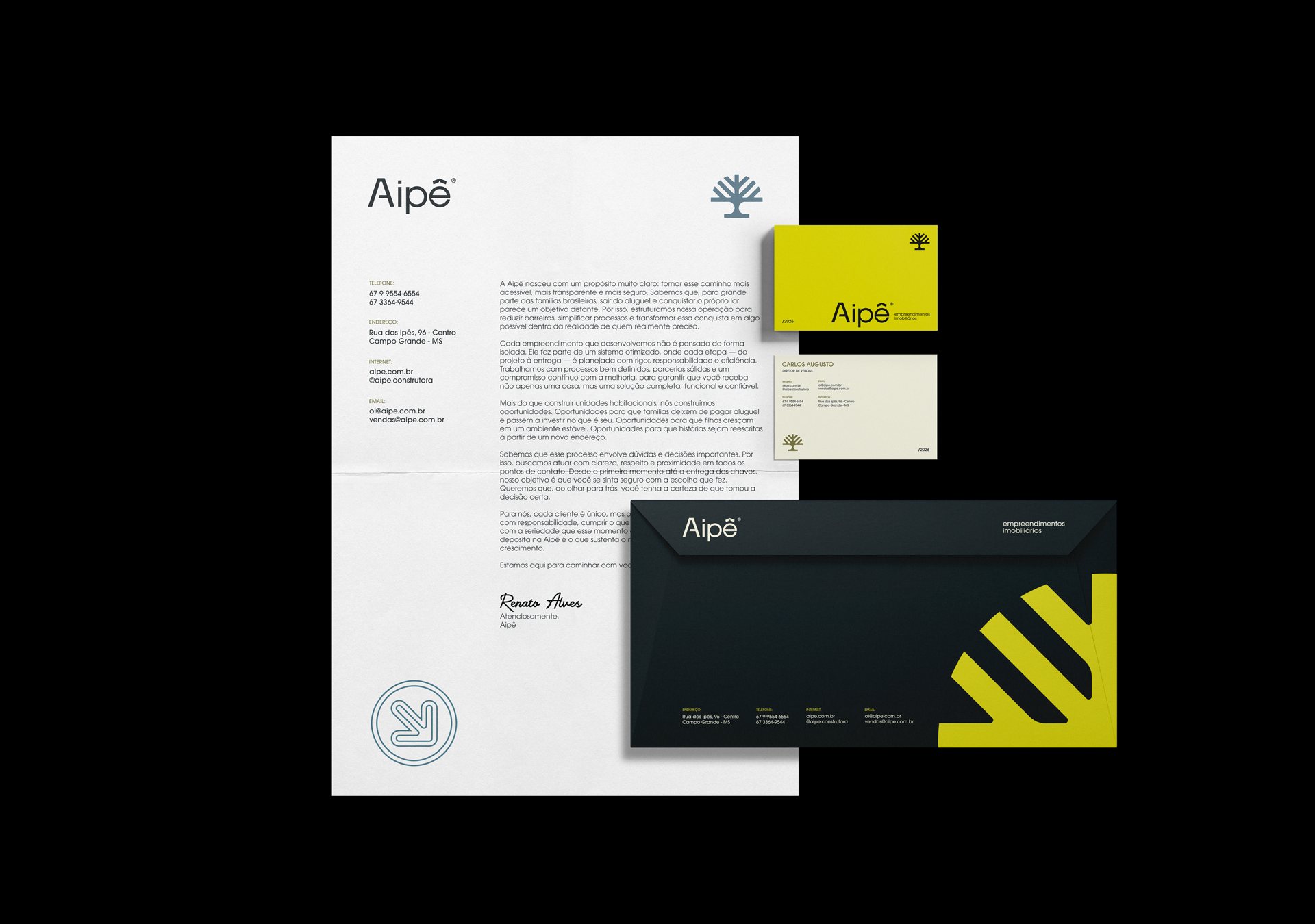
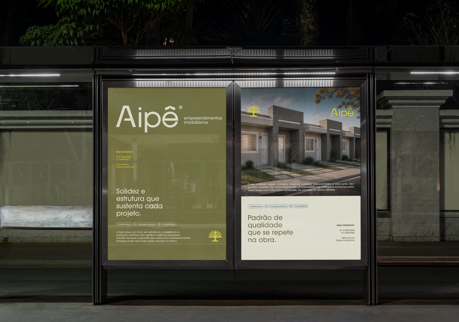
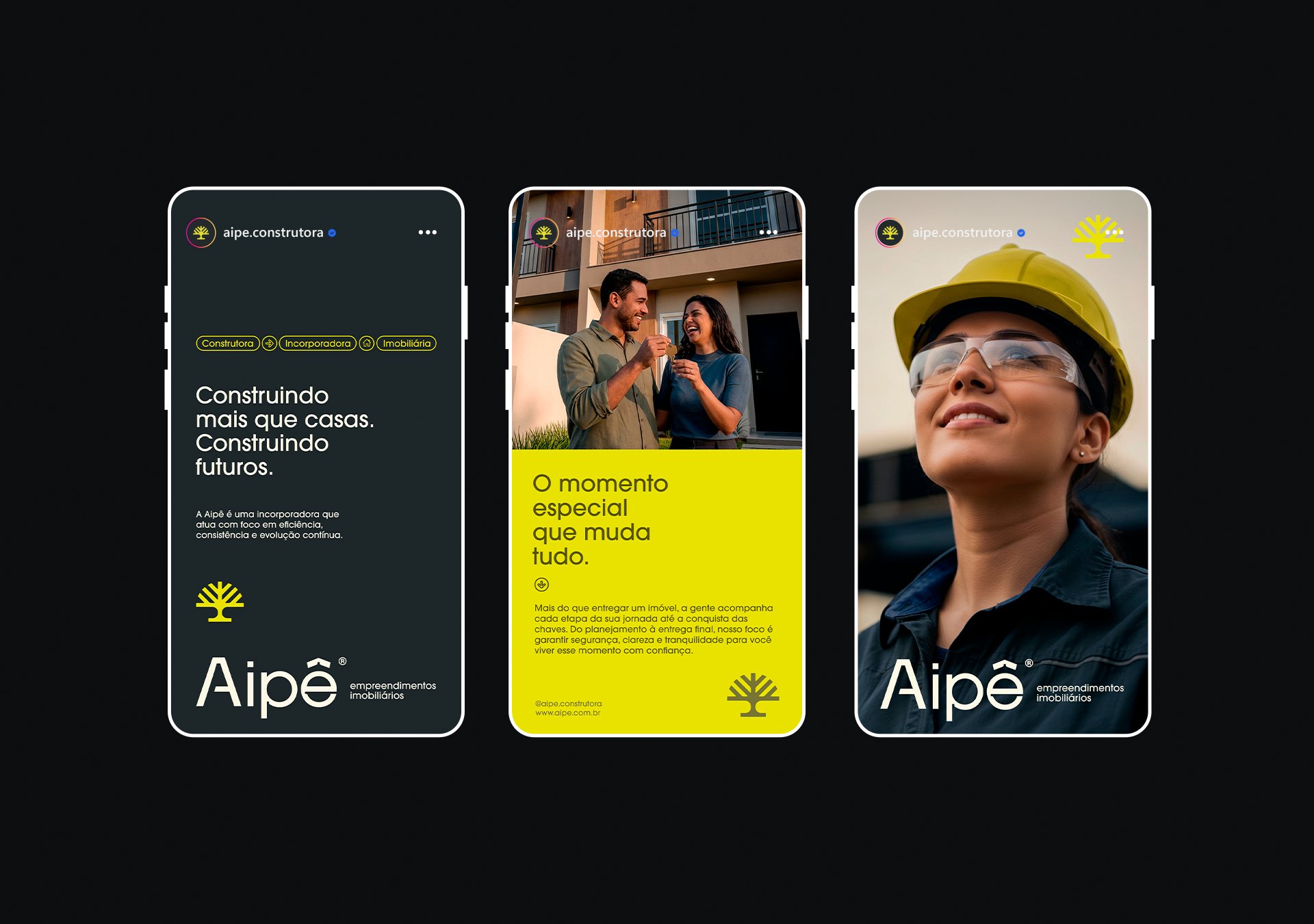
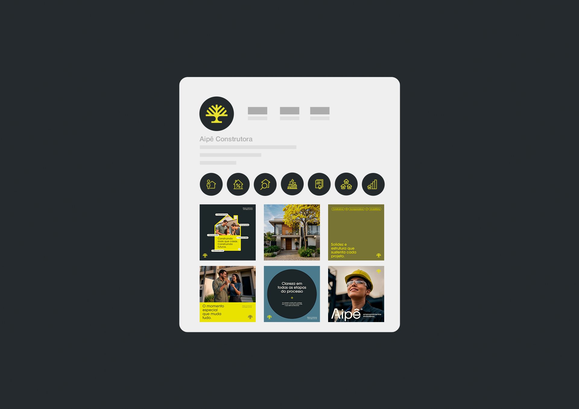
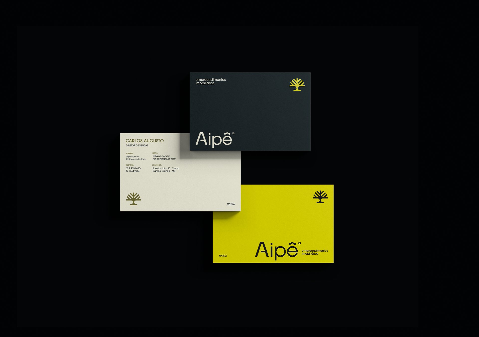
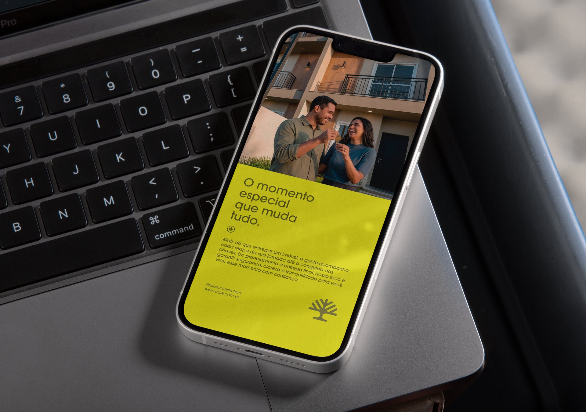
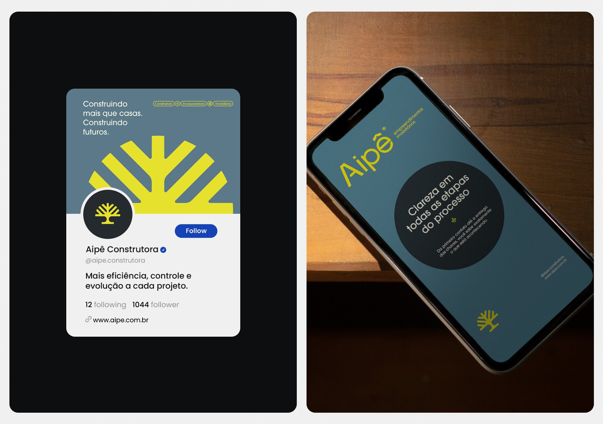
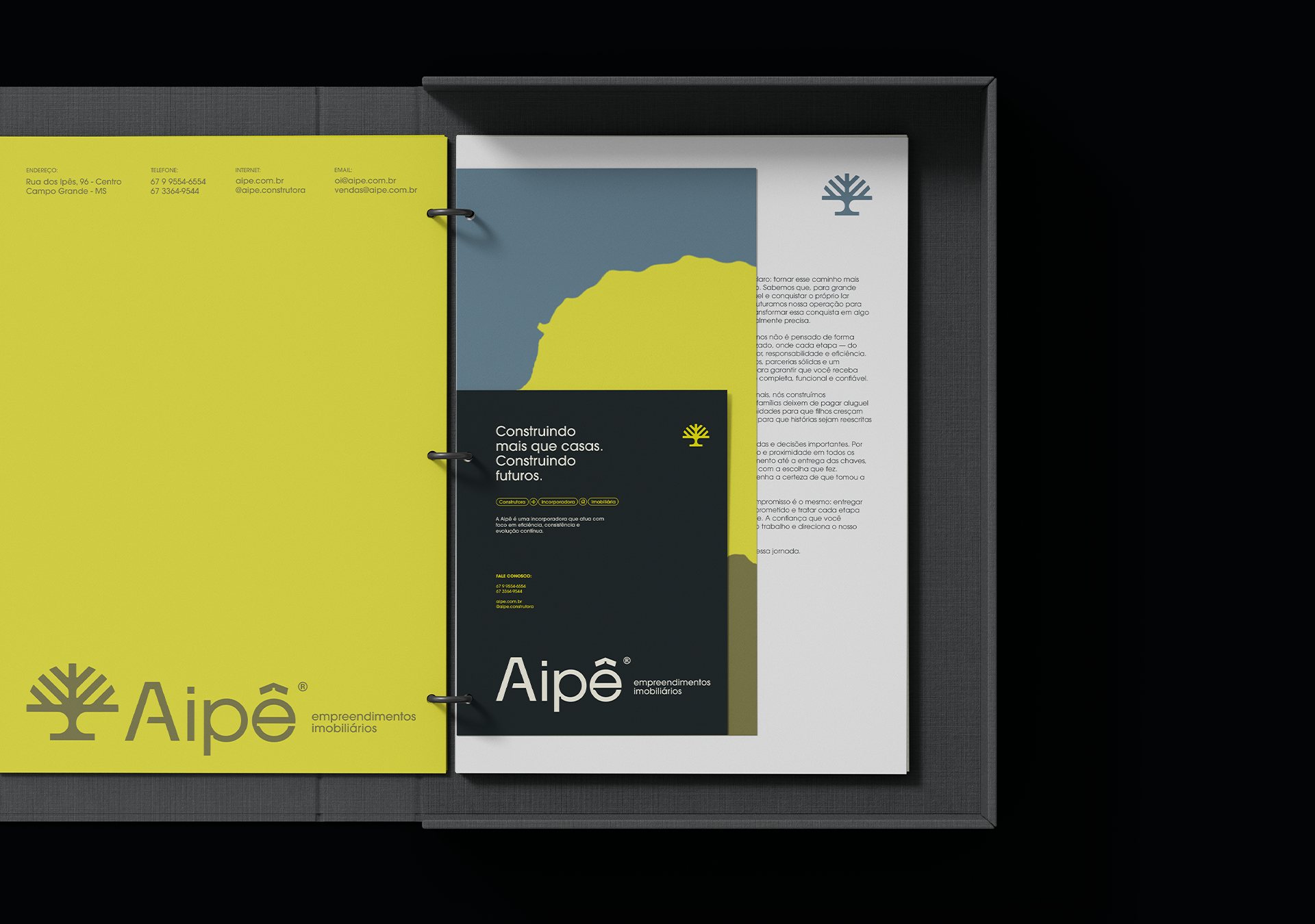
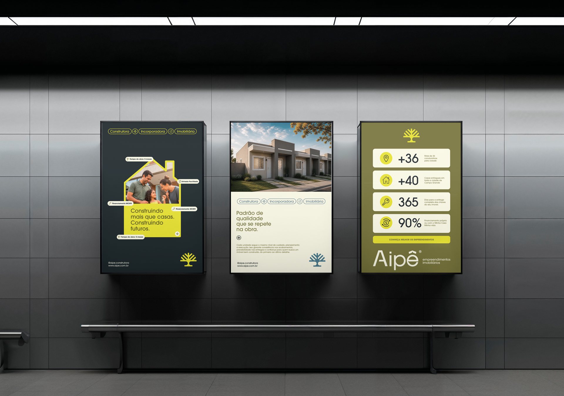
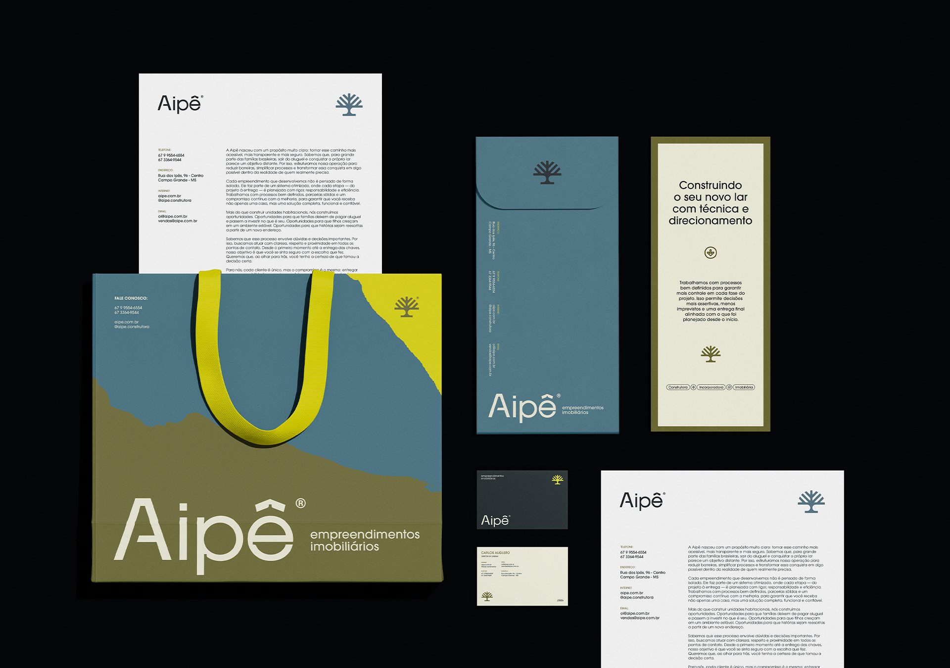
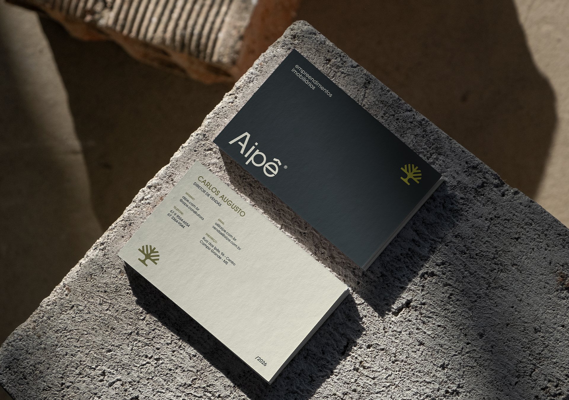
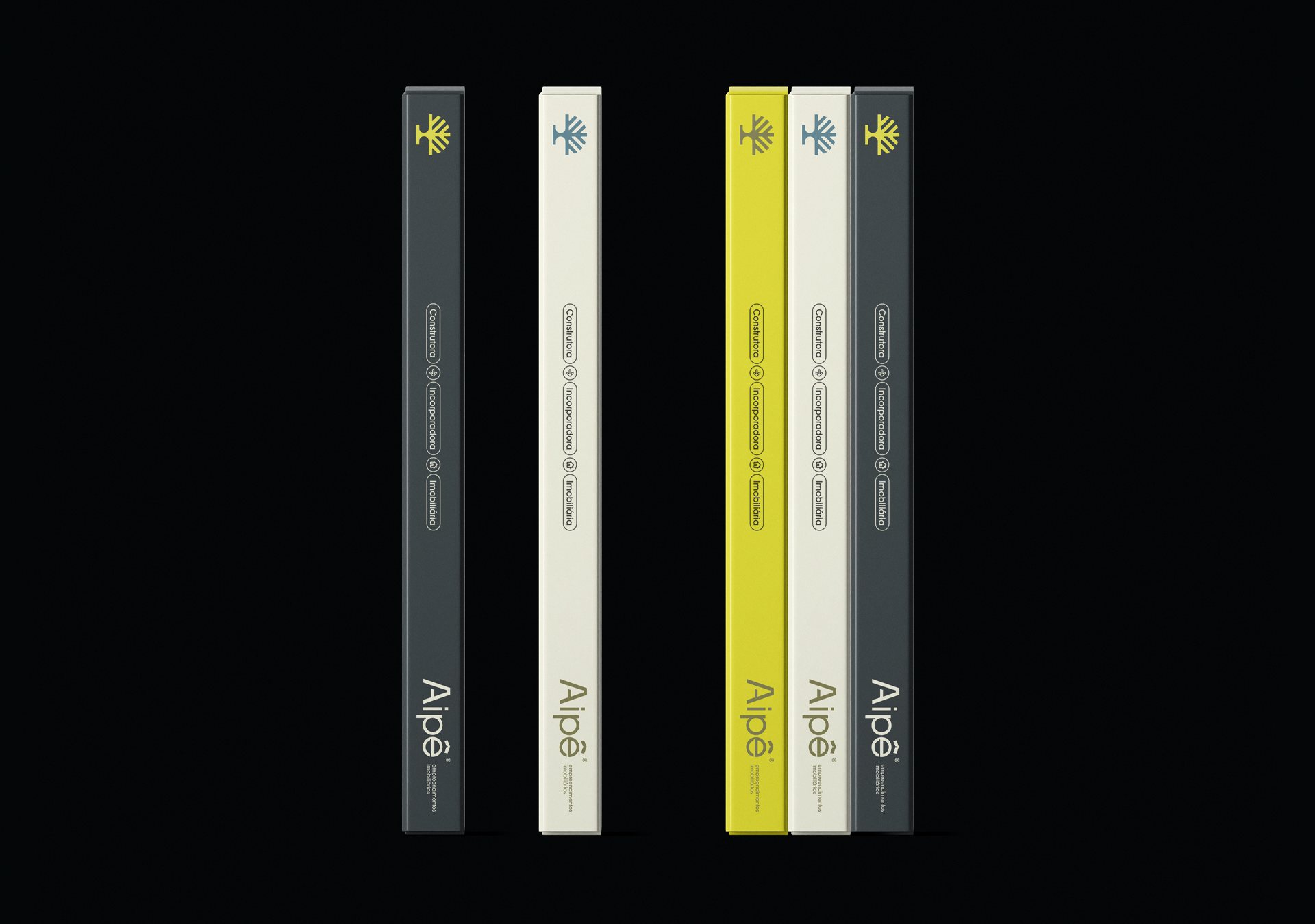
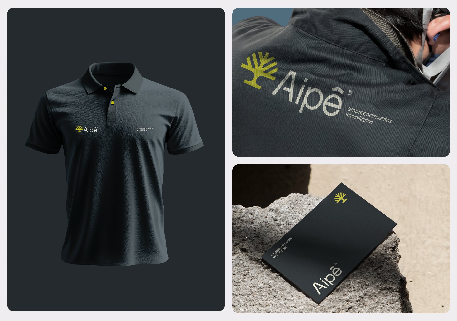
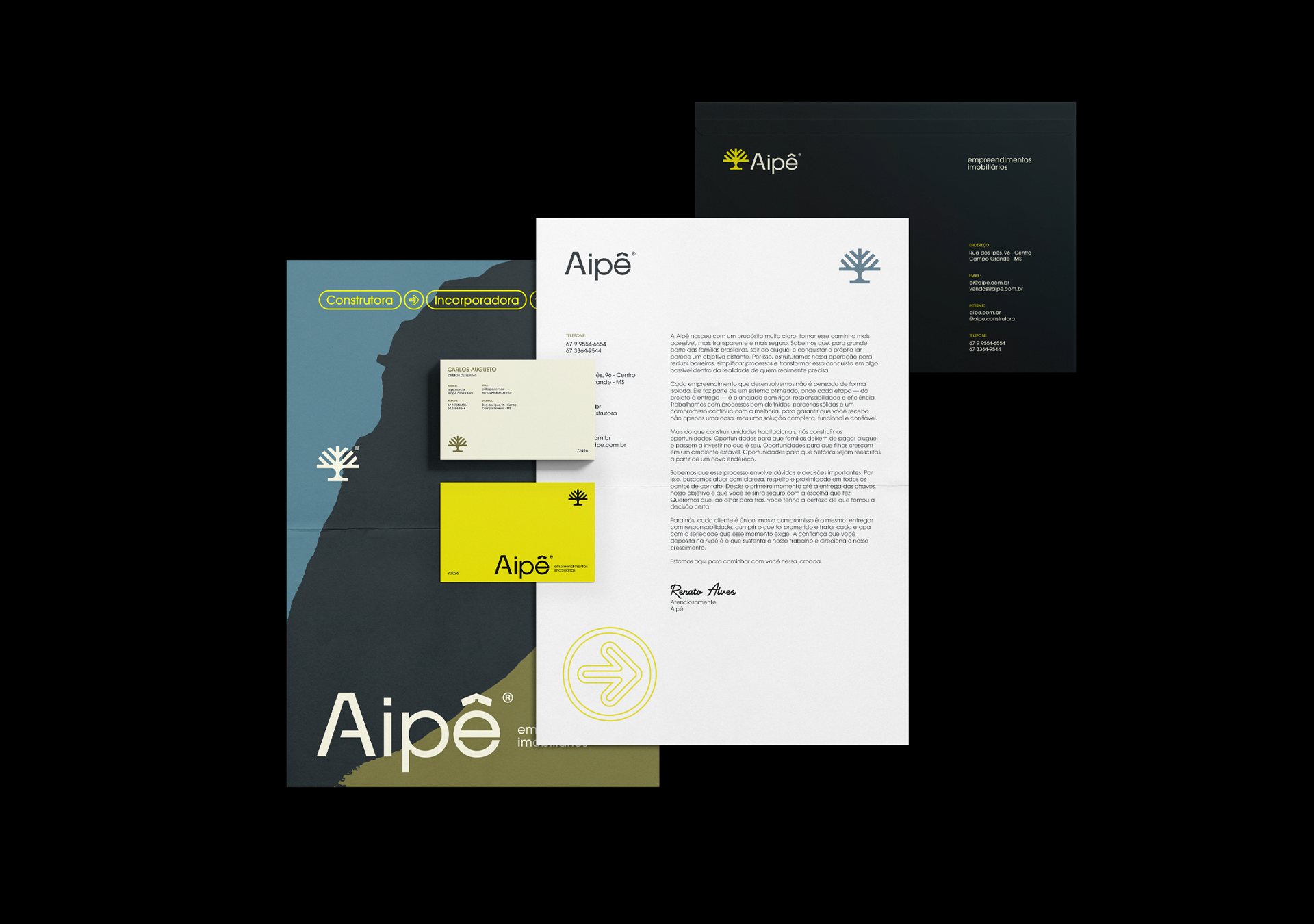
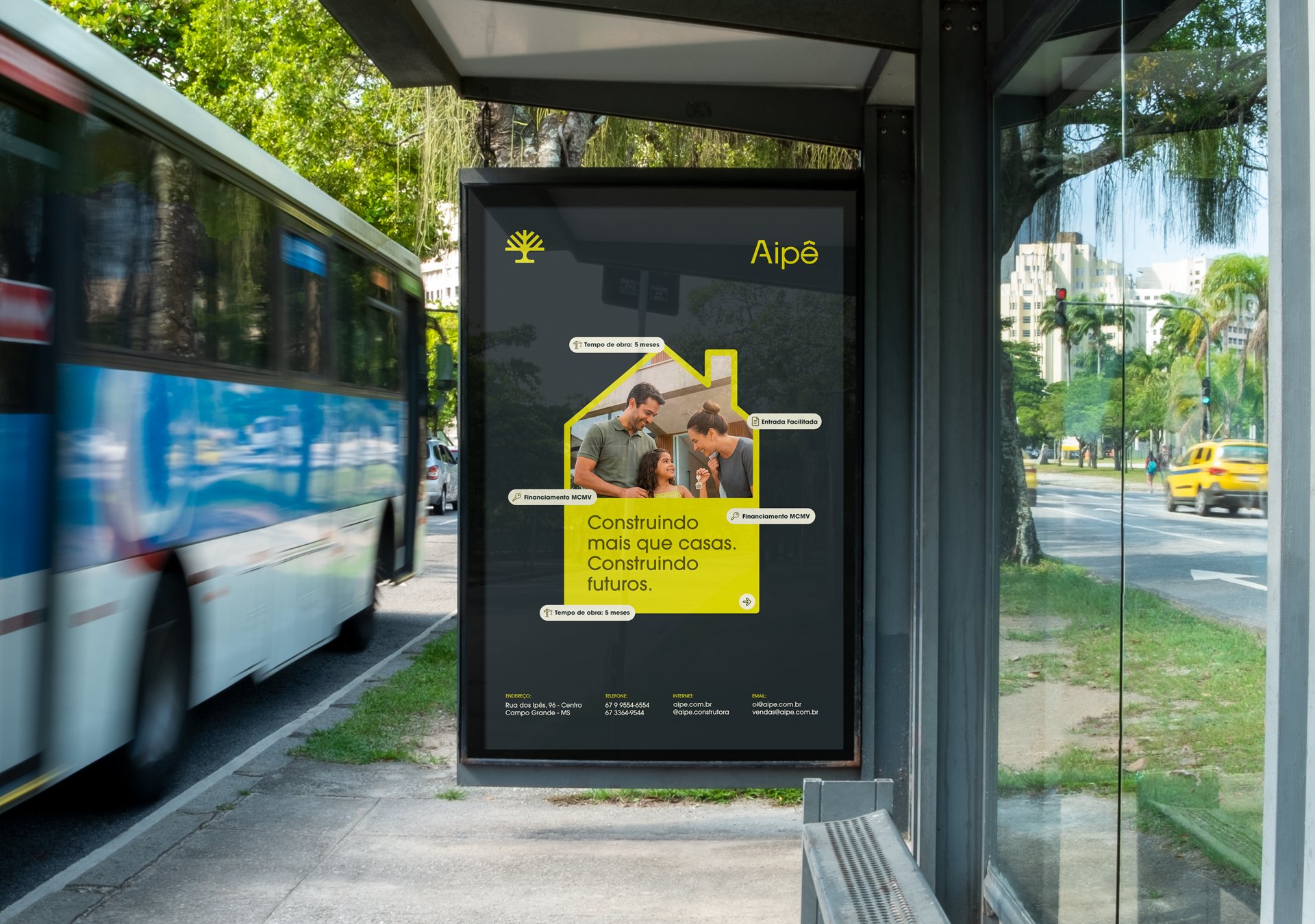
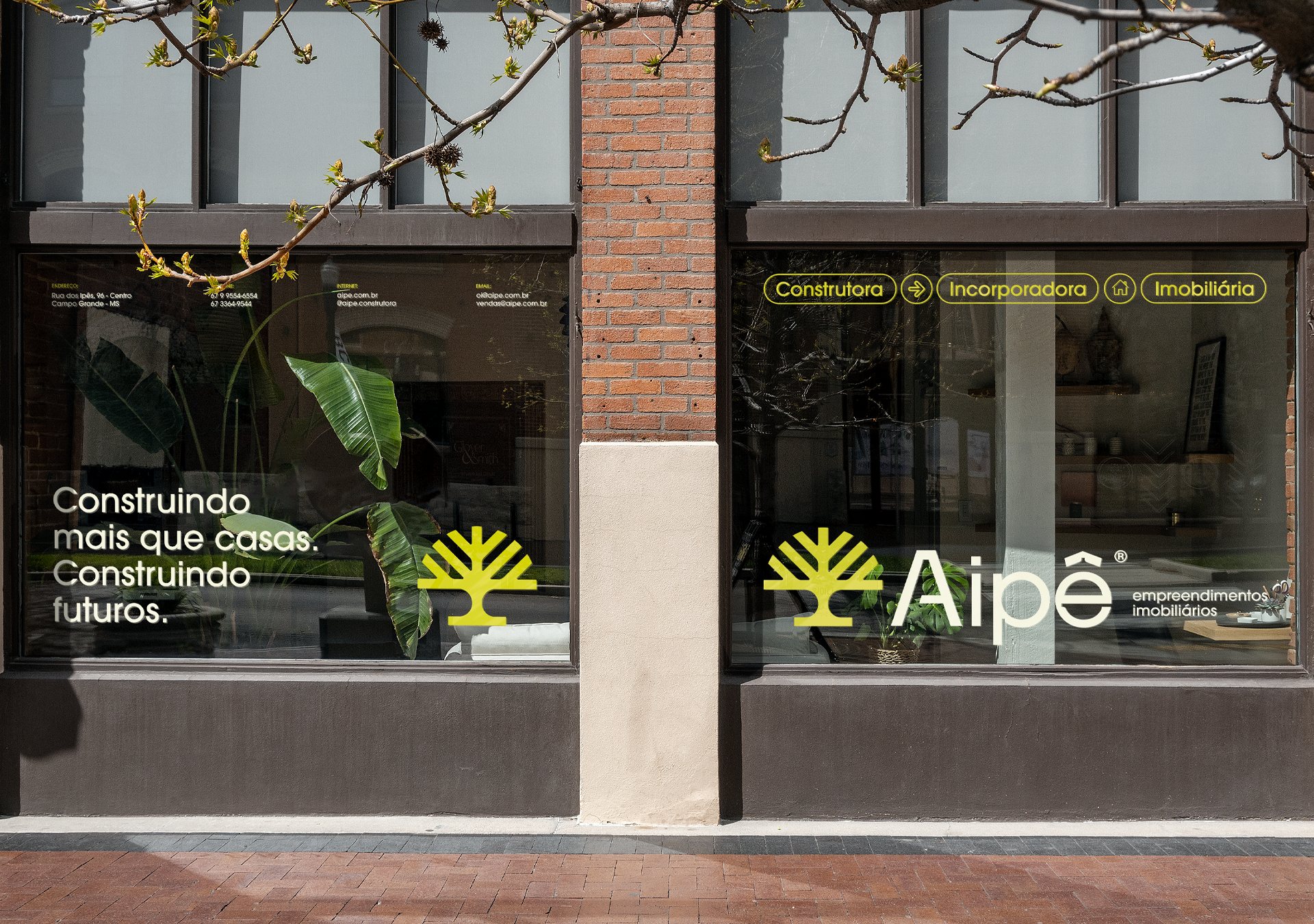
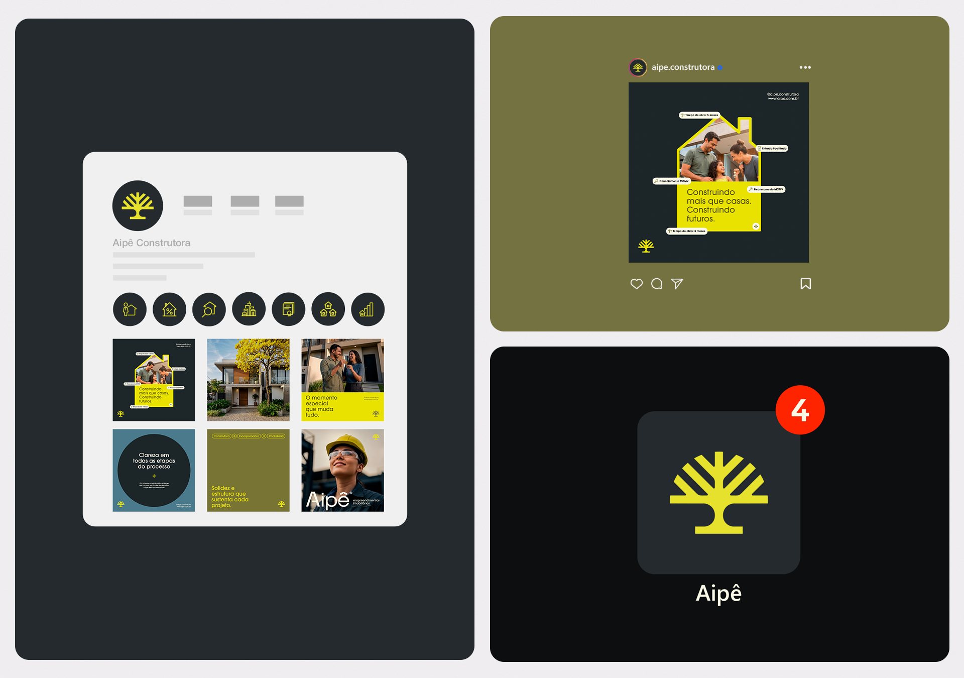
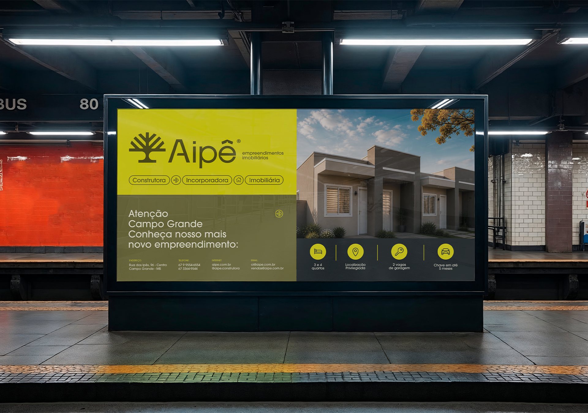
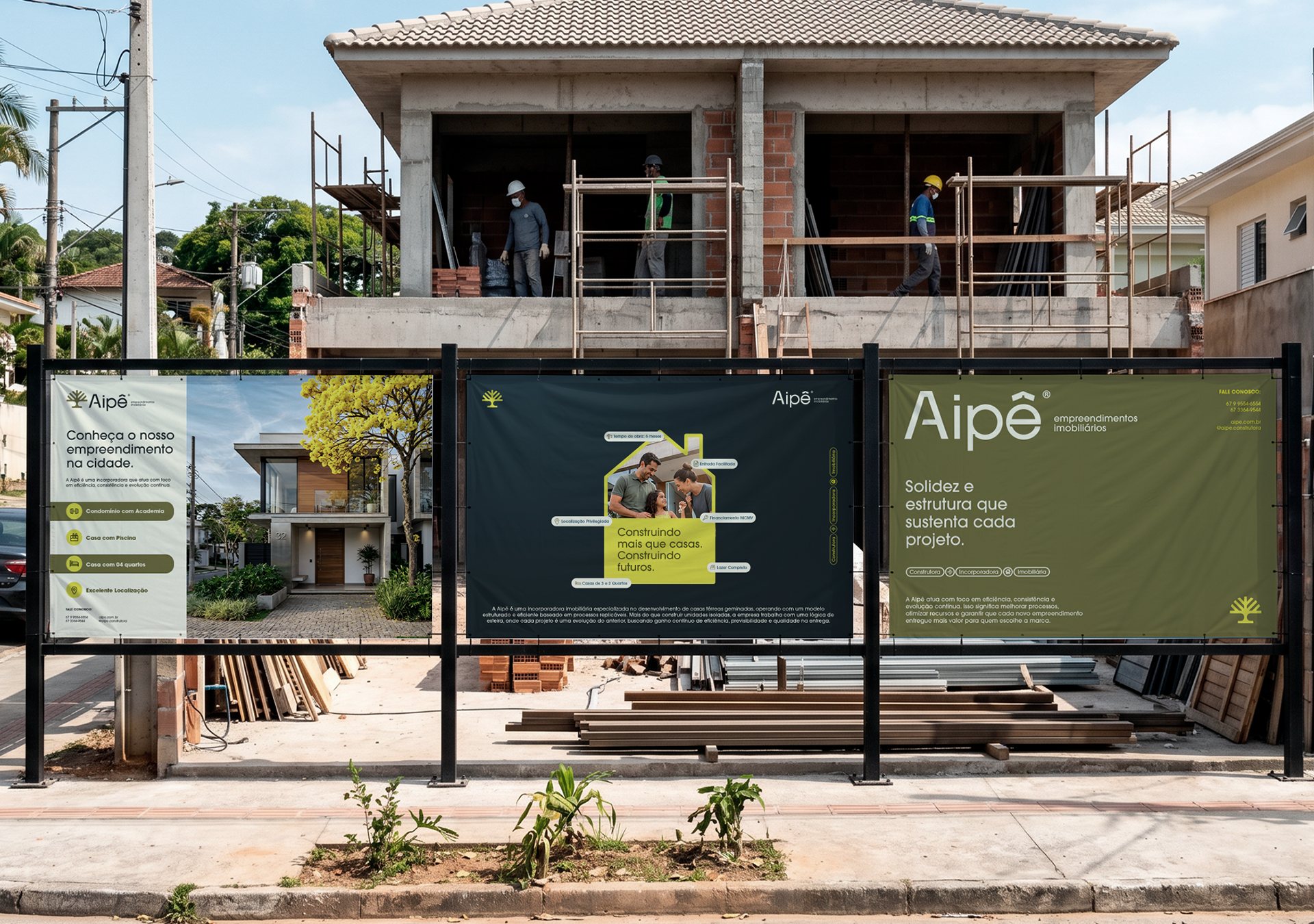
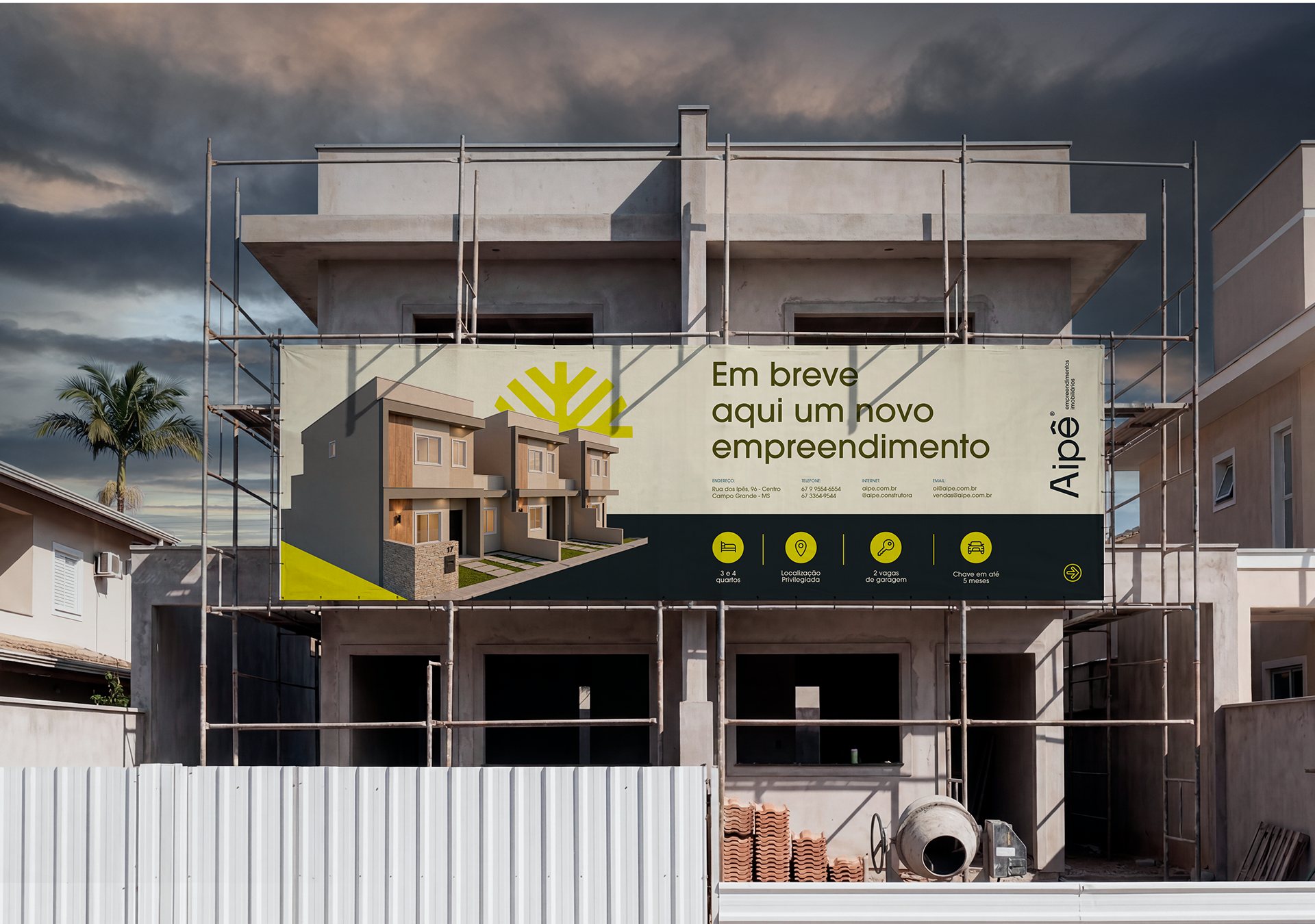
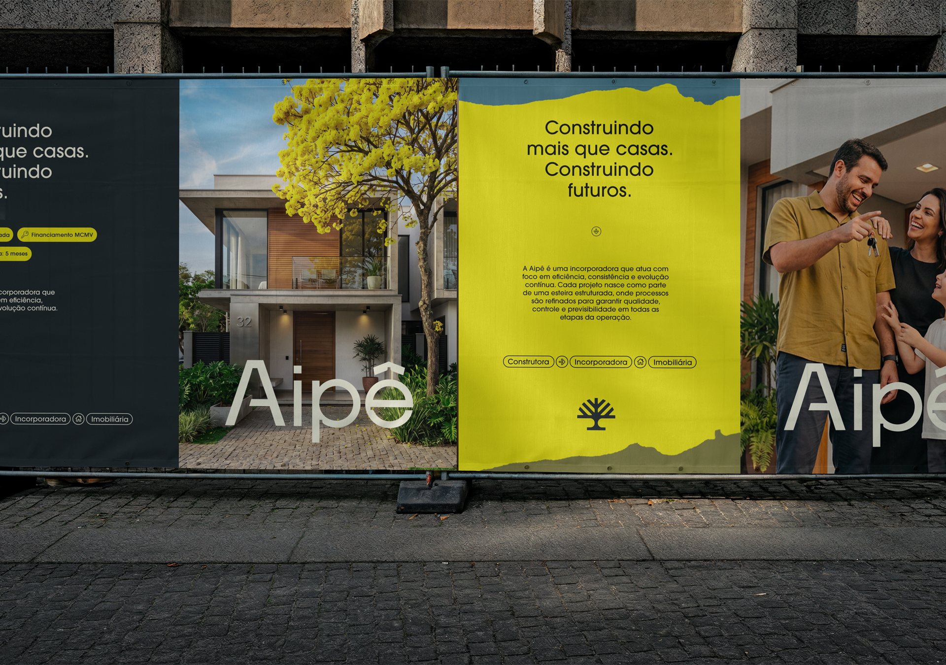
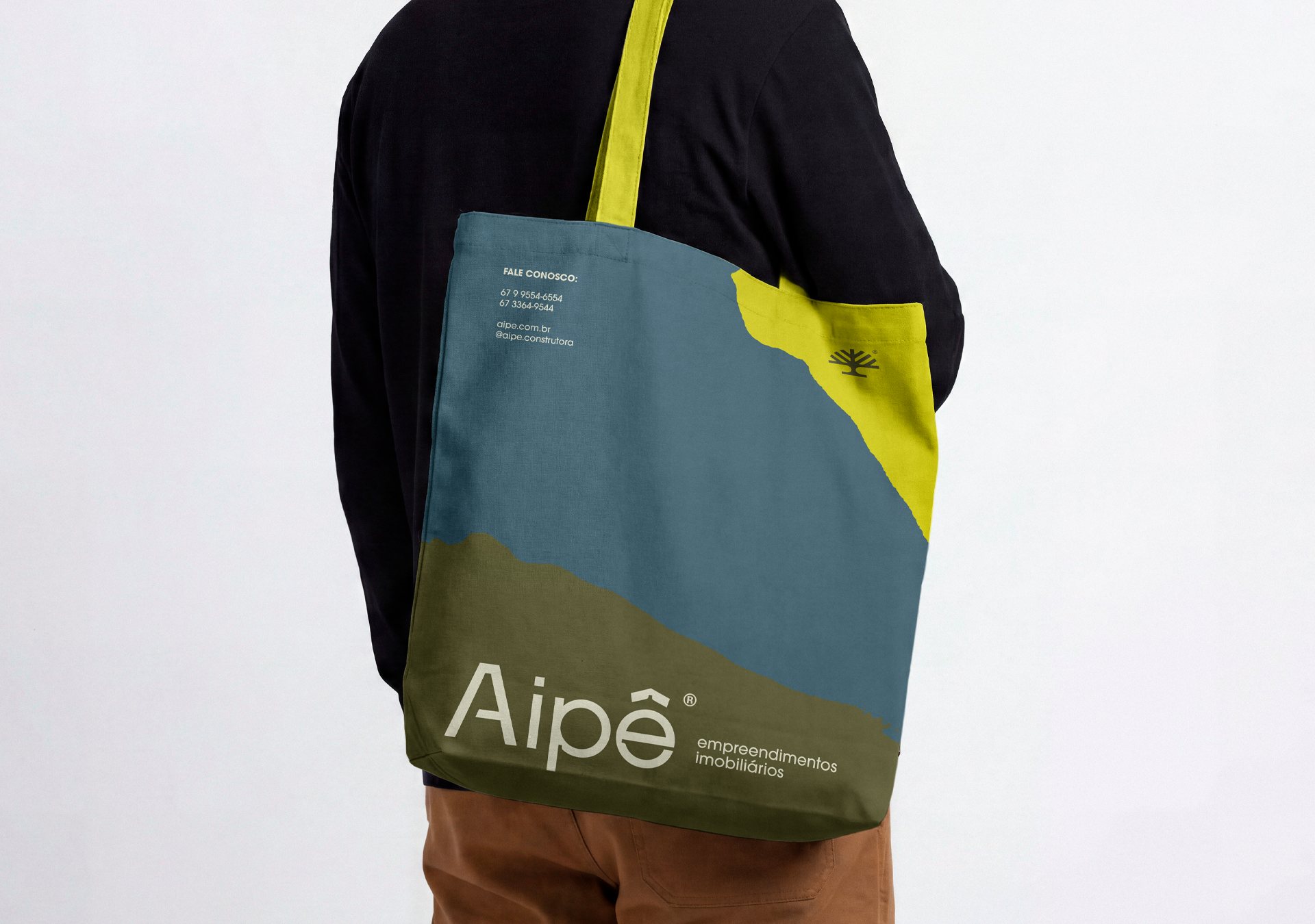
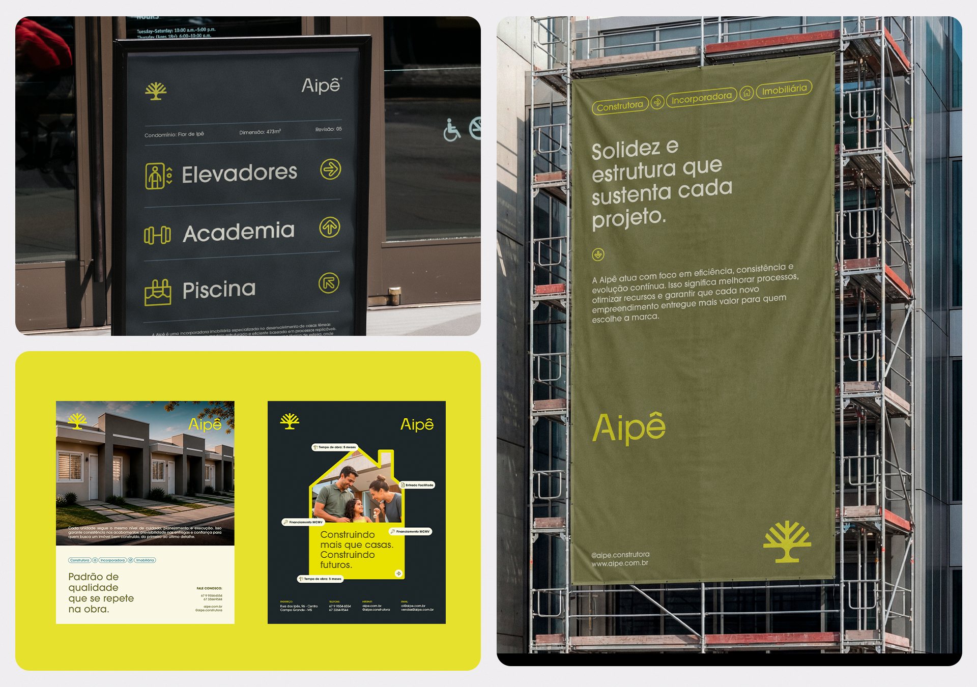
Visual identity developed for Aipê, an affordable-housing developer, around one central principle: turning home ownership into something more human, dignified and memorable. Rounded shapes, a yellow inspired by the ipê tree and organic elements create warmth and familiarity.
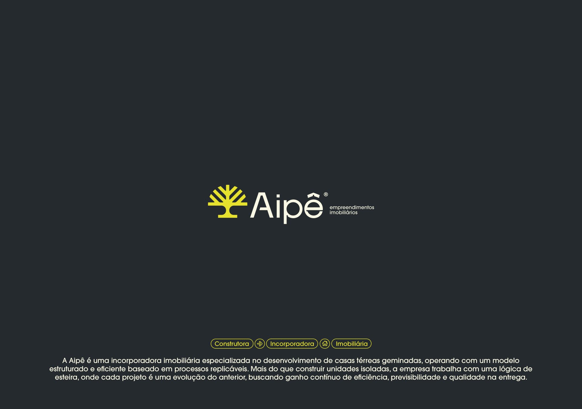
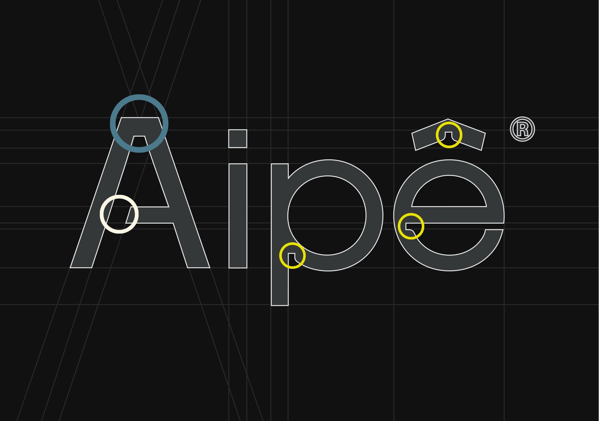
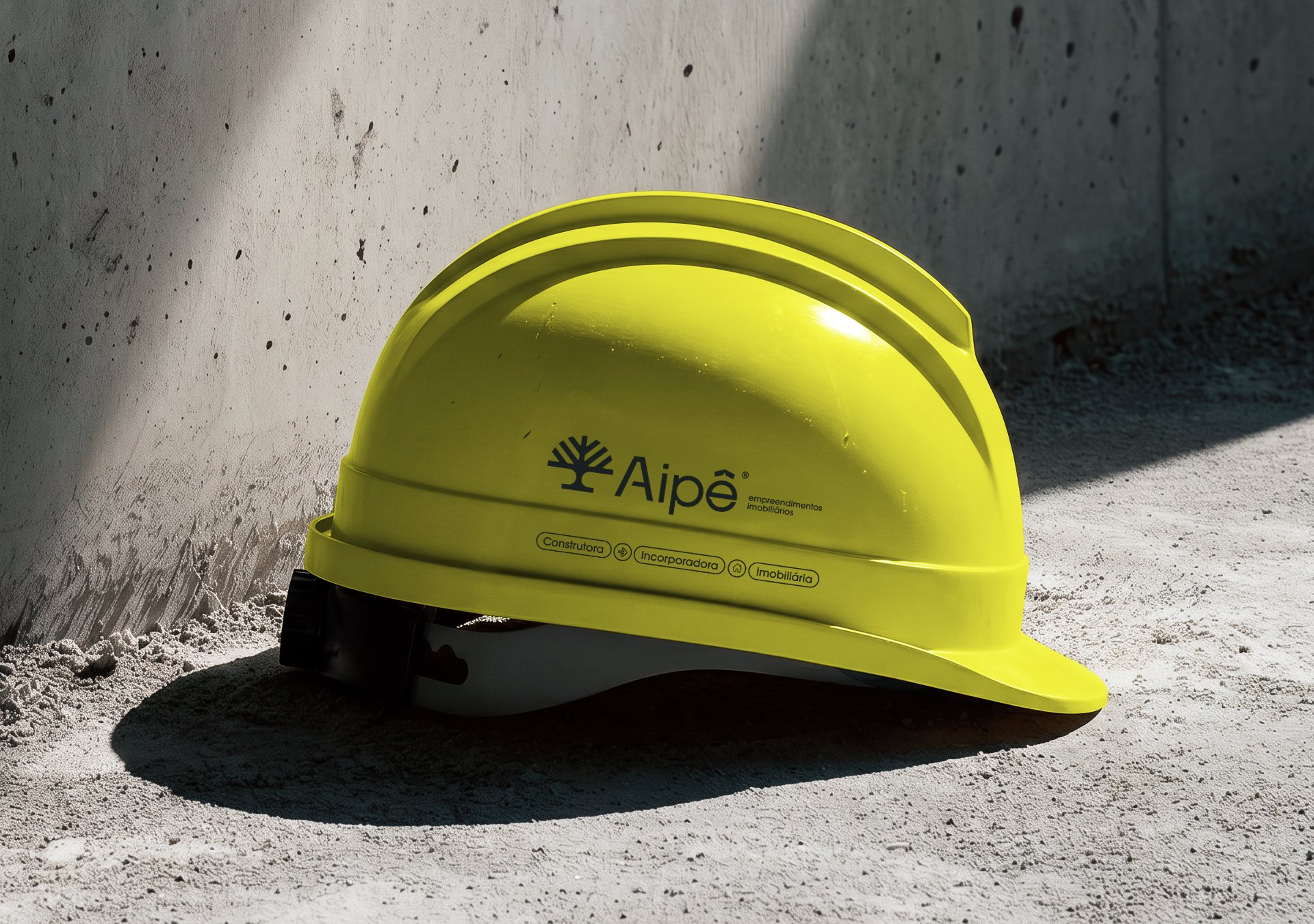
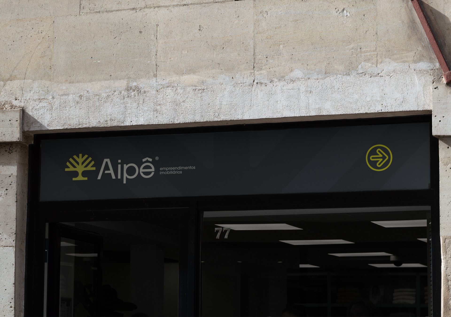
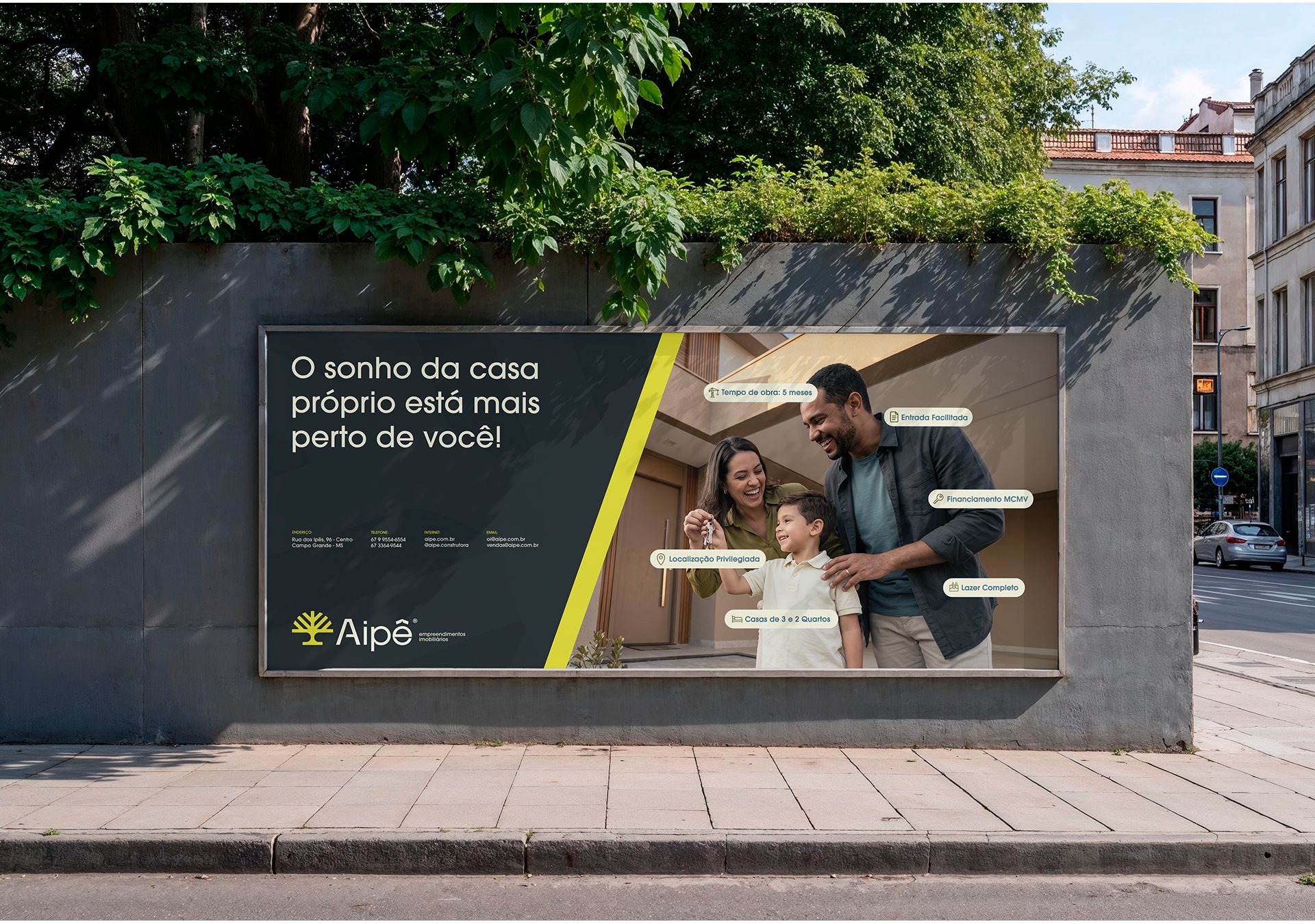
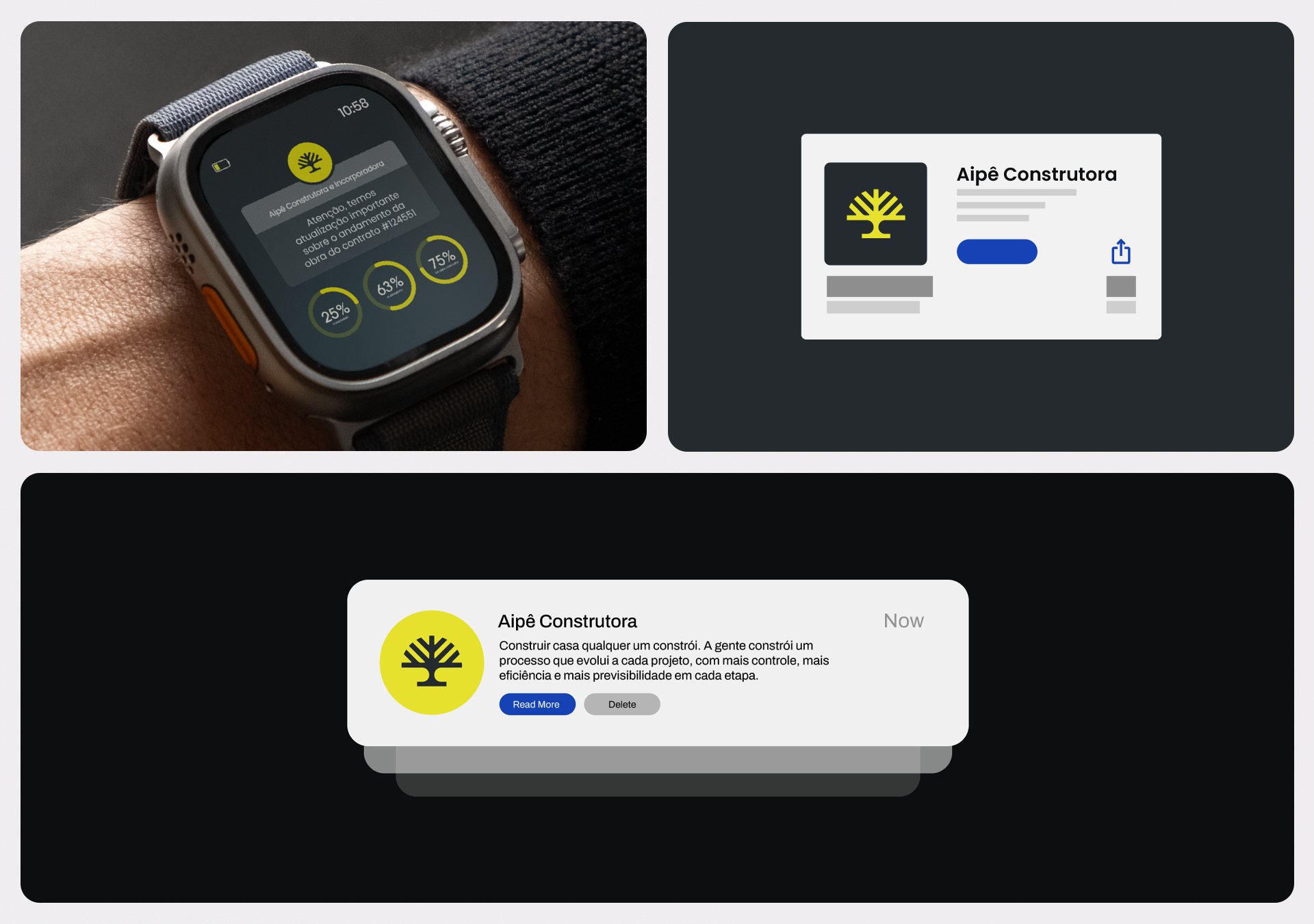
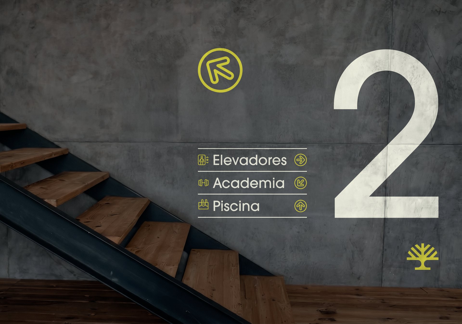
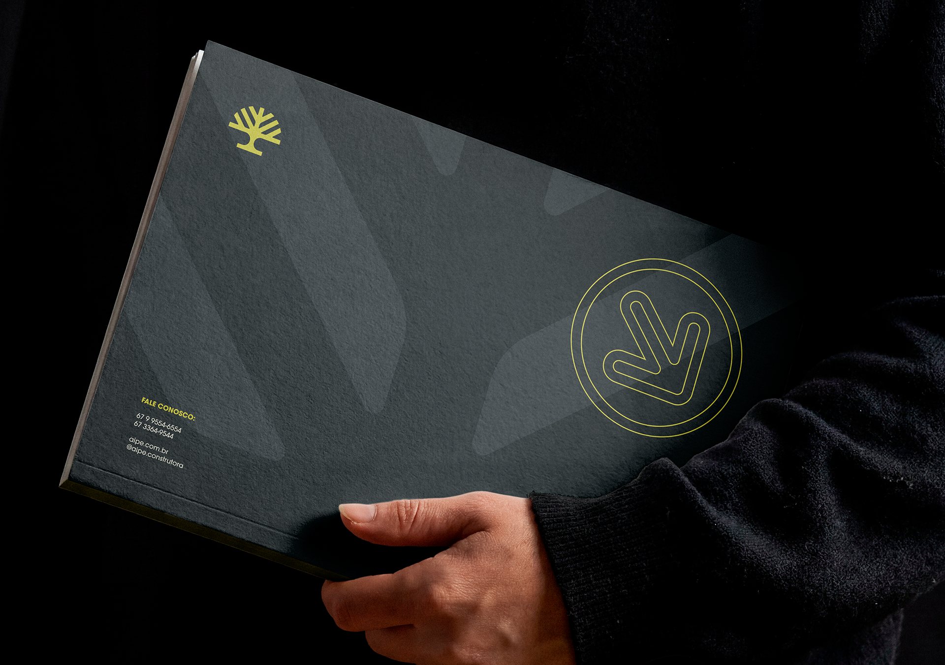
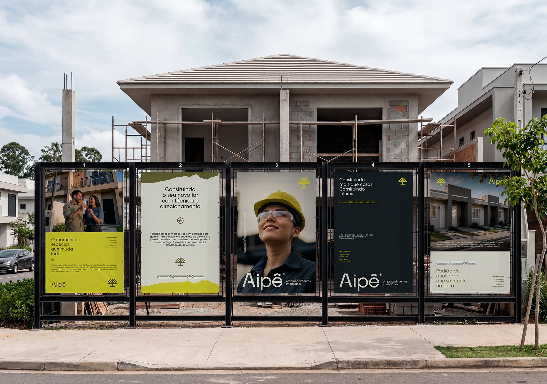
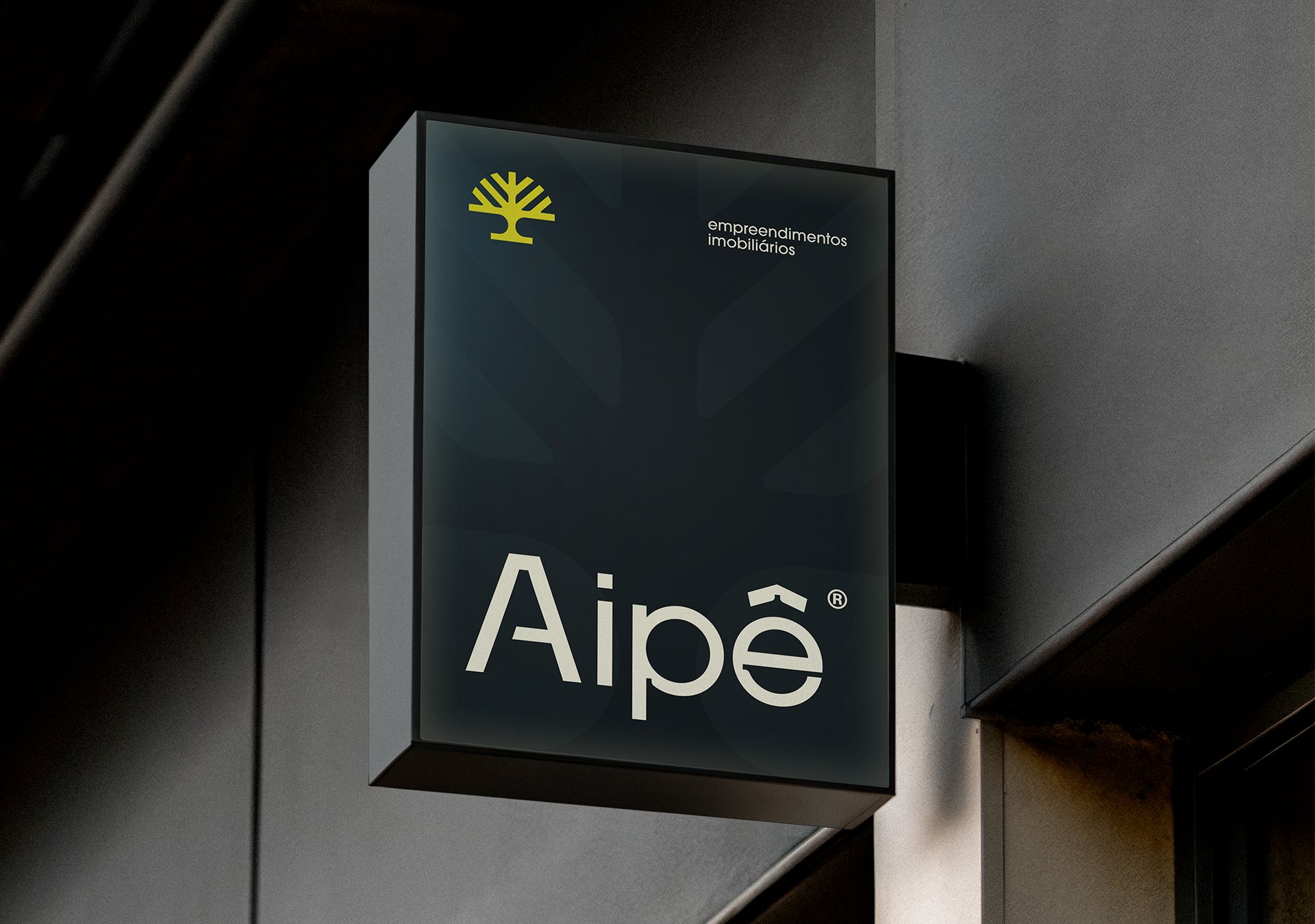
The geometric construction of the symbol and the typography reinforces stability, clarity and trust. The symbol reads the ipê tree as emotional memory and regional identity, and stands for roots, growth and building a future. The system was designed to work from site signage and hoardings to social media and urban applications.





Keep exploring

 GiruInventory management SaaS · 2026
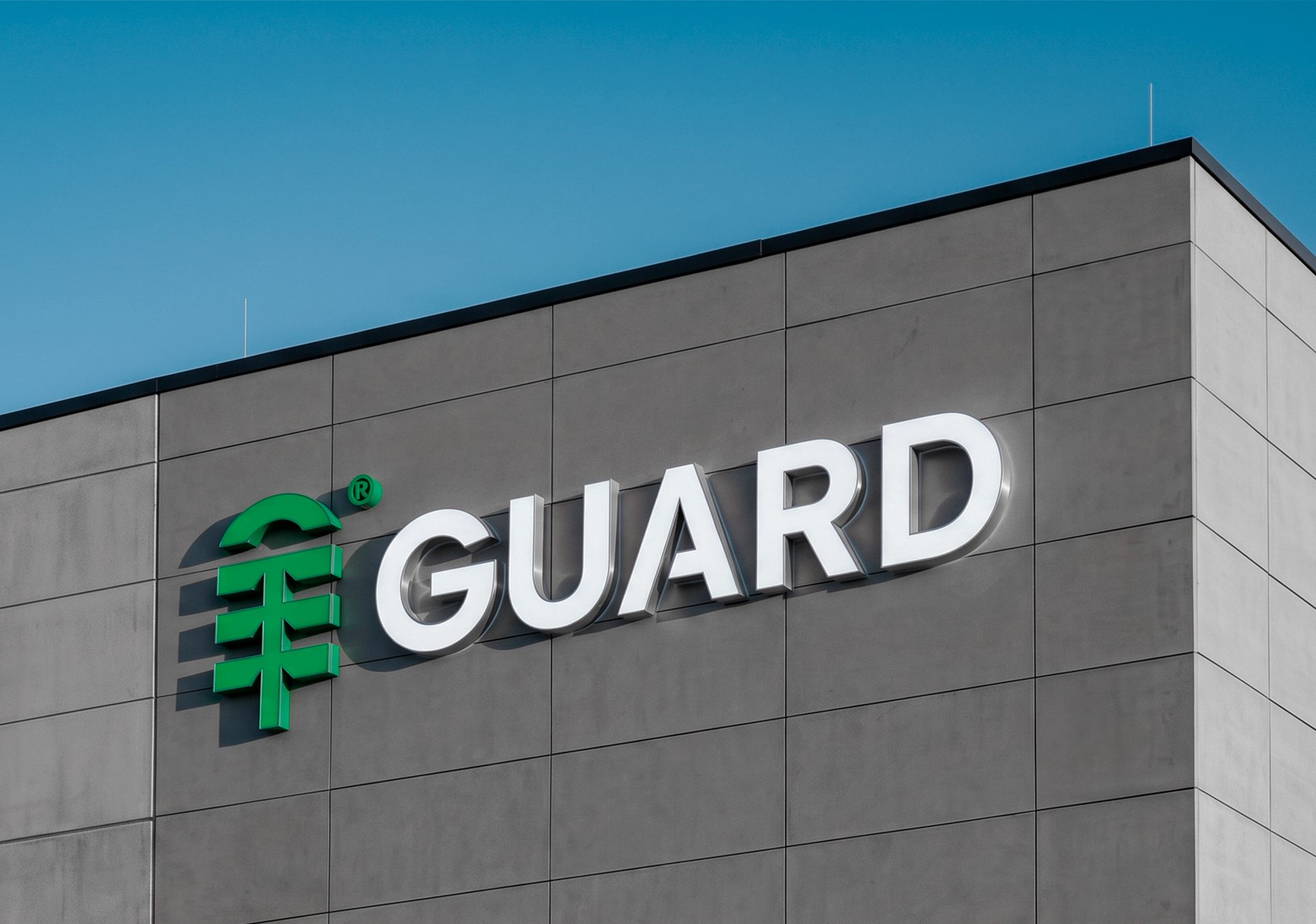 GuardGeneral Warehousing & Logistics · 2026

 HatamexMarketing Agency · 2025

 FreshwebMarketing Agency · 2025
 NollandherBuilder & Real Estate Developer · 2025